July 2007
In this issue:
- Counting Type Attributes Data
- When to Use a u Control Chart
- Steps in Constructing a u Control Chart
- u Control Chart Example
This month’spublication examines u control charts. This type of chart is often used in the health care industry to track items such as infections. For example, suppose you have developed a new medical device to help patients breathe while they are in ICU. The device sometimes, but rarely, causes an infection. You would like to track how often this occurs. Perhaps it occurs only once for every 1000 days the device is in use. This would give you a rate of 1/1000 or 0.001. This number by itself doesn’t mean too much to people. To make the number more useful, you might want to track the number of infections per 1000 days the device is in use. The u control chart allows you to do this.
Counting Type Attributes Data

There are two types of attributes data: yes/no and counting. You use the p or np control chart with yes/no type data. With this type of data, there are only two possible outcomes: something is either defective or not defective. If the item is complex in nature, like a television set, computer or car, it is not very valuable information to characterize such as being defective or not defective. For example, a television set may have a scratch on the surface, but that defect hardly makes the television set defective. The real issue here is how many defects there are on the television set.
Rating items as defective or not defective is not very useful if the item is continuous. For example, suppose you are making a plastic sheet. The fact that the sheet has a small defect such as a bubble or blemish on it does not make it defective. However, if there are too many bubbles, the sheet may not be useful for its intended purpose.
In situations such as these, the defects (such as the number of bubbles on a plastic sheet) are counted. The u control chart and the c control chart monitor the variation in counting type attributes data. With counting data, you count the number of defects. A defect occurs when something does not meet a preset specification. It does not mean that the item itself is defective. When looking at counting data, you end up with whole numbers such as 0, 1, 2, 3; you can’t have half of a defect.
The defects must occur within a finite region of space or time. For example, the size of the plastic sheet is the area of opportunity for defects to occur in the example above. It represents a finite region of space where the defects can occur.
The u and the c control charts use the Poisson distribution to model the results. There are four conditions that must be met for this to be correct. According to Dr. Don Wheeler in Advanced Topics in Statistical Process Control, these are:
- The counts must be discrete counts.
- The counts must occur in a well-defined region of space or time.
- The counts are independent of each other and the likelihood of a count is proportional to the size of the area of opportunity. This means that the probability of finding a bubble on a plastic sheet is not related to which part of the plastic sheet is selected.
- The counts are rare compared to the opportunity. For example, the opportunity for customer complaints to occur is large. However, the number that actually occurs is small.
Examples of counting type data include:
- number of accidents for delivery trucks
- number of customer complaints
- number of injuries in a plant
- number of surface imperfections on a plastic sheet
- number of burnt resin particles in a polymer resin
- number of incorrect prescriptions
- number of infections in a hospital
When to Use a u Control Chart
You can use the u control chart when the above conditions for counting data are met. You can use the c control chart if the area of opportunity does not change from subgroup to subgroup. You use the u control chart if the subgroup size (the area of opportunity) changes from subgroup to subgroup.

This area of opportunity is often referred to as an inspection unit. Suppose you monitor pumps in a large plant for leaks. An inspection unit can be one item, such as one pump, or it can be multiple items such as 10 pumps. If the inspection unit is 10 pumps, the subgroup size, n, indicates how many tens were inspected. For example, if 42 pumps were inspected, the subgroup size, n, would be 4.2 inspection units.
Operational definitions must be used to determine what constitutes a defect. Be careful here. Sometimes the u control chart is used to monitor different types of defects. For example, instead of monitoring pumps for leaks, you might be monitoring the pumps for leaks, low oil levels, worn gears, etc. In this case, condition number 3 above will not be true. The probability of each defect occurring will not be the same; thus the u control chart should not be used.
Steps in Constructing the u Chart
The steps in construction of the u chart are given below.
- Gather the data
- Select the size of one inspection unit (IU). The inspection unit should be large enough so defects have an opportunity to occur. An inspection unit can be one item (such as one pump) or area (such as one square foot). It can be multiple items (such as 100 pumps) or larger areas (such as 10 square feet)
- Select the frequency with which to collect data. Data should be collected in the order in which they are generated
- Select the number of subgroups (k) to be collected before control limits will be calculated (at least 25)
- For each subgroup, determine the following:
- c = number of defects found in the subgroup
- n = subgroup size = number of samples/IU
- For each subgroup, calculate the number of defects per inspection unit (u):
- u = c/n
- Record the data
- Plot the data
- Select the scales for the control chart.
- Plot the values of u for each subgroup on the control chart.
- Connect consecutive points with straight lines
- Calculate the process average and control limits.
- Calculate the process average number of defects per inspection unit (ubar)
- ubar = (Sum of c)/(Sum of n) = (c1 + c2 + … + ck)/(n1 + n2 + … + nk) where c1, c2, etc. are the number of defects in subgroups 1, 2, etc.; n1, n2, etc. are the number of inspection units in subgroups 1,2, etc.; and k is the number of subgroups.
- Draw the process average number of defects per inspection unit (ubar) on the chart as a solid line and label
- Calculate the control limits for the u chart. The upper control limit is given by UCLu. The lower control limit is given by LCLu. Note that if the subgroup size changes from subgroup to subgroup, the control limits will change.
- UCLu = ubar + 3SQRT(ubar/n)
- LCLu = ubar – 3SQRT(ubar/n)
- Draw the control limits on the control chart as dashed lines and label them.
- Calculate the process average number of defects per inspection unit (ubar)
- Interpret the chart for statistical control.
u Control Chart Example: Infections
Let’s return to the health care example in the introduction. You have a new device that is being used. It rarely produces one kind of infection, but you want to track how often that happens. You measure the number of days that the device is in use each month and the number of infections that occur. The data are shown below.
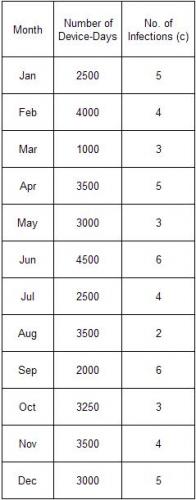
You decide to make your inspection unit 1000 days. So, the u control chart will be monitoring the number of infections per 1000 device-days. Using the data above, the subgroup size (n) and the values of u can be determined. These are shown in the table below using n = number of device-days/1000 and u = c/n.

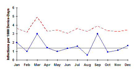
The next step is determine ubar, the average number of infections per inspection unit. This is found by summing the number of infections and dividing by the sum of the subgroup sizes:
ubar = 50/36.25 = 1.38.
This means that there is on average 1.38 infections per 1000 device-days. The control limits are then calculated using the equations above. Since the subgroup size varies from month to month, the control limits must be calculated for each subgroup size. For the first subgroup, n = 2.5. Thus,
There is no LCLu since it is less than zero.
The resulting control chart is shown below. As can be seen, the process is in statistical control. This means that if you want to reduce the number of infections, you will need to change the process fundamentally.
Summary
This month’s publication looked at u control charts. u control charts are used when the opportunity for defects to occur is large but the number that actually occur is small. The subgroup size (area of opportunity) can vary with the u control chart. A u control example was presented along with the steps in how to construct a u control chart.