In this issue:
What result occurs most frequently from a process? How much variation is there about this most frequently occurring result? Is the variation symmetrical? Is the process producing any results that are out of specifications? These types of questions are common when beginning to look at how a process is operating. This month’s e-zine introduces the histogram that can help you answer these types of questions. Next month we will look at how to construct a histogram and how histograms can be used to detect process problems.
Intro to Histograms

In addition to a product or service, a process also produces data. These data can be used to improve the quality of the process, and thus the quality of the product or service. Everything varies including the data generated by a process. If the data are generated from a process in statistical control (only common cause variation), the data as a group tend to form a stable pattern called a distribution. Distributions are characterized by three parameters:
- location (average or typical value)
- spread (amount of variation)
- shape (the pattern of variation – bell-shaped, symmetrical, etc.)
These parameters of a distribution can be estimated by using a histogram. Control charts present a picture of how a process varies over time. Histograms, on the other hand, present a picture of how the process “stacks up” over time. Histograms illustrate how many times a certain data value or range of data values occurred in a given time frame. Histograms provide estimates of the location, the spread and the shape of a distribution.
A process in statistical control has only common cause variation present. It is predictable in the near future. The average and the amount of variation present will not change as long as the process remains in control. In addition, the shape of the distribution will remain the same over time as shown in the figure above.
Histogram: Snapshot in Time

Suppose we are tracking on-time delivery on a weekly basis. Each week, we calculate the percentage of customer deliveries that are on time. The results will not be the same every week. This is because there are many sources of variation in our on-time delivery process. These sources of variation include people, measurements, machines, methods, materials, and the environment.
Although each result is different, the results taken as a group will form a pattern or distribution. The figure above illustrates this concept. The weekly on-time delivery results vary. However, if the results that are similar are “stacked up” over time, the pattern or shape of the distribution begins to form. Histograms provide a method of determining this pattern or shape.
Histograms Tell Us Four Things

The figure above shows a completed histogram. This histogram displays the number of days it takes for a supplier to deliver an order. The histogram includes data collected over a one-month period (the time frame or “history”). The number of days required for an order to arrive is given on the x (horizontal) axis. The number of times this value occurred (number or frequency of occurrences) during the month is given on the y (vertical) axis. For example, orders took 13 days to arrive 10 times during the month. They took 15 days to arrive 16 times during the month. The histogram can be viewed as a summary of information over a certain time frame; in this example, the time frame is one month.
We can easily determine the value that occurred most frequently during the time frame. This value is the highest point on the histogram and is called the “mode.” For this example, the mode is 15 days. The histogram also gives an indication of how much variation is present. An indirect measure of this variation is found by comparing the smallest value and the largest value on the histogram. For this example, it takes from 11 (smallest value) to 19 (largest value) days for the supplier to deliver our orders during the month. This is called the overall range and is given by:
Overall Range = Maximum Value – Minimum Value
The histogram also provides an estimate of the shape of the distribution. For example, does the histogram represent a normal distribution (a bell-shaped curve)? The figure above shows a bell-shaped curve superimposed on the histogram. This histogram appears to fit this distribution. Many histograms will have this type of shape. Most values will occur around the highest bar (mode). As you move away from the mode, the values occur less frequently. Normally there will be a gradual decrease as you move away from the mode.
A histogram also permits us to compare the results with specifications. For example, suppose our specifications for delivery is 15 days ± 3 days. This means we require the orders to arrive between 12 and 18 days from the time the order is placed. These specifications can be added to the histogram. It is easily seen that some of the deliveries are outside the specifications of 12 to 18 days.
A histogram tells us four things:
- What the most common value (the mode) is
- The amount of variation present
- The shape of the distribution
- The relationship of the data to the specifications
Nomenclature
There is some additional nomenclature associated with histograms. A class is a data value or range of data values that is used to construct the histogram. For the delivery example, there are 9 different classes (data values). The bars on the graph represent each class.
The class width is the width of the bar. For the delivery example, each class width represents one day . The overall range is the difference between the maximum data value (19 days) and the minimum data value (11 days). Thus, the overall range is 8 days.
Histograms should be used in conjunction with control charts. They provide additional information to us. It is important to remember that histograms do not tell us if a process is in statistical control. Only control charts can do this. The reason for this is that control charts look at variation over time (one data point followed by another).
Histograms look at variation as a snapshot in time (for example, over one month). The order in which the data were generated is lost. For example, when looking at the days to delivery histogram, you cannot tell when, in time, the delivery took 15 days. We just know that it occurred sometime during the month.
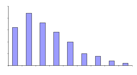
The relationship between the normal distribution and the histogram was discussed above. There are other types of distributions. The one above is an example of a skewed distribution. The mode (highest point) occurs on one side of the data. Few values occur on one side of the mode; most values occur on the other side. The figure is a positively skewed distribution. The average value occurs to the left of the center of the range. This shape often occurs in a process where a parameter is being minimized.
These types of distributions are real and occur naturally; one should not normally be concerned if a histogram has this shape. Being in statistical control does not necessarily mean that the underlying distribution is bell-shaped (normal curve). Other types of distributions (such as the skewed distributions) can generate results that will be in statistical control.
Next month we will look at how to construct a histogram and how histograms can be used to detect process problems.
Summary
This month’s publication introduced the histogram. The histogram represents a snapshot in time of the variation in your process. It will give you an idea of the most frequently occurring value or range of values, how much variation there is in the data, the shape of the data, and the relationship of the data to specifications. The nomenclature associated with histograms was introduced.