March 2007
In this issue:
- Introductions
- Constructing a Box and Whisker Chart
- Comparing Processes
- Detecting Outliers
- Skewed Data Indication
- Quick Links
This month’s newsletter examines Box and Whisker plots. A Box and Whisker plot provides a quick method of examining the variation in a process, determining if outliers are present in the data, and comparing processes. Instead of plotting the actual values, it plots a summary of the distribution.
Introduction
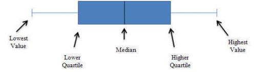
A Box and Whisker plot is a picture of how a set of data is spread out and how much variation there is. It is sometimes called a boxplot. It does not show all the data. Instead, it highlights a few of the important features in the data. These important features are the median, the upper (75th) quartile, the highest value, the lower (25th) quartile and the smallest value. Box and Whisker plots are ideal for comparing multiple processes because the center, the spread and overall range are immediately apparent from the chart. A diagram of a Box and Whisker plot is shown below.
Constructing a Box and Whisker Chart
Suppose we have the set of data below. It is arranged from the minimum value to the maximum value.
38 47 54 72 74 79 81 88 98 102 105 107 111 113 120
The first step is find the median. The median is the middle point of a data set; 50% of the values are below this point, and 50% are above this point. In the example above, 88 is the median. There are seven values above it and seven values below it. It should be noted that if there is an even number of data points, the median is the average of the middle two.
There is agreement on how to find the median. Unfortunately, there are about ten methods for determining the quartiles. A quartile is defined as the value of the boundary at the 25th, 50th, or 75th percentiles of a frequency distribution divided into four parts, each containing a quarter of the population. The lower quartile (the 25th) is first quartile (Q1). 25% of the values in the data set are less than this value. The 75th quartile is the third quartile (Q3). 75% of the values in the data set are less than this value.
We will use the method developed by Emil Gumbel for determining quartiles. This is also the method used by Excel. The first quartile is the kth observation when the data is arranged in ascending order and k = (n+3)/4. n is the number of data points. Linear interpolation is used if k is not an integer. In this example, there are 15 data points. Thus for Q1:
k = (15+3)/4 = 18/4 = 4.5
This means that Q1 lies between the fourth and fifth data point. Remember, the data must be in ascending order. The fourth data point is 72 and the fifth data point is 74. Since k = 4.5, the value of Q1 is halfway between these two values. So, Q1 is 73.
The third quartile is the kth observation where k = (3n+1)/4. Thus, for Q3:
k = (45+1)/4 = 46/4 = 11.5
This means that Q3 lies between the eleventh and twelfth data points. These two data points are 105 and 107. So, Q3 is 106. The Box and Whisker chart now be drawn. The chart is shown in the figure above.
This box and whisker plot provides a 5 point summary of the data. These are:
- The box represents the middle 50% of the data.
- The median is the point where 50% of the data is above it and 50% below it.
- The 25th quartile is where, at most, 25% of the data fall below it.
- The 75th quartile is where, at most, 25% of the data is above it.
- The whiskers cannot extend any further than 1.5 times the length of the inner quartiles. If you have data points outside this they will show up as outliers.
Note: the Quartile function in Excel can be used to find Q1 and Q3. The earlier versions of the SPC for Excel software did this; later versions use the calculations at this link.
The resulting Box and Whisker plot for these data is shown below.

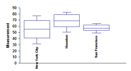
Comparing Processes
You can use a Box and Whisker plot to compare the variation and medians in multiple processes. For example, the data below shows the average monthly temperature in three cities.
New York City
31.5 33.6 42.4 52.5 62.7 71.6 76.8 75.5 68.2 57.5 47.6 36.6
Houston
50.4 53.9 60.6 68.3 74.5 80.4 82.6 82.3 78.2 69.6 61 53.5
San Francisco
48.7 52.2 53.3 55.6 58.1 61.5 62.7 63.7 64.5 61 54.8 49.4
You can make a Box and Whisker chart for each of these cities as was done in the chart above. It is easy to see that New York City has more variation in temperature than the other two cities. San Francisco has the least variation. Houston is the hottest on average; New York City the coldest, though it does get hotter at times than San Francisco.
The Box and Whisker charts are a great tool for a quick look at how several processes compare.
Detecting Outliers
Box and Whisker charts can also be used to identify outliers. Let’s return to our original data set.
38 47 54 72 74 79 81 88 98 102 105 107 111 113 120
Suppose we add one more value to that data set: 220. Then we make a Box and Whisker plot based on that data. The chart is shown below.
The outlier is easily seen.

The Box and Whisker plot provides a lot of information despite being a simple tool. The length of the box provides an indication of the spread or variation in your data.
If the median is not in the center of the box, it is an indication that your data is skewed. If the median is closer to the bottom of the box, the data are positively skewed. This is the case in the figure above. If the median is closer to the top of the box, the data is negatively skewed.
Summary
This month’s newsletter introduced the Box and Whisker plot. A Box and Whisker plot provides a quick method of examining the variation in a process, determining if outliers are present in the data, and comparing processes. It provides a summary of the variation in a process.