Surveys! Our organizations seem to use surveys quite often to “measure” things – customer service, employee satisfaction, customer satisfaction, etc., etc., etc. And we get surveys all the time! Every day, in my inbox, there is usually at least one survey.
Delta wants to know how they did on my last flight; Microsoft wants to know how their support was, Google wants to know about my last experience with their Adwords support, Domino’s wants to know how my last pizza was (actually that is my son who orders these), my elected representative wants to know my opinion on issues, etc. Everyone wants to know how they are doing.
Surveys are all over the place. How does your organization analyze and use the results of surveys? This month’s newsletter takes a look at how statistical process control can be used to help analyze survey results.
In this issue:
- Our Survey
- The Survey Results
- % Favorable and % Unfavorable Approach
- The Average Approach
- Comparing the Approaches
- Summary
- Quick Links
Please feel free to post your comments below.
Our Survey
There are many types of survey. Some include rating performance on different scales, such as 1 to 4 or 1 to 10. Others want you to compare something to something else – like their product to a competitor’s product. Others want you to actually write a comment. Many are a combination of the above.
To take a look at how statistical process control (SPC) can be used to help analyze survey results, we will use a simple survey. Suppose we want to measure how “satisfied” our employees are. We develop a survey with 15 different statements that we think will provide us feedback on employee satisfaction.
Maybe we have statements about employee benefits like:
- I have company benefits that meet the needs of my family.
Or statements about training like:
- I am given the training I need to do my job well.
Or statements about accountability like:
- I am held accountable by my supervisor for the work I do.
Now that we have our statements that reflect “satisfied” employees, we are ready to add our “measurement” system. We will ask respondents to rate each statement according to the following:
1 = Strongly Disagree
2 = Disagree
3 = Neutral
4 = Agree
5 = Strongly Agree
Now we are ready to send out to our employees. Suppose we randomly select 200 employees to fill out the survey. And to keep things simple, each of these 200 actually get filled out and sent back it to us to analyze. How do we analyze the results?
The Survey Results
Our survey results are shown in Table 1 below. These results are from an actual survey but the numbers have been changed a little to give us 200 responses per question.
Table 1: Survey Results – Number of Responses by Rating
| Ratings | |||||
| Statement |
Strongly Disagree (1) |
Disagree (2) |
Neutral (3) |
Agree (4) |
Strongly Agree (5) |
| S1 | 27 | 22 | 62 | 76 | 13 |
| S2 | 9 | 23 | 52 | 95 | 21 |
| S3 | 13 | 22 | 56 | 81 | 28 |
| S4 | 5 | 4 | 46 | 104 | 41 |
| S5 | 10 | 5 | 41 | 104 | 40 |
| S6 | 9 | 4 | 33 | 116 | 38 |
| S7 | 8 | 14 | 62 | 89 | 27 |
| S8 | 11 | 12 | 38 | 110 | 29 |
| S9 | 11 | 4 | 43 | 109 | 33 |
| S10 | 10 | 16 | 70 | 81 | 23 |
| S11 | 6 | 26 | 55 | 82 | 31 |
| S12 | 6 | 26 | 42 | 86 | 40 |
| S13 | 4 | 20 | 34 | 98 | 44 |
| S14 | 10 | 16 | 53 | 94 | 27 |
| S15 | 30 | 45 | 45 | 58 | 22 |
The table lists of the number of responses for each rating. For example, for the first statement, there were 27 people who rated it as a 1 (“Strongly Disagree”); 22 rated it as a 2 (“Disagree”) and so forth. You can scan through the table and get a feel for those statements that have a larger amount of “disagree” ratings and those that have a larger amount of “agree” ratings. But how can we analyze these results statistically using control charts?
There are many ways these survey results are analyzed by people. Some people will combine the top two ratings into a “% Favorable” rating and the bottom two ratings into a “% Unfavorable” rating. They may or may not use any statistics at this point – they might just address the items that have the largest % unfavorable rating.
Others may analyze the results by calculating an average – the higher the average, the more favorable the response since the ratings increase from 1 to 5. Some say you can’t calculate an average for this type of data because they are not continuous. The distance between strongly disagree and disagree is not the same as between disagree and neutral, so an average doesn’t mean much. But, some do it anyway.
These two approaches are common. We will compare both approaches and see what the results tell us. We will start with the % unfavorable and % favorable approach.
% Favorable and % Unfavorable Approach
With this approach, you decide what ratings are favorable and what ratings are unfavorable. In the above survey results, it was decided that ratings of 1 and 2 (strongly disagree and disagree) were unfavorable, while ratings of 4 and 5 (agree and strongly disagree) are favorable. You then add up those unfavorable and favorable results for each statement and divide by the total number of responses to get either a % unfavorable or a % favorable. Table 2 shows this.
Table 2: Survey Results for % Favorable and % Unfavorable
| Statement |
Total Responses |
Number Unfavorable |
% Unfavorable |
Number Favorable |
% Favorable |
| S1 | 200 | 49 | 25% | 89 | 45% |
| S2 | 200 | 32 | 16% | 116 | 58% |
| S3 | 200 | 35 | 18% | 109 | 55% |
| S4 | 200 | 9 | 5% | 145 | 73% |
| S5 | 200 | 15 | 8% | 144 | 72% |
| S6 | 200 | 13 | 7% | 154 | 77% |
| S7 | 200 | 22 | 11% | 116 | 58% |
| S8 | 200 | 23 | 12% | 139 | 70% |
| S9 | 200 | 15 | 8% | 142 | 71% |
| S10 | 200 | 26 | 13% | 104 | 52% |
| S11 | 200 | 32 | 16% | 113 | 57% |
| S12 | 200 | 32 | 16% | 126 | 63% |
| S13 | 200 | 24 | 12% | 142 | 71% |
| S14 | 200 | 26 | 13% | 121 | 61% |
| S15 | 200 | 75 | 38% | 80 | 40% |
Sometimes these results are simply put in a table form where you look at the results sorted from highest to lowest (or vice-versa). Some might even put the results into a Pareto diagram. For example, consider the % Unfavorable column. After all, this is where most people focus their attention – on what is wrong, not on what is right. You need to do both by the way. If you sort the % Unfavorable column, you get the results shown in Table 3.
Table 3: Results Sorted by % Unfavorable
| Statement | % Unfavorable |
| S15 | 38% |
| S1 | 25% |
| S3 | 18% |
| S2 | 16% |
| S11 | 16% |
| S12 | 16% |
| S10 | 13% |
| S14 | 13% |
| S13 | 12% |
| S8 | 12% |
| S7 | 11% |
| S5 | 8% |
| S9 | 8% |
| S6 | 7% |
| S4 | 5% |
Statement 15 has the highest unfavorable rating, followed by Statement 1. Should these be worked on? Are they significantly different from the other responses? What about statements 3, 2 and 11, 12? Should they be worked on?
What is needed is a method that separates the statements that are significantly different from the others. One method of doing this is to use a p control chart. A p control chart is used to monitor the percentage (or portion) of defective items in a group of items. So, we can use the p control chart to compare the % unfavorable (or % favorable) statements in the survey. For detailed information on p control charts please see our July 2005 newsletter or our April 2009 newsletter. If you are new to control charts, please see our newsletter on the purpose of control charts.
The % unfavorable control chart for the 15 statements is shown in Figure 1.
Figure 1: p Control Chart for % Unfavorable
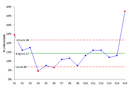
One use of a control chart is to separate “signals” from the “noise” in the process, i.e., separate common from special causes of variation. So, the question that a control chart is trying to answer for a survey is:
“Are any of the statement ratings significantly different from the other statements?”
If there is a point beyond the control limits, this means that there is a significant difference. Look at Figure 1 again. The points in red are beyond the control limits. There are two points above the upper control limit. This means that the ratings for statements 1 and 15 are significantly more unfavorable that the other questions. Action should be taken to figure out how to address the issues in those two statements.
Note that there are also two points below the lower control limits – for statements 4 and 6. This means that these two questions were rated significantly less unfavorable than the other questions. Less unfavorable? A little confusing perhaps, but you really don’t worry about these. You use the % favorable control chart to see if any statements are rated significantly higher on favorability.
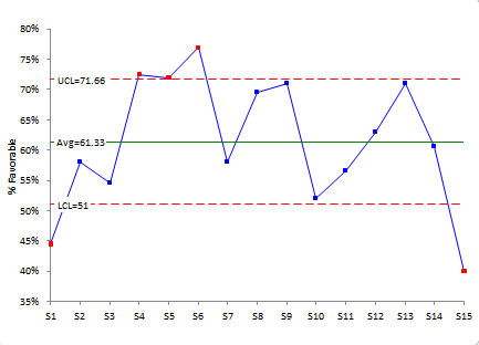
Figure 2 shows the p control chart for % Favorable. There are three questions that rated significantly higher on % Favorable: statements 4, 5 and 6. Whatever you are doing on these, keep doing it! And see if it can be spread to the other statements.
Figure 2: p Control Chart for % Favorable
This section examined how you can use the p control chart to analyze survey results based on % favorable and % unfavorable responses. A few words of caution are needed here. First, the control limits on the p control chart depend on subgroup size – that is the number of respondents. If your number of responses is too low, the control limits will be too wide. At the same time, you have a large number of responses (e.g., 1000 or more), the control limits are probably going to be very tight and everything may be beyond the control limits. In these conditions, the p control chart will not help you very much.
And, for the purists around, the p control chart may not be valid theoretically. To use a p control chart, the probability that each question will be rated favorably must be the same. This is probably not the case. But despite these shortcomings, this approach will be very useful for some in analyzing their surveys. And the control chart as a picture of the results is a great way to view the results.
The Average Approach
In this approach, the average and standard deviation for each statement are calculated. The results for the survey data are shown in Table 4.
Table 4: Survey Results with Average and Standard Deviation
| Statement | Average |
Standard Deviation |
| S1 | 3.1 | 1.13 |
| S2 | 3.5 | 0.98 |
| S3 | 3.4 | 1.07 |
| S4 | 3.9 | 0.85 |
| S5 | 3.8 | 0.96 |
| S6 | 3.9 | 0.91 |
| S7 | 3.6 | 0.95 |
| S8 | 3.7 | 0.98 |
| S9 | 3.7 | 0.95 |
| S10 | 3.5 | 0.97 |
| S11 | 3.5 | 1.00 |
| S12 | 3.6 | 1.04 |
| S13 | 3.8 | 0.96 |
| S14 | 3.6 | 0.99 |
| S15 | 3.0 | 1.25 |
The higher the average, the more favorable with rating with our rating system. The standard deviation gives a measure of the agreement between responses. The larger the standard deviation, the more disagreement there is among the responses; the smaller the standard deviation, the more agreement there is among the responses.
You can sort the results by average and standard deviation. But again, we are trying to see if there are any significant differences between the statements. We can use an X-mR (individuals) control chart to see if there are any significant differences. In this case, the average for each statement is considered an individual value. Figure 3 is the individuals control chart based on the averages.
Figure 3: Individuals Control Chart for Average Ratings from Survey
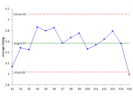
With this approach, only statement 15 is out of control. It is below the lower control limit. This means that statement 15 has a significantly lower average than the other questions.
Note that the standard deviation for statement 15 is the largest. You will often find this to be the case – the lower rated statements have large standard deviations meaning there is more disagreement among responses.
So, the individuals control chart did give an indication of differences in the statements – though not as many as the p control chart. This will vary depending on the number of responses you have.
Comparing the Approaches
In general, I like the p control chart approach if it can be used. Most often, this will be determined d by the number of responses you have – normally 50 to 300 is a great range. But sometimes you won’t be able to do that. In that case, try the average approach. The average and % favorable are usually correlated when using the 1 to 5 rating system shown above. Figure 4 shows a scatter diagram for the average and % favorable for these data.
Figure 4: Scatter Diagram: Statement Average vs. Statement % Favorable
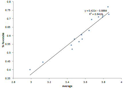
There is a strong correlation between the statement average and the % favorable rating for the statement. This also gives some credence to using the average method.
Summary
This newsletter has taken a look at how control charts can be used to analyze survey results. The basic premise is to find a tool that can separate the signals in the survey from the noise. Control charts can do that under certain situations. Two approaches were analyzed: the p control chart approach using % favorable or % unfavorable and the individuals control chart using the average rating. Both approaches can give insight into the survey results. One of the biggest advantages is simply plotting the results and taking a look at them.
I would not consider the "neutral" in percent calculation.
I agree. The neutral is not part of the favorable or unfavorable calculation.
Table 4: Survey Results with Average and Standard DeviationPlease how did you calculate the table 4? Can’t seem to get it here please help me
It is the average and standard deviation of the data. So for question 1, there were 27 people who answered 1, 22 who answered 2, 62 who answered three, 76 who answered 4 and 11 who answered 5. Take the average and standard deviation of those results to get the average and standard deviation. You need to use the 1, 2, 3, 4, and 5 results
inability to understand the above, please kindly compute the average and standard deviations for statement 1 then I will follow suit thank you once again for your help
Please email me at bill@SPCforExcel.com and i will send you the workbook with the calculations.
Why is the X-MR chart used, shouldn't we be using the Xbar-R/S chart instead? If not, could you please explain why I should be using the individual chart?
That data you are dealing with are ordinal data (1, 2, 3, etc.). There is debate about whether you can even take an average or standard deviation of this type of data (https://measuringu.com/mean-ordinal/). The purpose of this publication was to comare the two approaches. They give somewhat similar results regardless of the dubious ability to calculate the average or standard devaition that has any real meaning.
Can you please explain table 4..
Tabel 4 is the average and standard deviation of the data from Table 3. So for question 1, there were 27 people who answered 1, 22 who answered 2, 62 who answered three, 76 who answered 4 and 11 who answered 5. Take the average and standard deviation of those results to get the average and standard deviation. You need to use the 1, 2, 3, 4, and 5 results. So the avearge is (1(27)+2(22)+3(62)+4(76)+5(11))/total number. SImilarly use the standard deviation formula, e.g., use 27(1 – average)^2 for the first term and then likewise for the other results. Divide by total number – 1 and take the square root.
Can you explain table 4?
Please see explanation above.