July 2013
Think about your suppliers – how do you know the “quality” of the material your suppliers send you? Perhaps one of these sounds familiar:
- Our suppliers are ISO-9000 certified, so we don’t have to worry about that.
- We do a supplier audit on each supplier every year.
- Our suppliers provide us with process capability (Cpk) data on a monthly basis that shows that they are meeting our specifications.
- Our suppliers send us certificates of analysis with each shipment to ensure that every shipment meets our specification.
- Well, we haven’t had any problems recently.
 Suppose you work in a manufacturing plant and you have an array of suppliers. These suppliers provide you the raw materials you need to make your product. Everything they send you meets your specifications. So, should you be happy and content? Maybe – and then again, maybe not. Do you know that you can easily determine if your supplier is having to do 100% sorting to send material to you that is within specifications? That drives up your supplier’s cost – and, of course, the price you pay for the raw material. Finding this and other things out about your supplier is really easy and straightforward.
This month’s newsletter takes a look at how you can determine how a supplier is performing by using three basic tools – histograms, control charts, and process capability – and using the data supplied by the supplier.
In This Issue:
- Your Key Supplier
- Using Supplier Data
- Histograms
- Process Capability
- Control Charts
- Summary
- Quick Links
Your Key Supplier
Suppose you have a key supplier, Supplier XYZ, for a raw material. Your supplier sends you a certificate of analysis (COA) with each shipment. The COA provides you with an analysis of key properties for that raw material.
One of those key properties that is very important to you is density. You have a one-side specification – the density must be greater than 38. Your approval process is simply to look at the COA from the supplier and see if the material is within specification. If it is, you file the COA and release the material to production. If not, you put a hold on the material – but this has never happened. You get shipments from the supplier almost every week.
Yet, sometimes there are problems in production – and you really can never figure out what happened. The problems seem to go away after a while – just to return later on. You have begun to wonder about if the issue is due to incoming material quality. Where can you start to find out?
Using Supplier Data
If your supplier is providing you a COA on shipments (as they should), this is where you should start. You may wonder if you should take some samples of the material and have it tested by an outside lab – just to check the supplier. But that costs money. There is no need to do that at this stage. Simply use the data from the COA to start.
Since you have been filing the COAs over time, you will need to setup a database to track the data and to do the analysis. Microsoft Excel can fill this need. This can be time consuming if you have a large number of suppliers and properties to track. Start with your key suppliers.
How much data do you need? Go back as far as is reasonable. You may have COAs that stretch back over four or five years. But it is probably unreasonable to expect that data to be consistent over that long a time frame. The best time frame is probably the past year to look for seasonal issues – but sometimes there may not be enough data in a year and you will need to expand the time period.
Let’s return to supplier XYZ and the density information. You decide to pull the COAs on the last 26 shipments from Supplier XYZ. You enter the data from the COAs into an Excel worksheet. The data are shown in the table below.
Table 1: Density Data from Supplier XYZ’s COAs
| Shipment No. | Density | Shipment No. | Density |
| 1 | 41.6 | 14 | 39.9 |
| 2 | 40.6 | 15 | 41.5 |
| 3 | 41.4 | 16 | 42.0 |
| 4 | 40.3 | 17 | 43.0 |
| 5 | 41.3 | 18 | 43.3 |
| 6 | 39.4 | 19 | 45.0 |
| 7 | 41.6 | 20 | 42.5 |
| 8 | 40.2 | 21 | 42.2 |
| 9 | 41.2 | 22 | 42.0 |
| 10 | 41.5 | 23 | 42.9 |
| 11 | 38.4 | 24 | 43.9 |
| 12 | 41.4 | 25 | 44.1 |
| 13 | 40.5 | 26 | 45.0 |
What can you see from the table? It is difficult to see too much from a table of numbers, but you can see some things. Everything is above the lower specification of 38. There does seem to be a few larger numbers toward the end. It is time to use some basic SPC tools to analyze the data.
Histograms
Histograms are a quick and easy way to analyze data from a supplier. Histograms will give you some very good information about what the supplier is doing. If you need more information on histograms, please see our two-part newsletter on histograms.
The histogram, made using the SPC for Excel software, for the data in Table 1 is shown in the figure below.
Figure 1: Density Histogram (COA for Supplier XYZ)
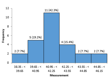
What does this histogram show you? Well, it does look somewhat like a bell-shaped curve. And, again, everything seems to be greater than the lower specification limit. But note that there are a few samples fairly close to the lower specification limit of 38. Is it possible that the supplier is sorting material to send to you?
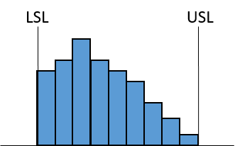
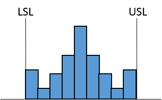
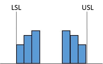
In those earlier newsletters on histograms, we talked about how histograms can reveal problems. For example, consider the five histograms below. Suppose each one of these is the histogram you made from the COA data. Assume that the density is known to be normally distributed and that, for these five histograms, there is both an upper specification limit (USL) and a lower specification limit (LSL). What do each of these histograms tell you about your supplier’s performance?
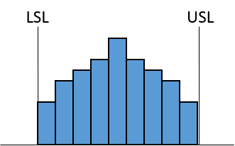 |
Histogram A: Everything the supplier is sending you is within specifications. The supplier’s process appears centered relative to your specifications. However, something is missing. With a normal distribution, you would expect “tails.” With a normal distribution, there are more points near the center of the distribution, and the number of points decrease as you get further from the center. Thus, you would expect some smaller bars on each side of the distribution. Since these tails are missing, the supplier is doing 100% sorting to ensure only in-specification product is sent to you. This costs the supplier money – which most likely results in a price increase to you. The supplier’s process is not capable of meeting your specifications. |
 |
Histogram B: Again, everything the supplier is sending you is within specifications. This time, though, the supplier’s process does not appear to be centered relative to your specifications. Again, you would expect smaller tails on each side. The supplier’s process is not capable of meeting your specifications, and the supplier is doing 100% sorting for you – again driving up your cost. He has more product out of specification with this histogram than histogram A. |
 |
Histogram C: This histogram does look a little strange. You would expect the bars to get smaller, but this histogram has larger bars – right before each specification limit. One possibility is that the supplier is reworking material to bring it back into specification. Another possibility is that the supplier is simply changing a test result to make it within specification. It doesn’t change the basic conclusion – the supplier’s process is not capable of meeting your specification and is driving up your costs. |
 |
Histogram D: This histogram appears to be missing the center part of the distribution. Some other company has much tighter specifications than you do, and that company is getting that heart cut. Does this matter to you? It should. You are not receiving material that is consistent and predictable. Again, the supplier is doing 100% sorting – just not for you. |
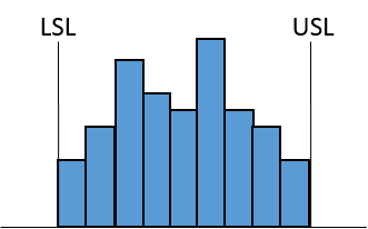 |
Histogram E: This histogram has two peaks – it is called a bimodal distribution. A bimodal distribution indicates that at least two processes are present. The two processes, for example, could be due to different shifts, different lots, or day and night. But the presence of two process increase variation. If the supplier could bring the two processes into one, the variation would decrease considerably. |
So, histograms do reveal problems and do give you insights into what the supplier is doing. Histograms are a good starting point for looking at your supplier’s performance.
Process Capability
Process capability is a measure of how well a process meets specifications. If you are new to process capability, please see our 2004 three part newsletter series on process capability. Far too often, we simply rely on the value of Cpk for the process. As long as it is greater than 1.00, you assume that everything is meeting specifications. You shouldn’t simply rely on a Cpk number. It does not tell the full story.
Returning to the raw material we are getting from Supplier XYZ. The process capability analysis, made using the SPC for Excel software, for the density data in Table 1 is shown in the figure below.
Figure 2: Process Capability Analysis for Density from Supplier XYZ
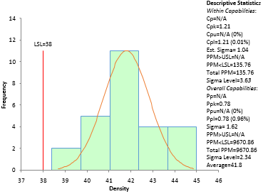
The Cpk value is 1.21. That value is very good. Plus, nothing is out of specification. So, what do you assume? That everything is fine with this supplier and move on to the next one. No, not quite yet. There are two values that are often reported for process capability: Cpk and Ppk. The only difference between them is the way that the standard deviation is estimated. Cpk uses the standard deviation estimated from a range control chart. Ppk simply uses the calculated standard deviation from all the data (e.g., using the STDEV function in Excel).
If the process is in statistical control, Cpk and Ppk will be very close. The value of Ppk in Figure 2 is 0.78. This is significantly different from the 1.21 value for Cpk. This is an indication that the supplier’s process is not in statistical control. Yes, you can compare Cpk and Ppk to get a “feel” for the state of control of a process. But in the end, you have to plot the data. And you should always do that in control chart format whenever possible.
Control Charts
Always, always chart the data over time. This is a key to understanding what is happening in your supplier’s process – and what it could be doing to your processes. If you are new to control charts, please refer to one of our many newsletter articles on control charts, e.g., the purpose of control charts. The control chart for the density data in Table 1 is shown in the figure below. The individuals (X-mR) control chart was used. Only the X chart is shown here. It was made using the SPC for Excel software.
Figure 3: X Chart for Density Data
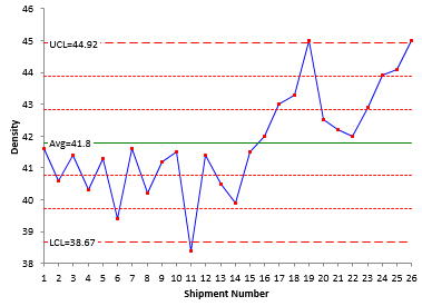
This chart shows something unexpected. The histogram and process capability analysis did not reveal any big issues – a few concerns perhaps. But this control chart shows that there has been a significant shift in the supplier’s process. There is a long run below the average until about shipment 17. Then there is a long run above the average. Both of these are out of control situations – and are shown as red points. Something has happened to cause the process to shift upward.
In fact, it looks like a new process is now established. Figure 4 shows the control chart with split control limits and confirms that there has been a process shift.
Figure 4: X Chart with Split Control Limits for Density Data
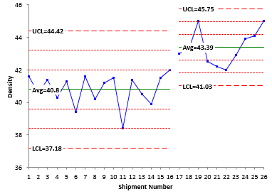
The new process appears to have any average of about 43.26 compared to old average of 40.7. Does this represent a new process from the supplier? Only way to find out is to ask the supplier. But now you know when the shift occurred – and you can compare the events in your process to see if this change in density impacted your process. But to do that, you must be monitoring your supplier’s performance – using more than just the COA.
Summary
You rely on your suppliers to provide you raw materials. Of course, you want the raw material to meet your specifications. But in reality, you should want more. You should want raw material that meets your specifications and is consistent and predictable, i.e., in statistical control. You can use histograms, process capability and control charts to “judge” your supplier performance. Be sure to plot the data. The resulting control chart will tell you the story you need to know about your supplier performance.
Thank-you William, I thoroughly enjoy your writing. Very simple. Very clear. And always interesting. Michelle
very simple and good article. point is, always analyze data to realize the hidden value.
It is a useful article. Could you tell me how to calculte UCL and LCL for X-mR chart?Thank you.
Please see our October 2006 article on Individuals Control Charts:
https://www.spcforexcel.com/knowledge/variable-control-charts/individuals-control-charts