September 2014
This month’s publication introduces the Exponentially Weighted Moving Average (EWMA) control chart. Just the name is enough to scare me away from the chart. But, it is not really that complicated. The primary purpose of the EWMA control chart is to detect small shifts from the process average or target – just like the CUSUM chart we introduced last month. Both of these charts are “time-weighted” charts. This means that they take into account past data. The EWMA accounts for this past data differently than the CUSUM chart does. And both have a slightly different purpose than the classical control chart.
Since January 2004, our monthly publications have covered a number of different control charts. These charts are primarily Shewhart control charts, e.g., X-R, X-s, and X-mR control charts. These types of control charts are very useful in monitoring a process for statistical control or to see the impact of your process improvement efforts. They are not necessarily the best at detecting small shifts from the average, although you can increase the sensitivity of these charts by using the zone tests and run tests in addition to the points beyond the control limits test for out of control conditions.

In this publication:
To download a pdf file of this publication, click here.
Introduction to the EWMA Control Chart

While many variable control charts are two charts, e.g., X-mR individuals control chart, the EWMA control chart is actually one chart. For each successive sample, a value of EWMA is calculated. This calculation involves weighting the previous data. So, past data influences the value of EWMA. The values of EWMA are then plotted on a chart. The control limits are then calculated and added to the chart.
And now the chart is then ready to be interpreted – the most important aspect of control charting. We will start by comparing the EWMA control chart with the individuals control chart and then show how the calculations are done.
Comparing the Individuals Control Chart to the EWMA Control Chart
Suppose we are a monitoring a process stream for a certain product characteristic, X. It is important that we keep this product characteristic at an average value of 30. We sample once an hour. The data for the past 20 hours are shown in Table 1.
Table 1: Product Characteristic Data
|
Sample |
X |
Sample |
X |
|
|
1 |
32.0 |
11 |
29.6 |
|
|
2 |
27.0 |
12 |
28.1 |
|
|
3 |
33.0 |
13 |
29.9 |
|
|
4 |
29.3 |
14 |
31.3 |
|
|
5 |
30.1 |
15 |
30.1 |
|
|
6 |
27.0 |
16 |
31.2 |
|
|
7 |
31.0 |
17 |
32.6 |
|
|
8 |
30.1 |
18 |
33.3 |
|
|
9 |
31.2 |
19 |
34.8 |
|
|
10 |
30.5 |
20 |
29.9 |

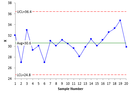
Figure 1: X Chart
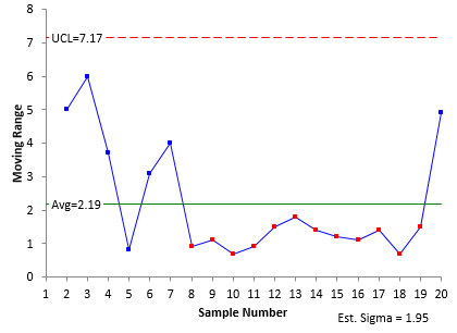
Figure 2: Moving Range Chart
Now it is time to interpret the charts. The X chart shows our process to be in statistical control. There are no points beyond the control limits and no non-random patterns (such as seven in a row above the average). The average is 30.6. Is that close enough to 30? Good question. Maybe. Maybe not. The upper control limit is 36.4 and the lower control limit is 24.8. In the classical sense, as long as the process remains unchanged, this is the range it should operate in: from 24.8 to 36.4 with a long term average of 30.6. Some folks would move the “average” of the X chart to 30 since this is where you are trying to control the process. This is not recommended because the out of control tests really do not apply to an artificially set average.
The moving range is shown in Figure 2. Note that there is a run of 12 points in a row below the average range. A special cause is present. Something has happened to decrease the variation the process. If we could find out what happened and implement it permanently, we would reduce the variation in the process. We will come back to this issue later.
The value of sigma (the standard deviation) can be estimated from the average moving range. For a moving range of 2, the estimated value of sigma is the average range divided by 1.128. For this example, the estimated value of sigma is 1.95. This will be used later in the calculation of the EWMA control limits.
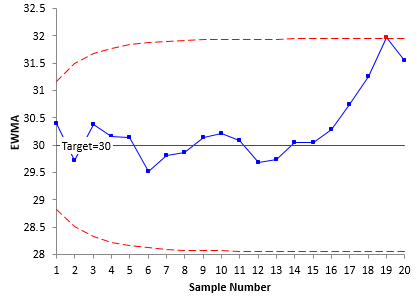
Now let’s take a look at what the EWMA control chart looks like in this situation. For each sample result, a value of EWMA is calculated. We will cover those calculations below. Remember, the EWMA is influenced by past data. As will be shown below, it gives less weight to older data points. The value of EWMA is then plotted along with the control limits. Figure 3 is the EWMA control chart based on the data in Table 1.
Figure 3: EWMA Control Chart
Note that, with the EWMA control chart, the center line is the target value. It does not have to be. You can use the average, but if the objective is to keep the process on target, the center line should be the target value. The control limits on the EWMA start out curved and then level out. We will explore that below. Note that these control limits are tighter than the ones for the individuals control chart.
The only out of control test that applies for the EWMA control chart is a point beyond the control limits. From Figure 3, you can see that there is one point beyond the UCL. It occurs at point 19. This is a signal that the process has moved off the target value. The reason for this shift should be investigated and corrected. At a minimum, the process has to be adjusted to bring it back to target.
So, the EWMA control chart did produce a signal that the X chart missed. But just looking at the EWMA chart caused us to miss the signal on the moving range chart – the long run below the average. So, it is probably advantageous to look at the range chart when you are doing a EWMA control chart.
Now, let’s take a look at how the EWMA statistic is calculated and how to influence the sensitivity of the EWMA control chart for picking up process changes.
Calculating the EWMA
To calculate the EWMA, you have to decide on a weighting factor, l. This defines how much weight is given to previous data points. It is common to use 0.2. That was the value of l used in Figure 3. The value of EWMA for sample i is defined as the following:
EWMAi = zi = ?Xi + (1 – ?)zi-1
where
zi = ith EWMA
Xi = ith sample result
? = the weighting factor (0 < ? ? 1)
zi-1 = (i-1)th EWMA
Since the calculations use i – 1, you have to figure out how to handle the first sample when i = 1. After all, there is no sample 0. You handle this by setting the zi-1 for sample 1 to the average of all the data or to the target. The average for all the data is 30.6, but we will use the target value of 30. Thus z0 = 30.
The first sample result is 32. The value of z for sample 1 is:
z1 = ?X1 + (1 – ?)z0 = .2(32)+(1- .2)(30)=30.4
The second sample result is 27. The value of z for sample 2 is:
z2 = ?X2 + (1 – ?)z1 =.2(27)+(1- .2)(30.4)=29.72
Table 2 shows the results of the calculations for all the samples.
Table 2: Calculations of EMWA
|
Sample |
X |
z |
Sample |
X |
z |
|
|
1 |
32.0 |
30.4 |
11 |
29.6 |
30.088 |
|
|
2 |
27.0 |
29.72 |
12 |
28.1 |
29.690 |
|
|
3 |
33.0 |
30.376 |
13 |
29.9 |
29.732 |
|
|
4 |
29.3 |
30.161 |
14 |
31.3 |
30.046 |
|
|
5 |
30.1 |
30.149 |
15 |
30.1 |
30.057 |
|
|
6 |
27.0 |
29.519 |
16 |
31.2 |
30.285 |
|
|
7 |
31.0 |
29.815 |
17 |
32.6 |
30.748 |
|
|
8 |
30.1 |
29.872 |
18 |
33.3 |
31.259 |
|
|
9 |
31.2 |
30.138 |
19 |
34.8 |
31.967 |
|
|
10 |
30.5 |
30.210 |
20 |
29.9 |
31.554 |
The values of z are plotted on the EWMA control chart. The center line on the chart is either the target (which we are using) or the process average. All that is left is to calculate the control limits.
Calculating the Control Limits for the EWMA Control Chart
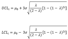
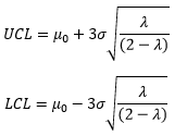
The control limits depend on the number of samples. The UCL and LCL for the ith sample are given by:
where m0 = the target, and s = the estimated standard deviation from the moving range chart. Note that there is the value of “2i” under the square root. This is why the control limits are variable and seem to curve at first and then level off. As i becomes very large, the control limits approach these values:
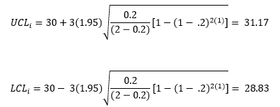
The control limits for the first sample are then given by:
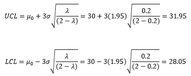
As i becomes very large, the control limits approach the following values:
The calculated control limits are then added to the EWMA control chart along with the values of z and the center line. The finished chart is shown in Figure 3. The 19th sample is out of control – it is beyond the upper control limit.
The Values of Lambda
The example above used a weighting factor, l, equal to 0.2. The control limit equations also used 3 as the multiplier for sigma – i.e., we used ± 3 sigma limits. You can vary the values of l and the multiplier for sigma to change the sensitivity of the chart. The values of 0.2 and 3 provide pretty good sensitivity in most cases, picking up shifts of 1 sigma with about ten samples.
More information on this topic can be found in the paper “Exponentially Weighted Moving Average Control Schemes: Properties and Enhancements”, Technometrics, Vol. 32. Another good reference for the EWMA control chart is the book “Introduction to Statistical Quality Control” by Douglas Montgomery. But staying with the values we used in this example will work fine for most applications.
Summary
This month’s publication introduced the Exponentially Weighted Moving Chart (EWMA). This type of control chart is useful when trying to keep a process on target or to detect small shifts in the process average. The EWMA statistic is plotted over time. The center line on the control chart is usually the target. The control limits depend on the number of samples and will start out curved before they level out. Only points beyond the control limits apply for out of control points.
This is a avery helpful article,thank you for providing !