January 2011
Control charts are really a study in variation. What does it mean when a control chart indicates that a process is in statistical control? It means it is consistent and predictable – you can predict what the process will do in the near future.But it also means that the short-term variation is consistent with long-term variation. If you are using an X-R chart, the short-term variation is given by the within-subgroup variation on the range chart. The long-term variation is given by the between subgroup variation on the X chart. But what happens when the process is such that it is not possible for the short-term variation to be consistent with the long-term variation?
This month’s newsletter takes a look at how to address situations with control charts where the within-subgroup variation is significantly different from the between-subgroup variation. We start with a brief review of X-R charts. We then take a look at what the X-R control charts often looks like when you have situation where there is a significant difference between the within-subgroup variation the between-subgroup variation. You will see that the control limits on the X chart are very tight and most of the points on that chart are beyond the control limits. We will then look at how to handle these types of situations by using three control charts.
In this issue:
- Classical X-R Control Chart
- X-R Control Chart Example: Small Average Range
- X-mR-R Chart: The Solution
- Summary
- Quick Links
Classical X-R Control Charts
The classical X-R control chart is designed to look at two types of variation:
- The range chart examines the variation within a subgroup
- The X chart examines the variation between subgroups
Suppose you are making a product. At the start of each hour, you collect five samples from the production line and measure a quality characteristic, X. This is your subgroup. You take those five measurement results and calculate a range. The range is the maximum value – minimum value. It is a measure of the variation in the individual results. You plot those range values on the R chart – which monitors the variation within a subgroup. You also calculate the subgroup average – the average of the five measurement results. You plot the average on the X chart – which monitors the variation between subgroup averages.
After you have enough points, you calculate the overall averages and the control limits. The control limits for the X chart are given below.
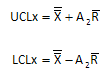
The X with the two lines above (“X double bar”) is the overall average; Rbar is the average range and A2 is control chart constant that depends on subgroup size. The control limits for the R chart are given below.

D4 and D3 are control chart constants that depend on subgroup size. Please see our two-part newsletter series on X-R control charts if you would like more information on X-R control charts.
Note that the control limits for the X chart are based on the average range (R). If a process is in statistical control, it means that the within-subgroup variation (measured by the range chart) is consistent with the between-subgroup variation (measured by the X chart).
But what happens if it is not reasonable to expect the within-subgroup variation to be consistent with the between-subgroup variation. For example, you might have a batch process and you take multiple samples from a batch and form a subgroup. In this case, the range is monitoring the within-batch variation and the X chart is monitoring the between subgroup variation in subgroup averages. It might be that the average range is very small and almost all the points on theX chart are out of control. How do you handle this situation?
X-R Control Chart Example: Small Average Range
Consider the following example. You are running a batch reactor. Each batch takes about four hours to run. You measure the purity of the batch four times in the last hour to ensure that it has stabilized. You want to monitor the results using an X-R chart. The data you have collected for the first 10 batches are given the table below. X1, X2, X3 and X4 are the four samples you pull from the batch in the last hour.
| Subgroup | X1 | X2 | X3 | X4 | X | R |
| 1 | 98.4 | 98.6 | 98.3 | 98.7 | 98.5 | 0.4 |
| 2 | 97.5 | 97.6 | 98.0 | 97.6 | 97.7 | 0.5 |
| 3 | 98.8 | 98.9 | 98.4 | 98.7 | 98.7 | 0.5 |
| 4 | 99.1 | 99.3 | 99.4 | 99.2 | 99.3 | 0.3 |
| 5 | 97.8 | 98.0 | 98.2 | 98.0 | 98.0 | 0.4 |
| 6 | 98.3 | 98.5 | 98.5 | 98.5 | 98.5 | 0.2 |
| 7 | 98.9 | 99.0 | 98.6 | 99.0 | 98.9 | 0.4 |
| 8 | 97.5 | 97.7 | 97.6 | 97.9 | 97.7 | 0.4 |
| 9 | 99.3 | 99.3 | 99.2 | 99.4 | 99.3 | 0.2 |
| 10 | 98.5 | 98.7 | 98.7 | 98.3 | 98.6 | 0.4 |
The subgroup averages (X) and range (R) have been included in the table as well. You then plot theX values on theX chart and the range values on the R chart. Then you calculate the overall averages and control limits using the equations given above for the X-R chart. A summary of the calculations are given below.
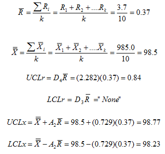
The resulting control charts are shown below.
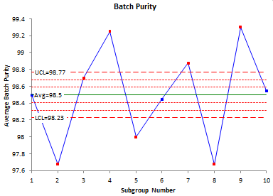
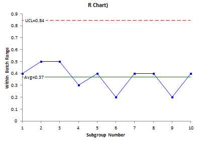
The range chart looks great. It is in statistical control. But the X chart looks terrible – almost everything is out of control. It is easy to see what happened in this example. Look at the data. There is very little variation within a batch – an average range of 0.37. Now look at the batch averages. They vary a lot more. And since you use the average range in the calculation of the control limits for the X chart, the control limits are very tight and everything looks like it is out of control. Plus, it is not reasonable to expect the within-subgroup variation to be consistent with the between-subgroup variation because of the process. So how do you handle this case?
X-mR-R Chart: The Solution
There are really three sources of variation you want to monitor in this situation. One is the within-subgroup (batch) variation. This is given by the range chart above. So, we will keep that one. The issue is the X chart. It doesn’t help tell us anything about the process. To make it useful, we will exchange the X chart for two charts. We will use the individuals chart (X-mR), but in this case, the individual values are really the subgroup averages. The mR chart will be the moving range between the subgroup averages.
The data are shown in the table below with addition of a mR column which is the moving range between consecutive subgroup averages. For example, the first mR listed is 0.8. That is the range between the first two subgroup averages: 98.5 and 97.7
| Subgroup | X1 | X2 | X3 | X4 | X | R | mR |
| 1 | 98.4 | 98.6 | 98.3 | 98.7 | 98.5 | 0.4 | |
| 2 | 97.5 | 97.6 | 98.0 | 97.6 | 97.7 | 0.5 | 0.8 |
| 3 | 98.8 | 98.9 | 98.4 | 98.7 | 98.7 | 0.5 | 1.0 |
| 4 | 99.1 | 99.3 | 99.4 | 99.2 | 99.3 | 0.3 | 0.5 |
| 5 | 97.8 | 98.0 | 98.2 | 98.0 | 98.0 | 0.4 | 1.2 |
| 6 | 98.3 | 98.5 | 98.5 | 98.5 | 98.5 | 0.2 | 0.5 |
| 7 | 98.9 | 99.0 | 98.6 | 99.0 | 98.9 | 0.4 | 0.4 |
| 8 | 97.5 | 97.7 | 97.6 | 97.9 | 97.7 | 0.4 | 1.2 |
| 9 | 99.3 | 99.3 | 99.2 | 99.4 | 99.3 | 0.2 | 1.6 |
| 10 | 98.5 | 98.7 | 98.7 | 98.3 | 98.6 | 0.4 | 0.8 |
The calculations for the X-mR based on subgroup averages are shown below. Please see our newsletter for more information on individuals control charts.

Note that the average range now used in the control chart equations is 0.9 compared with the 0.37 used in the classical X-R calculations.
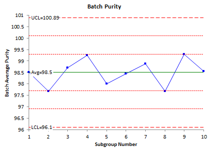
The X chart is shown below. Its control limits are based on the individuals control chart using each subgroup average as an individual value.
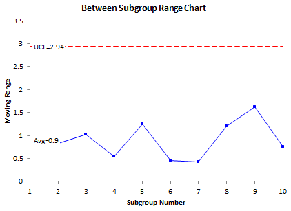
The moving range chart is shown below. This chart plots the moving range between subgroup averages. The average range on this chart was used to calculate the control limits on the batch averages above.
The third chart is the within-subgroup range chart. This is the same as the range chart shown before.
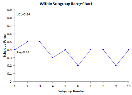
These three charts are in statistical control. They tell quite a different story than if the classical X-R charts had been used. These three charts can be used to monitor processes where the within-subgroup variation is significantly different from the between-subgroup variation.
Summary
This newsletter has examined how to handle the situation when the within-subgroup variation is naturally different from the between-subgroup variation. In this case, the classical X-R chart gives an X chart where most of the points are out of statistical control. The approach described in this newsletter uses three control charts to handle the problem: anX chart where the subgroup averages are treated as individual values and the limits are based on the moving range between the subgroup averages; the between subgroup range chart which is that moving range between the subgroup averages; and the within-subgroup range chart, which is the normal range chart for the X-R chart.