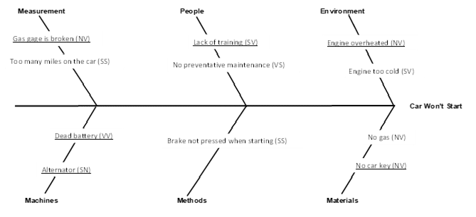
How to Analyze a Cause and Effect Diagram
Our previous blog, What is a Cause and Effect Diagram, introduced the technique and presented the cause and effect diagram
What is a Cause and Effect (Fishbone) Diagram?
A cause and effect diagram is a tool that shows the relationship between a quality characteristic (effect) and possible sources
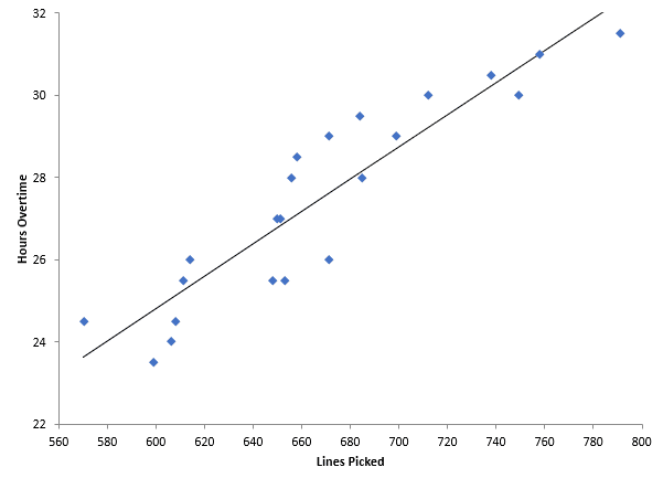
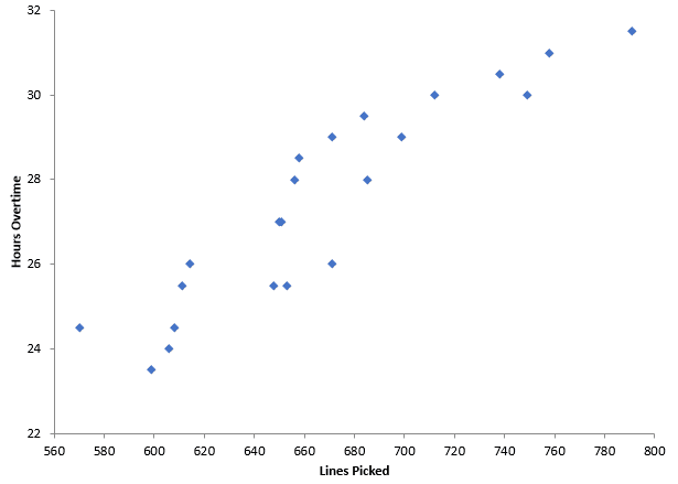
How Do I Analyze a Scatter Diagram?
Our previous blog (What is a Scatter Diagram?) included an example of overtime in a warehouse. You are a warehouse
What is a Scatter Diagram?
A scatter diagram shows the relationship between two variables. For example, you might want to compare the speed you drive
What Do These Histograms Tell You? – The Answers
Our recent blog, entitled What Do These Histograms Tell You?, showed you five different histograms. The blog challenged you to
What Do These Histograms Tell You?
Our previous blog introduced histograms. Histograms tell you four things about your process. Remember what those were? If not, see
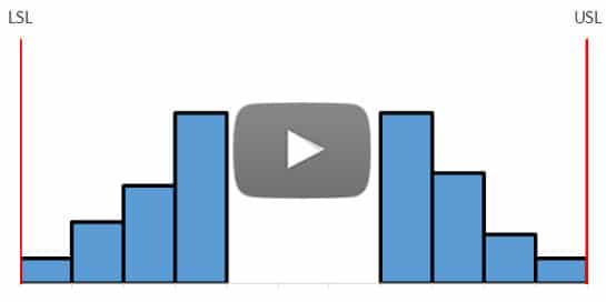
What is a Histogram?
A histogram is a snapshot in time of your process. It tells you four things: Which result (or range of
What is a Pareto Chart?
A Pareto chart helps you answer questions. What is the reason for the most rework or scrap in your organization?

How Good is My Measurement System?
You just completed your ANOVA Gage R&R analysis. The results indicate that your measurement system is responsible for 40% of