Variable Pareto Diagram Help
Home » SPC for Excel Help » Pareto Diagrams Help » Variable Pareto Diagram Help
The Variable Pareto diagram determines how frequently a defect occurred for a number of different variables. For example, suppose you are want to determine how often defects occurred by shift. The defects are usually text, such as “dent”, “scratch” or “late delivery”. The variables are usually text, such as day, afternoon, night or weekend for the shifts. There can also be a third entry, such as the cost of each defect. This would then present the Pareto diagram in terms of cost, not frequency. There are two options under the Variable Pareto diagram:

- Defect Pareto for Each Variable: gives a chart for each variable showing the number of defects (e.g., a chart of defects on afternoon shift) as well Pareto charts for the by all the variable and all the defects
- Two-Level (Variable-Defect) Pareto Diagram: shows all results on one Pareto chart
This page shows you how to make each of these. You can download the data at this link. This page contains the following:
- Data entry for the Variable Pareto diagram
- Creating a new Variable Pareto diagram
- Data Entry for the Two-Level Pareto diagram
- Creating a new Two-Level Pareto diagram
- Options for the Variable Pareto diagram
- Updating the Variable Pareto diagram with new data
- How SPC for Excel finds new data to update the Variable Pareto diagram
- Changing the options for the Variable Pareto Diagram
Data Entry for the VariablePareto Diagram
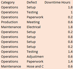
The data are entered in a worksheet as shown below. The variable in this example is Shift. The data can be in columns (variables in one column) or in rows (variables in row). Avoid having blank cells in the variable column or row to ensure that the chart updates correctly with new data. The data does not have to start in A1. It can be anywhere on the spreadsheet. The second column lists the defects that occurred on each shift. There can be a third column, for example, costs if you want to use a metric other than frequency of occurrence.
Creating a New Variable Pareto Diagram
1. Select the data to include in the Variable Pareto diagram.
2. Select “Variable” on the “Pareto” panel in the SPC for Excel ribbon
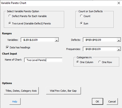
The input screen for the Variable Pareto diagram is shown. Note that the ranges selected on the worksheet are reflected in the variables and defects ranges. These can be changed at this point if the ranges are not correct. The only item required to create the Pareto chart at this point is to enter the Name of Chart. This is the name that will be on the worksheet tab containing the Pareto chart. In this example, the name “Defect by Shift” is used as the name of the chart.
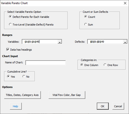
- Defect Pareto for Each Variable: this is the default option
- Two-Level (Variable-Defect) Pareto: this option places the results on one Pareto (see below)
- Count: this option counts the frequency of occurrence for the defects
- Sum: this option sums results for defects (for example, based on cost, downtime, etc.); if this option is selected, a third range entry is shown.
- Variables: range containing the variables, may be edited if not correct
- Defects: range containing the defects, may be edited if not correct
- Frequencies: range containing the values to be summed if the Sum option is selected above; not shown until that option is selected, may be edited if not correct.
- Data have headings: check if your data have headings (e.g, Product, Returns in this example)
- Name of chart: chart name for worksheet tab containing the Pareto chart – must be a unique name in the workbook and is limited to 25 characters
- Variables in: selected whether categories are in one column or one row based on data selected on range; may be changed if not correct
- Cumulative Line?: option to include cumulative line; default is Yes
- Add Titles/Dates/Category Axis: shows an input screen to change default titles, add dates of data collection or to switch category axis from x to y axis (see Options below)
- Vital Few Color/Bar Gap: shows an input screen with the option to color bars the red if cumulative frequency is less than 80% (not available for the individual Pareto diagram by variable) and the bar gap on the Pareto diagram (see Options below)
- Select OK to create the Pareto Chart
- Select Cancel to exit the program
3. Once you have entered the information, select OK and the Pareto charts will be generated on a new worksheet. An example based on the data in the example workbook is shown below. There is a Pareto chart for each variable.
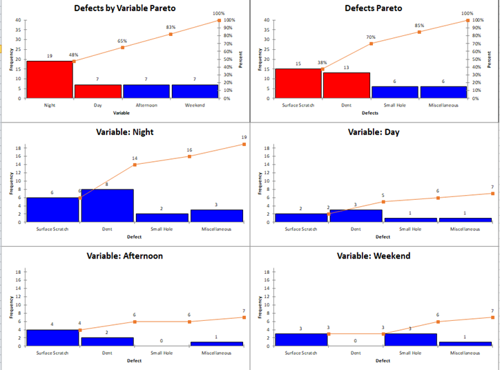
There is a Defects by Variable chart, which shows the total defects for each variable; there is a Defects Pareto chart which shows the total defects; there is a chart for each variable. Note that the chart for each variable is not sorted by the largest frequency first. Instead, the sorting is in the same order as the Defects Pareto chart
Creating a New Two-Level Pareto Diagram
- 1. Select the data to include in the Variable Pareto diagram.
- 2. Select “Variable” on the “Pareto” panel in the SPC for Excel ribbon
The input screen for the Variable Pareto diagram is shown.
The entries are explained above for the Variable Pareto diagram. Note that the Two-Level (Variable-Defect) is selected. The Sum option is also selected which shows the frequencies data range. Note that there is no cumulative line with the two-level Pareto. Select OK and the chart below is made.
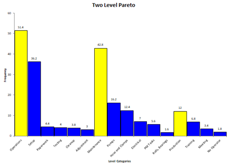
The variables are in yellow. The defects under each one are in blue. In this example, the downtime is summed for each and is shown.
Updating a Variable Pareto diagram with New Data
After you have added additional data to the worksheet, you can easily update the Pareto chart as shown below. See the Frequency Pareto Chart for information on updating the Pareto chart. With the Variable Pareto diagram, the entire worksheet is deleted and re-created. Any changes you made to the Variable Pareto diagrams on that worksheet will be lost when the chart is updated.
How SPC for Excel Finds New Data to Update the Variable Pareto Diagram
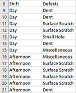
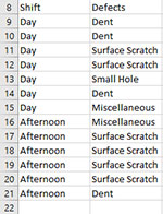
If the variables are in one column, the program will look down the variable column to find the last entry. For example, suppose your original data are shown below. The range used for the chart was from A8 to B15.
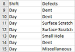
Now you have added new data from row 15 to 21. When you update the chart, the program will look from A8 down to find the last entry before a blank cell. This becomes the new range. In this case, the program updates the chart using the range A8 to B21.
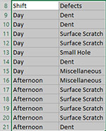
If the variables (shift) are in one row, the program looks across the row from the first entry to find the new data.
Changing the Options for a Variable Pareto Diagram
You can change the options for a Variable Pareto diagram (for example, adding or removing the cumulative line) by using the same procedures described for the Frequency Pareto Chart. When you change the options, the program does not add any new data to the chart. You have to run “Update Charts” to add the new data.