March 2005
In this issue:
- Introduction to X-R Charts
- Example
- When to Use X-R Charts
- Steps in Constructing an X-R Chart
- Summary
- Quick Links
This month is the first in a multi-part publication on X-R charts. This month we introduce the chart and provide the steps in constructing an X-R chart. Next month, we will look at a detailed example of an X-R chart. The X-R chart is a type of control chart that can be used with variables data. Like most other variables control charts, it is actually two charts. One chart is for subgroup averages ( X). The other chart is for subgroup ranges (R). These charts are a very powerful tool for monitoring variation in a process and detecting changes in either the average or the amount of variation in the process.
Introduction to X-R Charts
 Suppose you are a member of a bowling team. You bowl three games a night once a week in a bowling league. You are interested in determining if you are improving your bowling game. What are some different approaches you could use? One idea is that you could plot the score from each game. However, you are more interested in what your average score is on a given night. So another idea is to plot the average of the three games each night. You definitely would like to increase that average over time. You are also interested in being more consistent, i.e., not having one great game followed by a poor one. Thus, another idea is to keep track of the range in scores for the three games each night. In situations such as this (when you want to monitor averages over time but still keep track of the variation between individual results), the X-R chart is very useful.
The X-R chart is a method of looking at two different sources of variation. One source is the variation in subgroup averages. The other source is the variation within a subgroup. Consider the bowling example above. You have data available on a fairly frequent basis (three games each week). You can also rationally subgroup the data. The three individual games you bowl on one night can be used to form a subgroup.
Continuing with the bowling example, suppose that one night your three bowling scores are 169, 155, and 189. These three scores form a subgroup. You can calculate the range of this subgroup by subtracting the minimum score from the maximum score. Thus the range is:
Range = Maximum – Minimum = 189 – 155 = 34
You can plot this value on a range (R) chart. This is done for each subgroup (one night of bowling three games). The range chart shows how much variation there is within each subgroup, i.e., the amount of variation in your bowling scores on one night. You would like this variation to be small and be consistent over time.
The chart for averages ( X) presents a different variation than the range chart. Using the three scores above, you can calculate an average score for the night by taking the average of the three individual scores. The subgroup average is:
X = (169+155+189)/3 = 171
You can plot this value on the X chart. This is done for each subgroup. The X chart shows how much week-to-week variation there is in your weekly average bowling score. You would like this variation to be small and be consistent over time. This permits you to predict what your average score will be on any night, within certain limits.
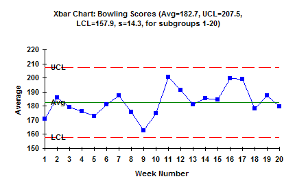
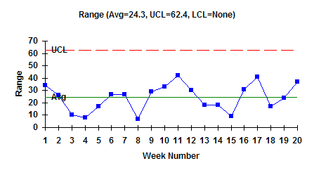
The figure below is an example of the X-R chart for this bowling example. The top part of the figure is the X chart. Each weekly average bowling score (i.e., the average of the three individual games) is plotted. The overall average (Xdbar = X double bar) has been calculated and plotted as a solid line. Xdbar is the average of all the subgroup averages. Upper and lower control limits have also been calculated and plotted. The X chart is in statistical control. The lower part of the figure is the range (R) chart. The range is plotted for each week. The average range and control limits have been calculated and plotted. The range is also in statistical control.
What does it mean when the X-R chart is in statistical control? It means that the subgroup average is consistent over time and the variation within a subgroup is consistent over time. We can predict what the process will do in the near future. In the bowling example, this means that you can predict what the average of your three games on any given night will be. Your average will be between about 158 and 208 with a long term average of about 183. You can also predict what your range in bowling scores will be on any given night. The range can be anywhere from 0 to about 62 with an average range of about 24. As long as the process stays in control (your bowling), the results will continue to the same.
Example
When to Use X-R Charts
X-R charts should be used when you have taken data frequently. How often you plot points on the charts depends on your subgroup size. For example, if your subgroup size is four, it will take four samples before you calculate the average and range and plot the points. If you only take one sample per day, it will be four days before you can plot the points. If the point is out of control, the reason for it could have occurred four days ago. This often makes it difficult to find out what happened.
X-R charts should be used if you can rationally subgroup the data and are interested in detecting differences between subgroups over time. This means there should be some logical basis for the way the subgroups are formed. They should be formed to examine the variation of interest to you. You might be interested in the variation from day to day. In this case, samples from one day would be used to form a subgroup. The X chart would examine the variation from day to day, while the R chart would examine the variation within a day.
The R chart is a measure of the short-term variation in the process. Subgroups should be formed to minimize the amount of variation within a subgroup. This causes the X chart to do the work in detecting process changes.
Steps in Constructing an X-R Chart
The steps in constructing an X-R chart are given below.
1. Gather the data.
a. Select the subgroup size (n). Typical subgroup sizes are 4 to 5. The concept of rational subgrouping should be considered. The objective is to minimize the amount of variation within a subgroup. This helps us “see” the variation in the averages chart more easily.
b. Select the frequency with which the data will be collected. Data should be collected in the order in which it is generated (in most cases).
c. Select the number of subgroups (k) to be collected before control limits are calculated. You can start with initial control limits after ten subgroups, but recalculate the limits each time until you get to twenty subgroups.
d. For each subgroup, record the individual, independent sample results.
e. For each subgroup, calculate the subgroup average:
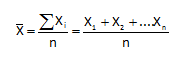
where n is the subgroup size.
f. For each subgroup, calculate the subgroup range:
R = Xmax – Xmin
where Xmax is the maximum individual sample result in the subgroup and Xmin is the minimum individual sample result in the subgroup.
2. Plot the data.
a. Select the scales for the x and y axes for both the X and R charts.
b. Plot the subgroup ranges on the R chart and connect consecutive points with a straight line.
c. Plot the subgroup averages on the X chart and connect consecutive points with a straight line.
3. Calculate the overall process averages and control limits.
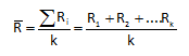
a. Calculate the average range (Rbar):
where k is the number of subgroups.
b. Plot Rbar on the range chart as a solid line and label.
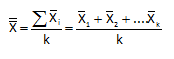
c. Calculate the overall process average (Xdbar):
d. Plot X on the X chart as a solid line and label.
e. Calculate the control limits for the R chart. The upper control limit is given by UCLr. The lower control limit is given by LCLr.
where D4, D3, are control chart constants that depend on subgroup size (see the table below).
f. Plot the control limits on the R chart as dashed lines and label.
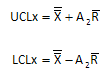
g. Calculate the control limits for the X chart. The upper control limit is given by UCLx. The lower control limit is given by LCLx.where A2 is a control chart constant that depends on subgroup size (see the table below).
h Plot the control limits on the X chart as dashed lines and label.

4. Interpret both charts for statistical control.
a. Always consider variation first. If the R chart is out of control, the control limits on the X chart are not valid since you do not have a good estimate of . All tests for statistical control apply to the X chart. Points beyond the limits, number of runs and length of runs tests apply to the R chart.
5. Calculate the process standard deviation, if appropriate.
a. If the R chart is in statistical control, the process standard deviation, s, can be calculated as:
![]()
where d2 is a control chart constant that depends on subgroup size (see the table below).
To calculate control limits and to estimate the process standard deviation, you must use the control chart constants D4, D3, A2, and d2. These control chart constants depend on the subgroup size (n). These control chart constants are summarized in the table below. For example, if your subgroup is 4, then D4 = 2.282, A2 = 0.729, and d2 = 2.059. There is no value for D3. This simply means that the R chart has no lower control limit when the subgroup size is 4.
|
Subgroup Size (n) |
A2 |
D3 |
D4 |
d2 |
|
2 |
1.880 |
|
3.267 |
1.128 |
|
3 |
1.023 |
|
2.574 |
1.693 |
|
4 |
0.729 |
|
2.282 |
2.059 |
|
5 |
0.577 |
|
2.114 |
2.326 |
|
6 |
0.483 |
|
2.004 |
2.534 |
|
7 |
0.419 |
0.076 |
1.924 |
2.704 |
|
8 |
0.373 |
0.136 |
1.864 |
2.847 |
|
9 |
0.337 |
0.184 |
1.816 |
2.970 |
|
10 |
0.308 |
0.223 |
1.777 |
3.078 |
|
11 |
0.285 |
0.256 |
1.774 |
3.173 |
|
12 |
0.266 |
0.284 |
1.716 |
3.258 |
|
13 |
0.249 |
0.308 |
1.692 |
3.336 |
|
14 |
0.235 |
0.329 |
1.671 |
3.407 |
|
15 |
0.223 |
0.348 |
1.652 |
3.472 |
|
16 |
0.212 |
0.364 |
1.636 |
3.532 |
|
17 |
0.203 |
0.379 |
1.621 |
3.588 |
|
18 |
0.194 |
0.392 |
1.608 |
3.640 |
|
19 |
0.187 |
0.404 |
1.596 |
3.689 |
|
20 |
0.180 |
0.414 |
1.586 |
3.735 |
|
21 |
0.173 |
0.425 |
1.575 |
3.778 |
|
22 |
0.167 |
0.434 |
1.566 |
3.819 |
|
23 |
0.162 |
0.443 |
1.557 |
3.858 |
|
24 |
0.157 |
0.452 |
1.548 |
3.895 |
|
25 |
0.153 |
0.459 |
1.541 |
3.931 |
Summary
This publication has introduced the X-R chart. When you should use an X-R chart was covered as well as the steps in constructing the chart.