July 2015
“We are pretty much a job shop. Our production runs are short. We are always changing over to a different product. Each job is different. We can’t use SPC here.”

But how can you do this when you only get one, two or three data points (samples) during a production run? You could set up a control chart for each product and hope that, over time, you get enough data to make a control chart. But, then you would have a lot of control charts to manage.
This month’s publication takes a look at how you can handle this type of situation – how to use control charts with short-runs. In particular, we will take a look at the z-mR control chart. In this issue:
- Introduction to z-mR Control Charts
- Example Data
- Calculation of z Values
- Control Limit Calculations for the z-mR Control Chart
- Plotting the z-mR Control Charts
- Using the z-mR Control Chart Effectively
- Summary
- Quick Links
You can download a pdf copy of this publication at this link. Please feel free to leave a comment at the end of the publication.
Introduction to z-MR Control Chart
Suppose you have 
A z-mR control chart is two charts. One chart is for the z value which is the “standardized” X value. It is determined by the following equation:
z=(X-X)/σ
where X is the sample result, X is the average, and σ is the standard deviation. You will have a different average and standard deviation for each part. Subtracting the average from the sample result and dividing by the standard deviation “standardizes” the results. This calculation creates the z distribution which has an average of 0 and a standard deviation of 1.
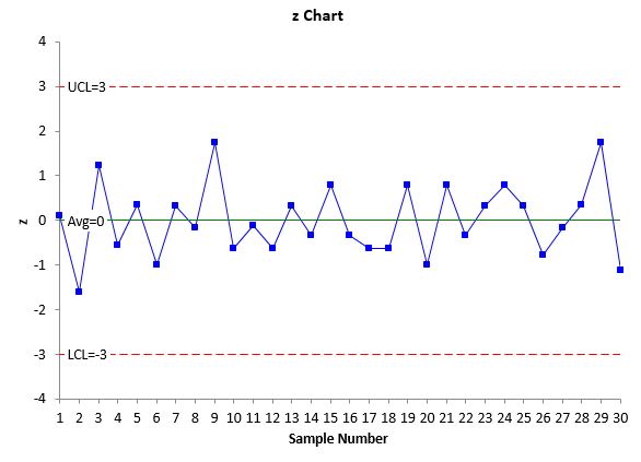
The z values are plotted over time. Since the z values are standardized, the average on the z control chart will be 0 and the control limits will be at +3 and -3. These represent +/- 3 standard deviation limits and the standard deviation is equal to 1.
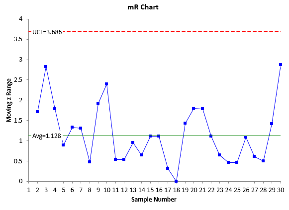
The mR control chart is the moving range chart. It monitors the variation between consecutive z values. The average and control limits for the mR control chart are set also. The average is 1.128 and the upper control limit is 3.686. These are derived below.
The process for creating a z-mR control chart is given below using an example of a process that creates two different products using short production runs.
Example Data
Suppose you make two products but regularly switch back and forth between those two products. Sometimes you might have one sample for a production run, other times two or three. The data for the last 30 samples you have collected are in shown in Table 1.
Table 1: Example Data
| Sample | Product | Result | Sample | Product | Result |
| 1 | 1 | 20 | 16 | 1 | 18 |
| 2 | 2 | 5 | 17 | 2 | 7 |
| 3 | 1 | 25 | 18 | 2 | 7 |
| 4 | 1 | 17 | 19 | 2 | 10 |
| 5 | 1 | 21 | 20 | 1 | 15 |
| 6 | 1 | 15 | 21 | 1 | 23 |
| 7 | 2 | 9 | 22 | 1 | 18 |
| 8 | 2 | 8 | 23 | 2 | 9 |
| 9 | 2 | 12 | 24 | 1 | 23 |
| 10 | 2 | 7 | 25 | 2 | 9 |
| 11 | 1 | 19 | 26 | 1 | 16 |
| 12 | 2 | 7 | 27 | 2 | 8 |
| 13 | 2 | 9 | 28 | 1 | 21 |
| 14 | 1 | 18 | 29 | 2 | 12 |
| 15 | 1 | 23 | 30 | 2 | 6 |
So, the first sample came from a Product 1 production run. The second sample came from a Product 2 production run; samples 3 to 6 came from another Product 1 production run; samples 7 – 10 came from another Product 2 production run, etc. We will use these data to construct the z-mR control chart.
Calculation of z Values

The average is determined as usual – add up the sample results for a product and divide by the number of samples. The average for each product is given below:
Product 1 Average: 19.5
Product 2 Average: 8.3
The standard deviation (or sigma) is not calculated using the basic equation for the standard deviation. Instead, it is calculated as it should be when using control charts and individual values – from the moving range between consecutive samples. Table 2 shows the results for Product 1. The moving range is determined as the absolute value between consecutive values. So, the first moving range is given by |20-25| = 5. The second moving range is |25 – 17| = 8 and so on.
Table 2: Moving Range Calculation for Product 1
| Sample | Product | Result | Moving Range |
| 1 | 1 | 20 | |
| 3 | 1 | 25 | 5 |
| 4 | 1 | 17 | 8 |
| 5 | 1 | 21 | 4 |
| 6 | 1 | 15 | 6 |
| 11 | 1 | 19 | 4 |
| 14 | 1 | 18 | 1 |
| 15 | 1 | 23 | 5 |
| 16 | 1 | 18 | 5 |
| 20 | 1 | 15 | 3 |
| 21 | 1 | 23 | 8 |
| 22 | 1 | 18 | 5 |
| 24 | 1 | 23 | 5 |
| 26 | 1 | 16 | 7 |
| 28 | 1 | 21 | 5 |

The estimated standard deviation is then determine by dividing the average moving range by 1.128 (the control chart constant for a moving range of 2).
σ = R/1.128
The average moving range for Product 1 is 5.1. So the estimated standard deviation for Product 1 is:
Product 1 Standard Deviation= 5.1/1.128 = 4.5
The standard deviation can for Product 2 can be estimated using the same procedure and it is equal to 2.1.
The z values can now be calculated for the data in Table 1. The first sample in Table 1 was for Product 1 and the sample result was 20. Thus the z value is given by:
z1 = (X-X1)/σ1 = (20-19.5)/4.5 = 0.11
The average and standard deviation for Product 1 was used in the above calculation. What does this value of z mean? It means that the sample result of 20 for Product 1 is 0.11 standard deviations above the average for Product 1.
The second sample in Table 1 was for Product 2 and the sample result was 5. The z value for this sample is found using the average and standard deviation for Product 2:
z2 = (X-X2)/σ2 = (5-8.3)/2.1 = -1.57
This value of z means that the sample result of 5 for Product 2 is 1.57 standard deviations below the average for Product 2. The z values for the other samples in Table 1 can be found using the same approach. Table 3 contains the calculated z values.
Table 3: Example Data with z Values
| Sample | Product | Result | z Value | Sample | Product | Result | z Value |
| 1 | 1 | 20 | 0.11 | 16 | 1 | 18 | -0.33 |
| 2 | 2 | 5 | -1.57 | 17 | 2 | 7 | -0.62 |
| 3 | 1 | 25 | 1.22 | 18 | 2 | 7 | -0.62 |
| 4 | 1 | 17 | -0.56 | 19 | 2 | 10 | 0.81 |
| 5 | 1 | 21 | 0.33 | 20 | 1 | 15 | -1.00 |
| 6 | 1 | 15 | -1.00 | 21 | 1 | 23 | 0.78 |
| 7 | 2 | 9 | 0.33 | 22 | 1 | 18 | -0.33 |
| 8 | 2 | 8 | -0.14 | 23 | 2 | 9 | 0.33 |
| 9 | 2 | 12 | 1.76 | 24 | 1 | 23 | 0.78 |
| 10 | 2 | 7 | -0.62 | 25 | 2 | 9 | 0.33 |
| 11 | 1 | 19 | -0.11 | 26 | 1 | 16 | -0.78 |
| 12 | 2 | 7 | -0.62 | 27 | 2 | 8 | -0.14 |
| 13 | 2 | 9 | 0.33 | 28 | 1 | 21 | 0.33 |
| 14 | 1 | 18 | -0.33 | 29 | 2 | 12 | 1.76 |
| 15 | 1 | 23 | 0.78 | 30 | 2 | 6 | -1.10 |
Control Limit Calculations for the z-mR Control Chart
The control limits for the z control chart are straightforward. The average is always 0 and the control limits are set at -3 and 3. This is because we take each sample result for a product, subtract the average from the result and divide by the standard deviation for the product. This standardization creates a distribution with an average of 0 and a standard deviation of 1. So, for the z control chart:
Average = 0; LCL = -3; UCL = 3
The average moving range and control limits for the mR control chart are also set. The equation to calculate sigma from the average moving range above can be re-arranged to give the following:
σ(R) = 1.128
Since sigma = 1, the average moving range is 1.218.
The upper control limit for the mR control chart is given by the following:
UCLR = 3.267R = (3.267)(1.128) = 3.686
There is no lower control limit for a mR control chart when n = 2. So, for a mR control chart based on z values, the average moving range is 1.128, the upper control limit is 3.686 and there is no lower control limit.
Plotting the z-mR Control Charts
The z values have now been calculated along with the moving range between the z values. The average and control limits have been set. The z-mR control charts can now be created. The z values are plotted on one chart along with the average of 0 and the lower and upper control limits of -3 and 3, respectively.
The moving ranges are plotted on another chart along with the average moving range of 1.128 and the upper control limit of 3.686. The z-mR control chart is shown in Figure 1. The top part of Figure 1 is the z control chart. All the basic tests for out of control points apply – points beyond the control limits, the zone tests, etc. There are no out of control situations on this chart. This z control chart is in “statistical control” – it is consistent and predictable. The bottom part of Figure 1 is the moving range chart. This chart is in statistical control as well. The moving range is predictable.
Figure 1: z-mR Control Chart
Using the z-mR Control Chart Effectively

Suppose you do that and continue to monitor the results over time. You have collected additional data. These data are shown in Table 4.
Table 4: Additional Data
| Sample | Product | Result |
| 31 | 1 | 15 |
| 32 | 2 | 7 |
| 33 | 1 | 20 |
| 34 | 1 | 22 |
| 35 | 1 | 22 |
| 36 | 1 | 25 |
| 37 | 2 | 12 |
| 38 | 2 | 9 |
| 39 | 2 | 9 |
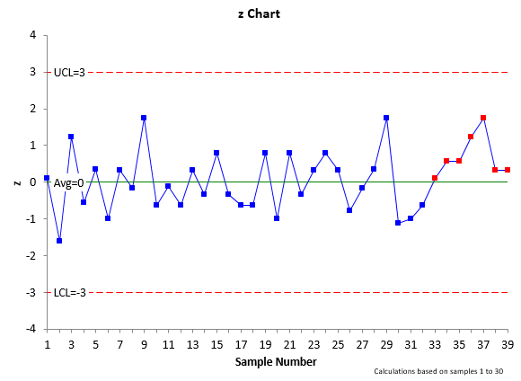
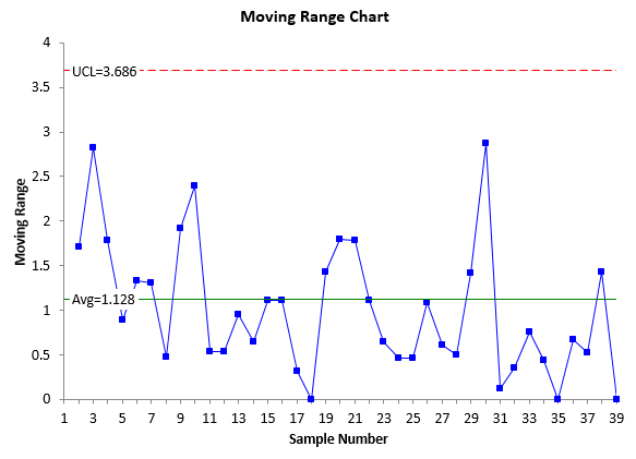
Figure 2 shows the control chart with the additional data. The z control chart is no longer in statistical control. There is a run of 7 above the average line (0). This means that something has happened to cause the z values to increase over these 7 runs. This special cause should be found and eliminated. This is the way that the z-mR control chart can be effectively used to determine when a special cause exists in your process.
Figure 2: z-mR Control Chart with Additional Data
Summary
This publication has shown one method of using SPC with short production runs. The z-mR control chart can be used to handle this type of situation. The methodology involves calculating a z value for each sample using the estimated product average and standard deviation. Doing this allows all the products to be placed on the same control chart. The averages and control limits for both the z chart and the moving range chart are set and do not change.


Thanks so much for the fun and educational article. It made me dive a little into where the control chart constants came from, originally. Also, I know that it is not easy to generate new fake data that illustrates a point. By inspection, it looked to me as if the new data gathered after the "set" was not independantly drawn or had a special cause that made it look that way. For example, the 30 point set data had about 21 "sign changes' in 30 data points. The post set new data had ony one in nine points in which successive points had a different sign. As we dug into the special cause, would we not want to pay special attention to factors common to both products? Both products One and Two combined to create the "seven points above average" disturbance in our Z chart. I plant to move some of this data over to "PAST" and look at it there. Have you ever used this free app? Its fun and has a lot of graphical power.Thanks again for the extra effort and may all of your data be true,Stephen Puryear
Thanks for you comment. Actually the data comes from the book "Short Run SPC" by Dr. Wheeler. I failed to reference that as I should have. I agree on your statement about something common to both products – but if they are run on the same process with different settings, it could be just process. What app are you referring to?
Bill
Hi, BillThanks for the rapid response. "PAST" was originally designed for paleontologists but has steadily grown until many other users would find it useful. The technical writing that supports the statistical tools is just about the clearest that I have ever read on which approach works for which problem, why it works and what their limitations are. It is quite compatable with Excel and is frequently updated primarily for Windows environments. Check it out!
Does the software have Z-bar with R (between) and R (within) ? In other words can the software handle short runs with sample sizes greater than 2 and look at variability. Ie. Z-bar R(within) and R(between)?
Hi Tim,
The software uses individual values to determine z values – not subgroups. So, you have the z chart with those z values and then you have a moving range chart for the values between consecutive z values.
Hi, there are 7 points (points 31 to 37) of the Moving Range Chart below the average line. Would this be considered out of control?
No, with a moving range chart you are reusing each point twice, so the run has to be longer, like 14 points.