Box and Whisker Plots Help
Home » SPC for Excel Help » Statistical Tools » Multiple Processes Help » Box and Whisker Plots Help
A Box and Whisker plot is used to present a visual representation of how data are spread out and how much variation there is in the data. It focuses attention on the median, the quartile, and the minimum and maximum values. The example below demonstrates how to use the Box and Whisker plot in SPC for Excel.

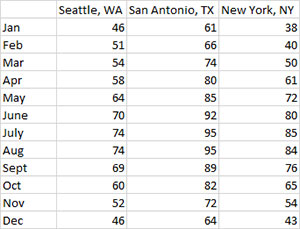
You are interested in comparing the average monthly temperature for three cities. The Box and Whisker plot can show this variation. The data you have is shown below.
- 1. Enter the data into a worksheet as shown below. The data can be downloaded at this link.
- 2. Select the data and the column headings shown above.
- 3. Select “Multiple Processes” from the “Statistical Tools” panel in the SPC for Excel ribbon.
- 4. Select the “Box and Whisker” plot option. Select OK and the input form below is displayed.
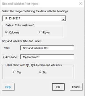
- Select the range: The default range is the range that is selected on the worksheet.
- Treatment Data in Columns/Rows: The data can be in columns or rows.
- Box and Whisker Title and Labels:
- Title: The title that will appear on the chart, default is Box and Whisker Plot.
- Y Axis Label: The label that will appear on the Y axis; default is Measurement.
- Label Chart with Q1, Q3, Median and Whiskers:
- Select Yes to label the chart for Q1 (25% quartile), Q3 (75% quartile), the median and the whiskers; default is no.
- Select OK to generate the results.
- Select Cancel to end the program.
Box and Whisker Plot Output
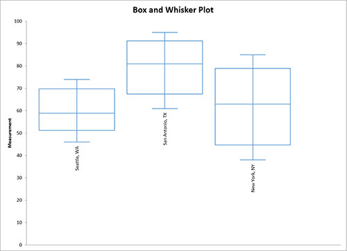
The program will plot outliers and color them red.
The calculations for the Box-Whisker plot are shown here.