You have a set of data. You would like to know if the data comes from a normal distribution. How do you do that? A normal probability plot can be used to determine if sets of data come from a normal distribution. This involves using the probability properties of the normal distribution. The data are compared to a normal distribution in such a way that will result in a straight line if the data are normally distributed.
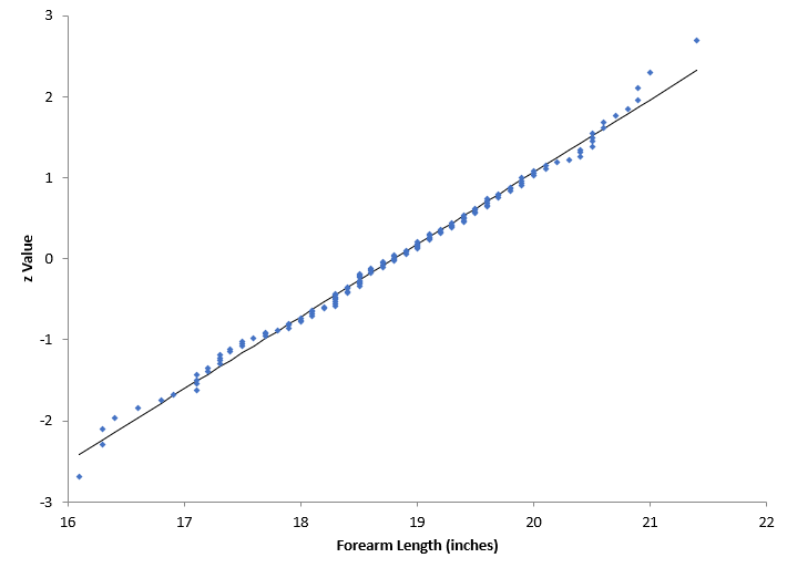
For example, consider the normal probability plot below. This is a data set of the forearm lengths for males. We want to know if the data come from a normal distribution. The forearm lengths are given along the x-axis. The y-axis is the z value from the standard normal distribution. We will not worry about the calculations here, but the reference is given below for those who want to see how the calculations are done.
It appears that the data does fall along a straight line. So, one would conclude that this data probably comes from a normal distribution.
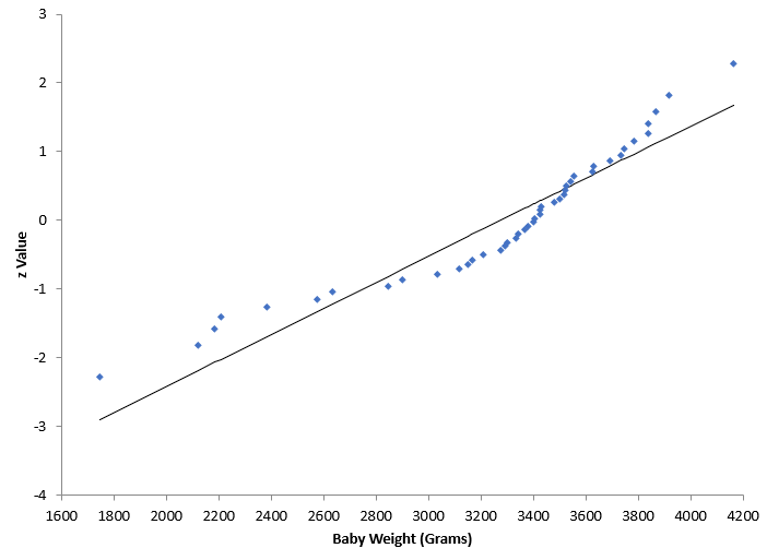
The probability plot below is for the weight of babies. Again, we want to know if the baby weight data follows a normal distribution. It does not look like the data falls along a straight line. One would conclude, in this case, that the data are not normally distributed.
The data and calculations for the normal probability plots are given in our SPC Knowledge Base article Normal Probability Plots.
The Anderson-Darling statistic is something that often accompanies a normal probability plot. This statistic is a “measure” of how “normal” the data are and is often given with a p-value, which can help you decide if the data are normally distributed. This will be the topic of our next blog.
The normal probability plots above were made using SPC for Excel, a simple but powerful software for statistical analysis in the Excel environment.

