What is Ppk?
Our first two blogs in this process capability series answered two questions: What is process capability? – and – What
What is a Control Chart?
This is the start of a four-part blog on control charts. The blogs will answer the following questions: What is
The Basic EMP Study and Gage R&R
This is the final blog in a four-part series on Gage R&R studies. The first blog addressed what a gage

Two Universal Metrics We Can All Measure and Improve
Have you ever heard someone say “You can’t measure what I do!” Or maybe this one: “We are a job
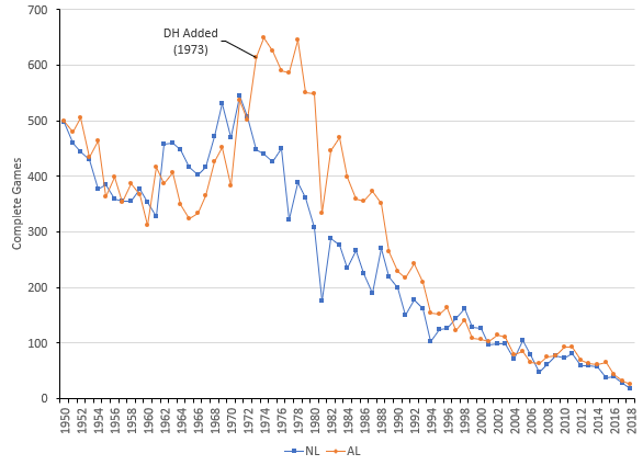
What Happened to the Complete Game?
In 1968, Bob Gibson, a pitcher for the St. Louis Cardinals started 34 games. He finished the season with 22
How is Sigma Estimated from a Control Chart?
Sigma – an important statistic for us to know. Sigma, or the standard deviation, is a measure of how much
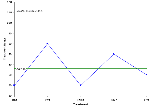
What is the Analysis of Ranges (ANOR)?
Our last blog – What is the Analysis of Means(ANOM)? – explained how ANOM is used to determine if there
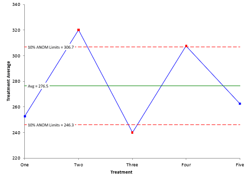
What is the Analysis of Means (ANOM)?
There are times we want to compare things, e.g., different machines, different raw materials or different shifts. There are several
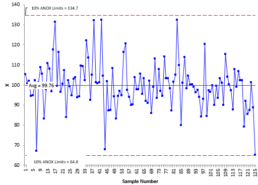
What is the Analysis of Individual Values (ANOX)
You have just finished a pilot production run for a new product. You want to know if the data you