Analysis of Means (ANOM) Help
Home » SPC for Excel Help » Analysis Help » Analysis of Means (ANOM) Help
Analysis of means is a graphical and statistical way of comparing k treatments means with the overall average and the k treatment ranges with the average range. The method used in this program is described in the book Analyzing Experimental Data by Dr. Donald J. Wheeler. The maximum number of treatments is 60. The maximum subgroup size for each treatment is also 20. The data must be in columns.
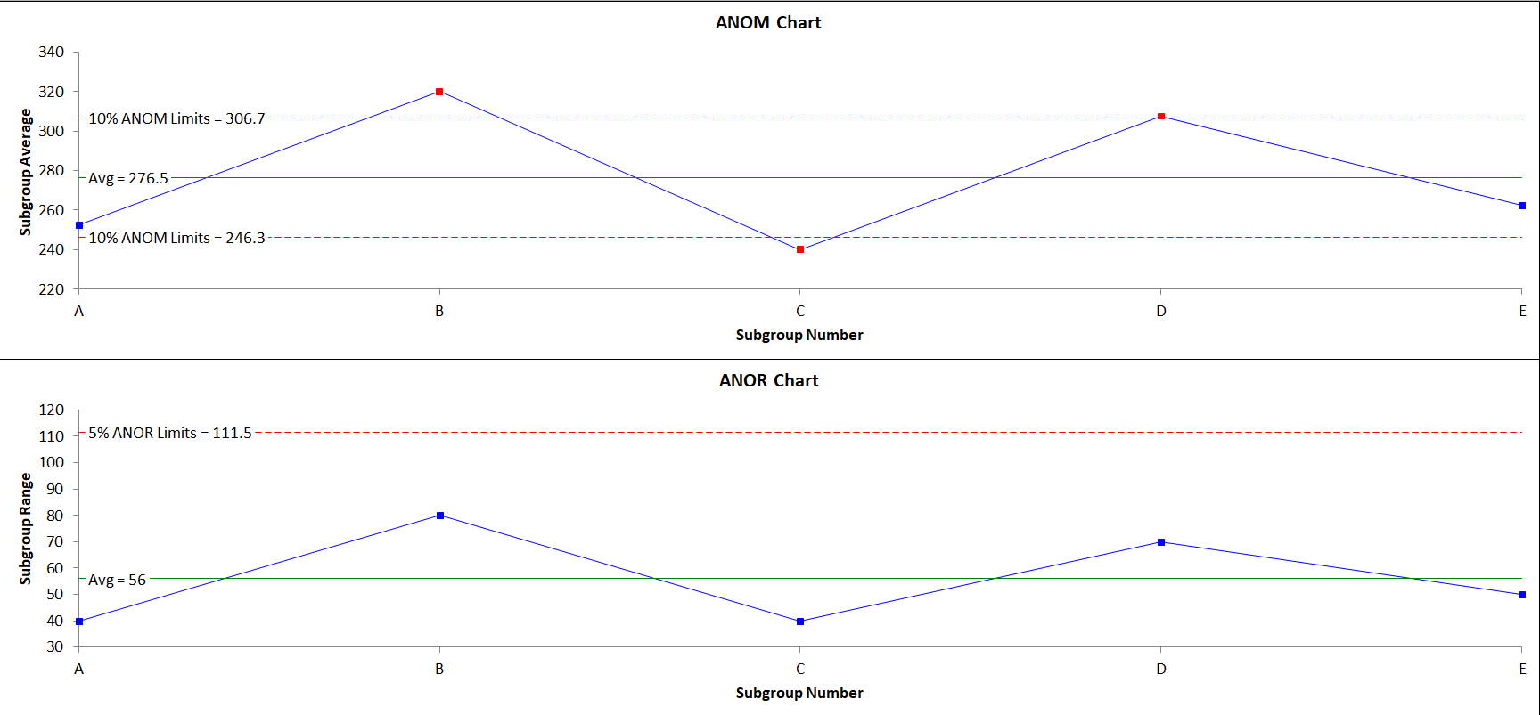
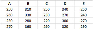
Five different treatments (A to E) were used to control the weight of a coating in grams. There were four samples for each treatment. We want to use the Analysis of Means method to determine if there are any significant differences in the treatments. The data can be download at this link.

- 1. Enter the data as shown below. The column headings represent the treatment labels with the responses for each treatment under the label. The number of results for each treatment must be equal.
- 2. Select the data and the column headings.
- 3. Select the “ANOM” option in the Analysis panel on the SPC for Excel ribbon.
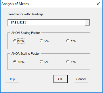
- Treatment with headings: enter the worksheet range containing both the data and the treatment names; the default is the range selected on the worksheet.
- ANOM Scaling Factor: the scaling factor used to determine the detection limits for the subgroups.
Detection Limits = Grand Average +/- ANOMa(Average Range)
- ANOR Scaling Factor: the scaling factors used to determine the detection limits for the ranges:
Upper ANOR Detection Limit = ANORa(Average Range)
Analysis of Means Output
There are two new worksheets added for to your workbook for this test. One worksheet contains the numerical results. The other worksheet contains the analysis of means chart. The output is described below starting with the numerical results.
Numerical Results
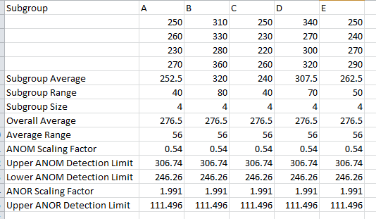
The treatment averages, ranges and subgroup sizes are calculated. The overall average and range are calculated. The scaling factors are found and the detection limits calculated. This table is used to generate the ANOM and ANOR charts.
Analysis of Means Chart
The top chart is the ANOM chart. Means that are in red are significantly different from the other means on the top chart. The bottom chart is the ANOR chart. The number of observations in each treatment does not have to be equal.