Scatter Diagram Help
Home » SPC for Excel Help » Cause and Effect Help » Scatter Diagram Help
A scatter diagram examines the relationship between two variables, X and Y. Quite often you are looking to determine if Y can be controlled by controlling X. This page shows to make a scatter diagram. The data can be downloaded here. This page contains the following:
You can fit the following trend: linear (default), logarithmic, polynomial, power or exponential.

Creating a New Scatter Diagram
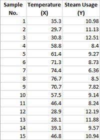
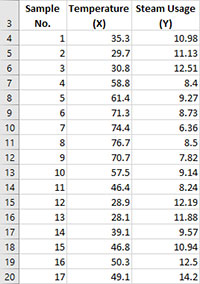
- 1. Select the data on the worksheet to be included in the analysis. This is the shaded area shown below. You can use “Select Cells” in the “Utilities” panel of the SPC for Excel ribbon to quickly select the cells. Note: you do not have to select the headings for the two columns (temperature and steam usage). If you do, the program will add these as the labels for the X axis and Y axis.
- 2. Select “Scatter” from the “Cause and Effect” panel on the SPC for Excel ribbon.
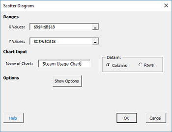
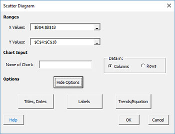
- 3. The input screen for the scatter diagram is displayed. The program sets the initial X and Y ranges as the range that is selected on the worksheet. This is why there is an advantage to selecting the sample and data ranges prior to making the scatter diagram. You can edit the ranges if needed here. Enter a name for the chart. In this example, the name “Steam Usage Scatter” is used as the name. This is the name that will appear on the worksheet tab containing the scatter diagram. It must be unique – there can not be another workbook tab with that name.
This is all that is needed to make the scatter diagram. If you select OK at this point, the software will generate the scatter diagram using the default options.
- X Values Range: enter the range containing the X values
- Y Values Range: enter the range containing the Y values
- Name of Chart: chart name – must be a unique name in the workbook and is limited to 25 characters (note: when you enter the name of the chart, it also becomes the chart title)
- Data In: this information is used to search for new data when updating the chart (see below)
- Columns: the x values and y values are in columns (like this example)
- Rows: the x values and y values are in rows
- Show Options: selecting this button shows the various options for the scatter diagram (see options below)
- Titles, Dates
- Labels
- Best Fit Equation
- Select OK to create the scatter diagram
- Select Cancel to exit the software
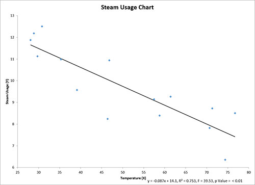
4. Once you have entered the information, select OK and the scatter diagram will be generated. An example based on the data above is shown below
Options for the Scatter Diagram
On the input screen for the scatter diagram, there is the button labeled “Show Options”. If you select that button, the input screen will show the options available for the scatter diagram. It is not required to select any of these options. The options are explained below.
Titles, Dates
If you select the “Titles, Dates” option, the input screen below is shown.
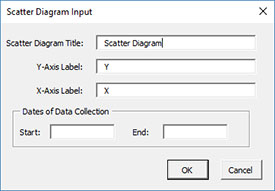
- Scatter Diagram Title: this is the title at the top of the scatter diagram; it defaults to the name of the chart you entered on the first input screen above
- Y Axis Label: this is the label for the Y (vertical) axis; if the headings were selected as shown above, the heading becomes the label; otherwise “Y” is used as the default
- X Axis Label: this is the label for the X (horizontal) axis; if the headings were selected as shown above, the heading becomes the label; otherwise “X” is used as the default
- Dates of Data Collection: enter the start and end dates of data collection; optional; dates will be plotted at the bottom of the chart
- Select OK to use selected options
- Select Cancel to revert to previous options
Labels
If you select the “Labels” option, the input screen below is shown. This option allows you to add labels to the points on the scatter diagram. The labels must be in columns if the X and Y values are in columns (likewise for rows).
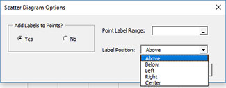
- Add Labels to Points?
- Yes: this option adds labels to the scatter diagram
- No: this option will not labels to the scatter diagram
- Point Labels Range: enter the worksheet range containing the labels; they must be on the same worksheet as the X and Y values
- Label Position: select the position where you want the labels printed (e.g., above the points)
- Select OK to use selected options
- Select Cancel to revert to previous options
Best Fit Equation
If you select the “Best Fit Equation” option, the input screen below is shown.
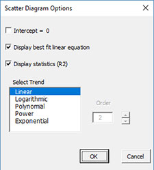
- Intercept = 0: select this option to force the regression through the origin (default is not checked)
- Display best fit linear equation: select this option to draw the best fit line and print the equation (default is checked)
- Display statistics ( F, p, R squared): select this option to print the F value, p Value and R2 value (default is checked); not printed if the Intercept = 0 option is checked.
- Select trend: select from linear (default), logarithmic, polynomial, power or exponential curve fits.
Updating the Scatter Diagram with New Data
The scatter diagram can be easily updated with new data after it has been added to the spreadsheet. The updating of the scatter diagram with new data are based on the X values entry. Suppose the data you used for the original scatter diagram was for sample numbers 1 to 15. The last X value is in cell B18. You have now added new data: samples 16 and 17 as shown below.
When you update the scatter diagram, SPC for Excel does the following:
- If there is data in the first cell below the last X value on the current chart (B18), assume that there is new data; search from that last cell down (if in columns) until the first empty cell is found. In this case, that is cells B21, so the data range is set from B4 to B20.
- If there is no data in the first cell below the last X value on the current chart (B18), but there is data in that, assume that there is no new data.
- If there is no data in the last cell containing the last X value on the current chart (B18), assume that data have been deleted; SPC for Excel searches up until it finds the first cell with data and resets the range for the chart.
Changing the Options for the Scatter Diagram
You can change the current options for the scatter diagram by selecting “Options” on the “Updating/Options” panel on the SPC for Excel Ribbon.
The list of available charts in the workbook will be displayed. Select the chart you want to change options for. The input screen for that chart will be shown and changes can be made. See Changing Chart Options for more information