g Chart Help
Home » SPC for Excel Help » Control Charts Help » Attribute Control Charts Help » g Chart Help
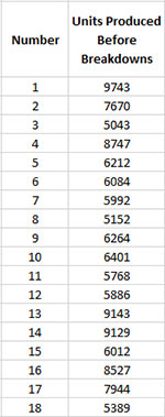
A g control chart is used to monitor the time between rare events or the number between rare events. For example, you might you want to monitor the time between lost time accidents in a plant or the time between infections in a hospital. There are two options with the g control chart. One option is to track the number of units produced between events. In this case, you must enter the sample number (or date) and the number of units produced since the last event. The other option is the time between events. In this case, the dates are entered in one column and SPC for Excel calculates the time between events and puts that time in the adjacent column. The example below deals with the number of units produced between events. For more information on g control charts, please see our SPC Knowledge Base.

This page shows you how to make the g chart. The data can be downloaded at this link. This page contains the following:
Creating a New g Chart
- 1. Select the data on the worksheet to be included in the analysis. You can use “Select Cells” in the “Utilities” panel of the SPC for Excel ribbon to quickly select the cells.
- 2. Select “Attribute” from the “Control Charts” panel on the SPC for Excel ribbon.
- 3. Select “g Chart” and then select “OK”.
- 4. The input screen below for the g chart is displayed. The program sets the initial subgroup identifiers and data ranges based on the range you selected on the worksheet. This is why there is an advantage to selecting the sample and data ranges prior to making the chart. You can edit the ranges if needed here. Enter a name for the chart. In this example, the name “Breakdown” is used as the name of the chart. This is the name that will appear on the worksheet tab containing the control chart. It must be unique – there can not be another workbook tab with that name.
This is all that is needed to make the chart. If you select OK at this point, the software will generate the control chart using the default options. Simple and quick.
The options on the input screen are:
- Subgroup Identifiers: the worksheet range containing the subgroup identifiers
- Data: the worksheet range containing the data
- Name of Chart: chart name – must be a unique name in the workbook and is limited to 25 characters
- Subgroup Identifiers: this information is used to search for new data when updating the chart (see below)
- In One Column: the subgroup identifiers are in one column (as in this example)
- In One Row: the subgroup identifiers are in one row
- Automatic Updating of Limits: option controls whether the average and control limits are updated as new data are added, default value is Yes; set this to No to stop the average and control limits from updating
- Options for Events:
- Time: Select this option if you want the time between events (data must be in single column or row and be dates)
- Number: Select this option to track the number between events (like breakdowns)
- Select OK to create the chart
- Select Cancel to exit the software
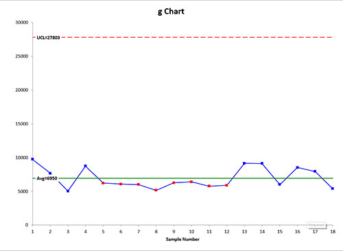
- 5. Once you have select the options you want (again, no options are required to make the chart), select OK and the chart will be generated. An example based on the data above is shown below.
Changing the Options for the g Chart
You can change the current options for a u chart (e.g., changing the out of control tests) by selecting “Options” on the Updating/Options panel on the SPC for Excel Ribbon. See Changing Chart Options for more information
In addition, once a control chart is made, there are numerous actions you can take on the chart including splitting control limits, removing points from the calculations, adding comments, selecting the range on which to base control limits, etc. Please see Control Chart Actions for details.