Xbar-mR-s Chart Help
Home » SPC for Excel Help » Control Charts Help » Variable Control Charts Help » Between/Within Charts Help » Xbar-mR-s Chart Help
There are times when the “within subgroup” variation is significantly different from the “between subgroup” variation. When this occurs, the control limits the Xbar chart in a Xbar-R or Xbar-s combination are very tight and many of the points are out of control. For example, you might have a batch process where you sample a batch four times and use those four samples to form a subgroup. The range between those four subgroups is very small. Using that average range to calculate the control limits for the Xbar chart is what causes the control limits to be so tight. The solution for this type of problem is to use three charts: Xbar-mR-R or the Xbar-mR-s.

This page shows how to create the Xbar-mR-s chart. With the Xbar-mR-s chart, the subgroup averages are plotted on the Xbar chart. The mR is used to monitor the variation in the range between consecutive subgroup averages. The s chart is used to monitor the variation in the within subgroup standard deviation. The data can be downloaded at this link. This page contains the following:
Data Entry
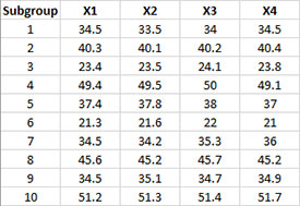
Suppose we are producing a chemical from a batch reactor. We take four samples from each batch and use those four samples to form subgroups. You enter the data are entered into a worksheet as shown below The data does not have to start in A1. It can be anywhere on the spreadsheet. The data can be in rows or in columns.
Creating a New Xbar-mR-s Chart
- 1. Select the data on the worksheet to be included in the analysis. This is the shaded area shown below. You can use “Select Cells” in the “Utilities” panel of the SPC for Excel ribbon to quickly select the cells.
- 2. Select “Variable” from the “Control Charts” panel on the SPC for Excel ribbon.
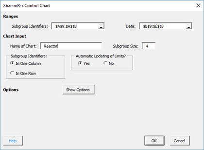
- 3. The input screen for variable control charts is displayed. The Xbar-mR-s chart is on the “Between/Within Charts” tab.
- 4. Select “Xbar-mR-s Chart” from the “Between/Within Charts” tab. Select OK.
- 5. The input screen for the Xbar-mR-s Chart is then displayed. The program sets the initial subgroup identifiers (A9: A18 in the example workbook) and data ranges (B9:E18 in the example workbook)as well as the subgroup size based on the range you selected on the worksheet. This is why there is an advantage to selecting the subgroup and data ranges prior to making the control chart. You can edit the ranges if needed here. Enter a name for the chart. In this example, the name “Reactor” is used as the name of the control chart. This is the name that will appear on the worksheet tab containing the control chart. It must be unique – there can not be another workbook tab with that name.
This is all that is needed to make the control chart. If you select OK at this point, the software will generate the control chart using the default options. Simple and quick.
The options on the input screen are:
- Subgroup Identifiers: the worksheet range containing the subgroup identifiers
- Data: the worksheet range containing the data in subgroups
- Name of Chart: chart name – must be a unique name in the workbook and is limited to 25 characters
- Subgroup Size: enter the subgroup size; default value is determined by the range selected on the worksheet; maximum subgroup size is 100 (note: if you change the subgroup size here, the software will adjust the data range)
- Subgroup Identifiers: this information is used to search for new data when updating the chart (see below)
- In One Column : the subgroup identifiers are in one column (as in this example)
- In One Row: the subgroup identifiers are in one row.
- Automatic Updating of Limits: option controls whether the average and control limits are updated as new data are added, default value is Yes; set this to No to stop the average and control limits from updating
- Show Options: selecting this button shows the various options for this chart (see options below)
- Out of Control Tests
- Control Limit Options
- Titles and Formats
- Manual Control Limits
- Chart Location
- Box-Cox Transformation
- Process Capability
- Select OK to create the control chart
- Select Cancel to exit the software
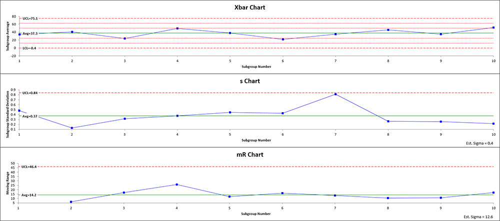
- 6. Once you have select the options you want (again, no options are required to make the control chart), select OK and the control chart will be generated. An example based on the data above is shown below. Note that there is an estimated sigma for the s chart and for the mR chart. Both are printed in the lower right-hand corner of the respective chart.
Options for the Xbar-mR-s chart
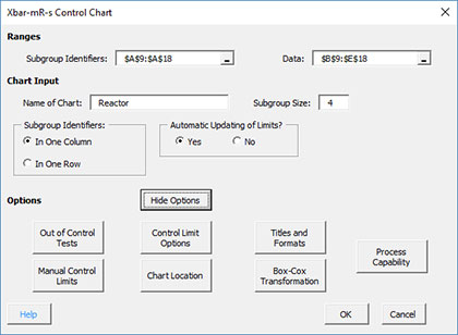
On the input screen for the Xbar-mR-s chart, there is a button labeled “Show Options”. If you select that button, the input screen will show the options available for the chart. It is not required to select any of these options.
Each option is described below.
Out of Control Tests
If you select the Out of Control Tests, the input screen, Tests for Out of Control Points, is displayed below.
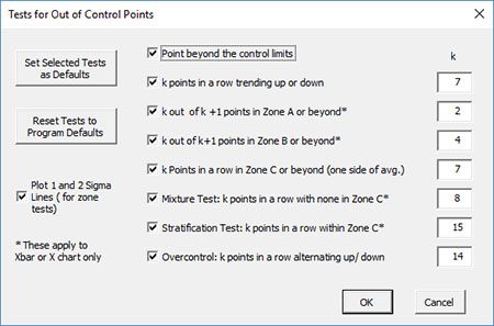
These options include:
- Point beyond the control limits: out of control if a point that is above the upper control or below the lower control
- k points in a row trending up or down: out of control if there are k points in a row trending upward or trending downward; two points in a row that are equal break this trend
- k out of k+1 points in Zone A or beyond: Zone A is two standard deviations of what is being plotted above the average and below the average
- k out k+1 points in Zone B or beyond: Zone B is one standard deviation of what is being plotted above the average and below the average
- k points in a row in Zone C or beyond (one side of avg): Zone C is the zone between the average and one standard deviation above the average on the top half of the chart and the average and one standard deviation below the average on the bottom half of the chart; out of control of there is a run of k points in a row above or below the average
- Mixture Test: k points in a row with none in Zone C: out of control if there are k points in a row not in Zone C on either side of the average
- Stratification Test: k points in a row within Zone C: out of control if there are k points in a row in Zone C on either side of the average
- Overcontrol: k points in row alternating up and down: out of control if k points in a row are such that the values alternate up and down
- Set Selected Tests as Defaults: this will set the selected test and k values as defaults for the type of chart
- Reset Tests to Program Defaults: resets the tests to the original program defaults for the type of chart.
- Plot 1 and 2 Sigma Lines (for zone tests): select this option to plot the 1 and 2 sigma lines on the control chart; this option is overridden by the option to add two additional lines on the Control Limits Options.
Note: only four of these tests apply to the s and mR chart:
- Point beyond the control limits
- k points in a row trending up or down
- k points in a row in Zone C or beyond (one side of avg)
- Overcontrol: k points in row alternating up and down: out of control if k points in a row are such that the values alternate up and down
Control Limit Options
If you select the “Control Limit Options” button, the following is displayed.
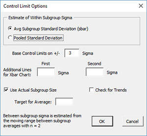
The options include:
- Estimate of Within Subgroup Sigma: defines the way the software estimates sigma (standard deviation) for the s chart
- Avg. Subgroup Standard Deviation (sbar): estimates sigma from the average subgroup standard deviation
- Pooled Standard Deviation: estimates sigma from the pooled standard deviation
- Based Control Limits on +/- ___ Sigma: defines how to calculate the control limits; default is +/- 3 sigma
- Additional Lines for Xbar Chart: the software allows you to add two additional lines to the chart based on multiple of sigma; additional lines are added above the average and below the average; this option will override the option of putting the 1 and 2 sigma lines shown on the Out of Control Tests option.
- Use Actual Subgroup Size: option to use actual subgroup size to determine control limits if subgroup size varies; default is checked; if not checked, the software uses the subgroup size entered on the control chart input screen.
- Check for Trends: option to check for trends; if present, a trend control chart will be made using the best-fit line
- Target for Average: option to enter a target for the average
- Select OK to use selected options
- Select Cancel to revert to previous options
Notes:
- The additional lines, check for trends and target for average options apply only to the Xbar chart.
- The between subgroup variation is estimated from the average moving range where n = 2.
Titles and Formats
If you select the “Title and Formats” button, the following screen is displayed:
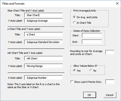
The options include:
- Xbar Chart Title & Y Axis Label:
- Title: title at the top of the Xbar chart; default is “Xbar Chart”
- Y-Axis Label: label to put on the Xbar chart vertical axis; default is “Subgroup Average”
- s Chart Title & Y Axis Label:
- Title: title at the top of the range chart; default is “s Chart”
- Y-Axis Label: label to put on the range chart vertical axis; default is “Subgroup Standard Deviation”
- mR Chart Title & Y Axis Label:
- Title: title at the top of the moving range chart; default is “mR Chart”
- Y-Axis Label: label to put on the moving range chart vertical axis; default is “Moving Range”
- X-Axis Label: label for the horizontal axis for both the Xbar chart and the range chart; default is “Subgroup Number”
- Print Average/Limits:
- On Avg. and Limits: prints the values of the average and control limits on the average and control limit lines on the control chart (this is the default)
- In Chart Title: prints the values of the average and control limits in the control chart title
- Dates of Data Collection: enter the start and end dates of data collection; optional; dates will be plotted at the bottom of the chart
- Rounding to Use for Average and Limits on Chart: used to control the number of decimal places in the values of the average and control limits printed on the chart; default is estimated by the software
- Allow Values Below 0?: select Yes to allow values below 0 on the chart; select No to keep the chart from showing anything below 0; default is Yes
- Show Last K Points Only: option to show only the last K points of the chart; calculations include all the data but only the last K points will be shown
- Select OK to use selected options
- Select Cancel to revert to previous options
Manual Control Limits
If you select the “Manual Control Limits” button, the following screen is displayed:
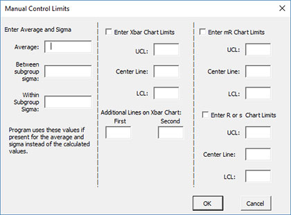
The options include:
- Enter Average and Sigma: the software uses these input values instead of those calculated by the software
- Average: enter the average to be used in the calculations
- Sigma: enter the standard deviation to be used in the calculations
- Enter Xbar Chart Limits: if you select this option, you must enter at least one of the UCL, centerline, and LCL; the software will calculate the values that are not entered
- UCL: enter the upper control limit
- Center Line: enter the center line value
- LCL: enter the lower control limit
- Additional Lines on Xbar Chart: the software allows you to plot two other lines with manual entry; lines are plotted above and below the center line; this option overrides the options above to plot lines at +/- x sigma.
- Enter mR Chart Limits: if you select this option, you must enter at least one of the UCL, centerline, and LCL for the moving range chart; the software will calculate the values that are not entered
- UCL: enter the upper control limit
- Center Line: enter the center line value
- LCL: enter the lower control limit
- Enter R or s Chart Limits: if you select this option, you must enter at least one of the UCL, centerline, and LCL for the range chart; the software will calculate the values that are not entered
- UCL: enter the upper control limit
- Center Line: enter the center line value
- LCL: enter the lower control limit
- Select OK to use selected options
- Select Cancel to revert to previous options
Chart Location
If you select the “Chart Location” button, the following screen is displayed.
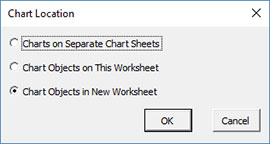
The options are:
- Charts on Separate Chart Sheets: places the Xbar chart on one chart sheet and the range chart on another chart sheet
- Chart Objects on This Worksheet: places both the Xbar and range chart on the worksheet containing the data
- Chart Objects in a New Worksheet: places both the Xbar and range chart on a new worksheet
- Select OK to use selected options
- Select Cancel to revert to previous options
Notes:
- Once a control chart is made, you can move the chart to new locations in the workbook. The software will find the chart when updating.
- This option is not available when a chart’s options are updated since you can manually move the charts to new locations in the workbook
Box-Cox Transformation
Selecting the “Box-Cox Transformation” button displays the following screen:
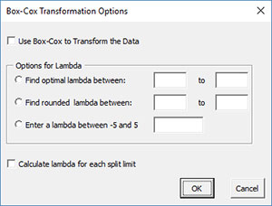
The options are:
- Use Box-Cox to Transform the Data: selecting this option reveals the bottom part of the input form
- Options for Lambda
- Find optimal lambda between: finds the value of lambda that minimizes the standard deviation between the default values of -5 and 5
- Find rounded lambda between: finds the rounded value of lambda that minimizes the standard deviation between the default values of -5 and 5; rounded value of lambda are -5, -4, -3, -2, -1, -.5, 0, .5, 1, 2, 3, 4 and 5
- Enter a lambda between -5 and 5: enter a value of lambda to use between the values of -5 and 5
- Calculate lambda for each split limit: this option will calculate the value of lambda for each set of split control limits
- Select OK to use selected options
- Select Cancel to revert to previous options
Notes:
- The default values of -5 and 5 can be changes when finding the optimal or rounded values of lambda, but must stay between -5 and 5.
- The standard deviation that is minimized is based on the option you selected to estimate sigma for the control chart (see Control Limit Options)
Process Capability
The “Process Capability” button gives you the option to “tie” a control chart to a process capability chart. This is different from running a process capability option by itself. When the process capability is tied to a control chart, the estimated sigma is based on the option you selected to estimate the value of sigma for the range chart for that control chart. For example, you might have 20 subgroups and split the control limits for the last 10 subgroups. In that case, the process capability (when it is tied to a control chart) will be based on the estimated sigma for the last ten subgroups. When you run a process capability by itself, it would use all the 20 subgroups to estimate sigma. If you manually enter the value of sigma to use for the control chart (see Manual Control Limits above), the software will use that value of sigma for the process capability analysis. The process capability chart is added to a new chart sheet.
If you select the “Process Capability” option, the following input screen is shown. You must enter a name for the control chart before this input screen will show. In the example below, the name of the control chart is Reactor. The name of the process capability chart will be the name of the control chart plus “Cpk” – or ReactorCpk in this example.
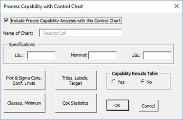
The options include:
- Include Process Capability Analysis with this Control Chart: select this to activate the option, the rest of input screen is then shown
- Name of Chart: name of worksheet tab that will contain the Cpk chart; this name cannot be manually changed
- Specifications: enter specifications or nominal; at least one specification is required
- LSL: enter lower specification
- Nominal: enter nominal
- USL: enter upper specification limit
- Sigma & Avg Lines, Shading: select this to show the Cpk chart options (see the Sigma, Average, Shade option for Cpk charts for details, note: the option to change how sigma is estimated is not available; this is determined by the control chart)
- Titles, Labels, Target, Classes: select this option to show the titles options (see the Titles, Rounding, Dates, Target, Classes option for Cpk charts for details, note: the option for dates and rounding are not available; these are determined by the control chart)
- Capability Results Table: selecting this option places a summary of the process capability results into a summary worksheet; this worksheet contains all the process capability results for the workbook if this option was selected; default value is No.
- Select OK to use selected options
- Select Cancel to revert to previous options
Changing the Options for the Xbar-mR-s Chart
You can change the current options for this control chart (e.g., adding a Box-Cox transformation) by selecting “Options” on the Updating/Options panel on the SPC for Excel Ribbon.
The list of available charts in the workbook will be displayed. Select the chart you want to change options for. The input screen for that chart will be shown and changes can be made. See Changing Chart Options for more information
In addition, once a control chart is made, there are numerous actions you can take on the chart including splitting control limits, removing points from the calculations, adding comments, selecting the range on which to base control limits, etc. Please see Control Chart Actions for details.