Defect Pareto Diagram Help
Home » SPC for Excel Help » Pareto Diagrams Help » Defect Pareto Diagram Help
The Defect Pareto diagram determines how frequently a defect occurred in a set of data. The defect is usually text, such as “dent”, “scratch” or “late delivery”. This page shows you how to make a frequency Pareto chart. The data can be download at this link. This page contains the following:

Creating a New Defect Pareto Diagram
1. Select the data to include in the Defect Pareto diagram. The data can have empty cells in the selected range.
2. Select “Defect” on the “Pareto” panel in the SPC for Excel ribbon
The input screen for the Defect Pareto diagram is shown. Note that the range selected on the worksheet is in the defects range. These can be changed at this point if the ranges are not correct. The only item required to create the Pareto chart at this point is to enter the name of Chart. This is the name that will be on the worksheet tab containing the Pareto chart. In this example, the name “Defect Pareto” is used as the name of the chart.
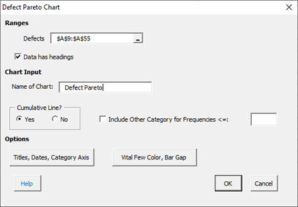
- Defects: range containing the defects
- Data have headings: check if your data have headings (default is checked)
- Name of chart: chart name for worksheet tab containing the Pareto chart – must be a unique name in the workbook and is limited to 25 characters
- Cumulative Line?: option to include cumulative line; default is Yes
- Include Other Category for Frequencies <=: if selected, will group all categories with frequencies less or equal to the value entered into a category called “Other”
- Add Titles/Dates/Category Axis: shows an input screen to change default titles, add dates of data collection or to switch category axis from x to y axis (see Options for the frequency Pareto chart below)
- Select OK to create the Pareto Chart
- Select Cancel to exit the program
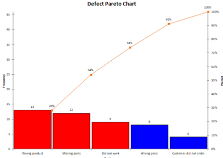
3. Once you have entered the information, select OK and the Pareto chart will be generated on a new chart sheet. An example based on the data in the example workbook is shown below. Note that it is on the worksheet tab “Defect Pareto”.
Options for the Defect Pareto Diagram
The input screen above has the “Add Titles/Dates/Category Axis” option button. See the Frequency Pareto Chart for information on these options.
Updating a Defect Pareto diagram with New Data
After you have added additional data to the worksheet, you can easily update the Pareto chart as shown below. See the Frequency Pareto Chart for information on updating the Pareto chart. When a Pareto chart is updated, the formatting on the chart, the chart title and the axis labels are maintained.
How SPC for Excel Finds New Data to Update the Defect Pareto Diagram
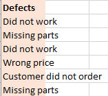
With the Defect Pareto diagram, there may be time when a cell is empty. To find new data, the program finds the last entry in the column. For example, suppose the original data entry is shown below. The program uses the range from A10 to A15 to make the Defect Pareto diagram.
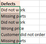
The new data entry is shown below, starting in A17 and ending in A22. When you update the Defect Pareto diagram, the program searches for the last entry in the column, in this case A22. The range from A10 to A22 is used to update the Defect Pareto diagram. Empty cells are ignored.
Changing the Options for a Defect Pareto diagram
You can change the options for a Defect Pareto diagram (for example, adding or removing the cumulative line) by using the same procedures described for the Frequency Pareto Chart. When you change the options, the program does not add any new data to the chart. You have to run “Update Charts” to add the new data.