Frequency Pareto
Home » SPC for Excel Help » Pareto Diagrams Help » Frequency Pareto
The Frequency Pareto diagram contains how frequently a category (e.g., problem) occurred in a data set. The diagram can be easily updated with new data. This page shows you how to make a frequency Pareto diagram. The data can be downloaded at this link. This page contains the following:

Data Entry
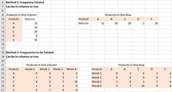
Data are entered into a worksheet and can be in columns or in rows based on how the categories are entered. Consider the case where you are tracking the number of returns by product. In this case, product represents the categories and returns represents the frequencies (the numeric data). You can enter the data in columns (categories are listed in one column) or in rows (categories listed in one row). The frequencies can be summed already or the program will sum the frequencies for each category. For example, you might be tracking the product returns by product by week. It is recommended that you enter 0 when there is no frequency for a category because this helps ensures the Pareto diagram can be updated correctly with new data (see Updating the Frequency Pareto diagram below).
The figure below shows the various options for entering the data into a worksheet. The data does not have to start in A1. It can be anywhere on the spreadsheet. The categories range does not have to be adjacent to the frequencies range.
Creating a New Frequency Pareto Diagram
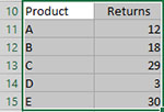
The following steps show how to create a new frequency Pareto diagram. The data in the upper left-hand corner of the figure above will be used.
1.Select the categories and frequencies range on the worksheet. For example, if the data starts in cell A10, select cells A10 to B15.
2. Select “Frequency” on the “Pareto” panel in the SPC for Excel ribbon
The input screen for the Frequency Pareto diagram is shown. Note that the categories and frequencies are already filled in based on the ranges selected on the worksheet. These can be changed at this point if the ranges are not correct. The only item required to create the Pareto diagram at this point is to enter the name of diagram. This is name that will be on the worksheet tab containing the Pareto diagram. In this example, the name “Product Returns” is used as the name of the diagram.
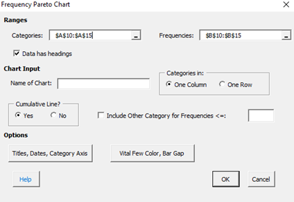
- Categories: range containing the categories, may be edited if not correct
- Frequency: range containing the frequencies, may be edited if not correct
- Data has headings: check if your data have headings (e.g, Product, Returns in this example)
- Name of diagram: diagram name for worksheet tab containing the Pareto diagram – must be a unique name in the workbook and is limited to 25 characters
- Categories in: selected whether categories are in one column or one row based on data selected on range; may be changed if not correct
- Cumulative Line?: option to include cumulative line; default is Yes
- Include Other Category for Frequencies <=: if selected, will group all categories with frequencies less or equal to the value entered into a category called “Other”
- Add Titles/Dates/Category Axis: shows an input screen to change default titles, add dates of data collection or to switch category axis from x to y axis (see Options for the frequency Pareto diagram below)
- Vital Few Color/Bar Gap: shows an input screen to color the vital few bars red and to set the gap between the bars on the chart (see Options for the frequency Pareto diagram below)
- Select OK to create the Pareto diagram
- Select Cancel to exit the program
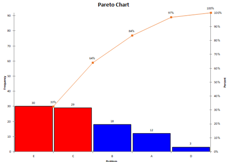
3. Once you have entered the information, select OK and the Pareto diagram will be generated on a new diagram sheet. An example based on the data above is shown below. Note that it is on the worksheet tab “Product Returns”.
Options for the Frequency Pareto Diagram
The input screen above had the “Add Titles/Dates/Category Axis” option button. If you select that button, you will get the input screen below.
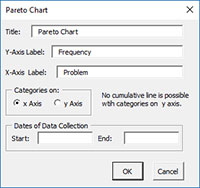
- Title: title to be placed at top of the diagram, default is “Pareto diagram”
- Y-Axis Label: label on vertical axis, default is “Frequency”
- X-Axis Label: label on horizontal axis, default is “Problem”
- Categories on: option to place categories on x axis (default) or on y axis; cumulative line is not done if placed on y axis
- Dates of Data Collection: option to enter start and end dates of data collection; optional; if added appears as text box on bottom left of the completed Pareto diagram
- Select OK to return to the first input screen
- Select Cancel to cancel out any new information entered
The input screen above also had the “Vital Few Color/Bar Gap” option button. If you select this option, you will get the input screen below.
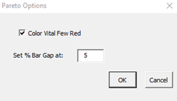
- Color Vital Few Red: this option will color the bars with cumulative value < 80% red, the default option is checked
- Set % Bar Gap at: this controls the width of the bar on the chart; the default is 5; the smaller the value, the wider the bars on the chart are
Updating a Frequency Pareto diagram with New Data
After you have added additional data to the worksheet, you can easily update the Pareto diagram as shown below. When a Pareto diagram is updated, the formatting on the diagram, the diagram title and the axis labels are maintained.
- 1. Select the “Update diagrams” on the Updating/Options panel on the SPC for Excel Ribbon.
- 2. Select the diagram you want to update. All diagrams in the workbook are listed. You can select multiple diagrams at the same time to update.
- 3. Select OK. The program will search for the new data and update the diagram automatically.
How SPC for Excel Finds New Data to Update the Frequency Pareto Diagram
The program looks for new data depending on how the original data was entered.
Categories in one column, frequencies summed option
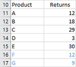
You have added new data (in blue) to the original data as shown below. Products F and G have been added. The program searches from the first data cell (cell A11 in this case) down the column to find the last cell with an entry before an empty cell. This is the range that is used to update the diagram. Note that the original data for returns for products A – E could have been updated as well. The program will use whatever is now in the range from A11 to B17.
Categories in one column, frequencies not summed option
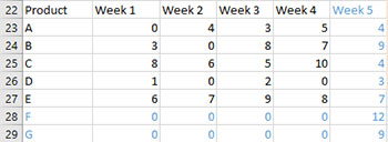
You have added new data (in blue) to the original data as shown below. Week 5 is new data for existing product and products F and G have been added. The program searches two directions for new data. First it searches from cell A23 down to find the last product entry before a empty cell. Then it searches from cell B23 across the row to find the last entry (week 5) before a empty cell. This is why it is recommended that you put 0 in for categories that have no frequency. The new range for the Pareto diagram is contained from A23 to F29.
The program handles the categories in one row in a similar fashion.
Change the Options for a Frequency Pareto Diagram
To change the options for a Pareto diagram (e.g., to change if a cumulative line is added), do the following:
- 1. Select “Options” on the Updating/Options panel on the SPC for Excel Ribbon.
- 2. Select the diagram where you want to change the options.
- 3. Select OK. The input screen for the frequency Pareto diagram will be shown with your current options selected. Change the options you would like to change. Some items cannot be changed. These includes the name of the diagram and whether the data are in columns or rows. Also, the diagram title and axis labels cannot be changed. These should be changed on the diagram directly.
Note: When you change the options, the program does not add any new data to the diagram. You have to run “Update diagrams” to add new data.