BACI Charts Help
Home » SPC for Excel Help » Statistical Tools » Correlation Help » BACI Charts Help
BACI charts are used to judge how a change has impacted a process. It is usually used to judge the impact of a change on the same type of equipment or, at least, equipment that produces the same thing. For example, suppose we have three machines and want to make a change that will increase the value of an output characteristic. We make the change to Machine 1 first to see what impact the change has. This is the baseline data. Then we make the change for Machine 2 followed by Machine 3 and plot the results over time. The program gives you the option to calculate control limits for the baseline data if desired.

Example
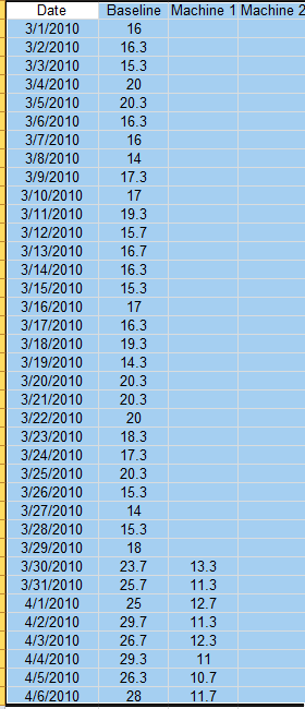
You have three machines making the same product. You want to see if a change will improve an output variable for each machine. You collect baseline data on Machine 1 and then make the change (on 3/30/2010 in data below). After you see the results on Machine 1, you make the change on Machine 2 (4/24/2010) and then on Machine 3 (5/17/2010). The data you collected are shown below.
- 1. Enter the data into a worksheet as shown below. The data must be in columns with the first cell in each column range containing the heading. The data can be downloaded at this link.
- 2. Select the all the data including the headings.
- 3. Select “Correlation” from the “Statistical Tools” panel on the SPC for Excel ribbon.
- 4. Select the “BACI Charts” option and then OK. The input form below is displayed.
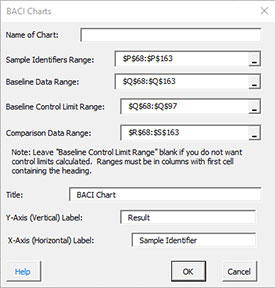
- Name of Chart: This name is the name that will be displayed on the worksheet tab. It must be unique and meet the requirements for naming worksheets tab in Excel.
- Sample Identifiers Range: This is the range that contains the sample identifiers. The default value is the first column in the range selected on a worksheet; must be a single column.
- Baseline Data Range: The range contains the baseline data; default value is the column next to the sample identifiers – must be a single column.
- Baseline Control Limit Range: This is the range within the baseline data to calculate the control limits on; the program scans the first comparison range column to see if there are blanks; if so, the control limit range is the baseline range corresponding to the data in the first comparison range; if this range is left blank, the control limits will not be calculated.
- Comparison Data Range: The range contains the comparison data; – can be more than one column, but each must have a heading.
- Enter Title: This is the title that goes on the chart. The default title is BACI Chart.
- Enter Y-Axis (Vertical) Label: This is the vertical axis label. The default label is Result.
- Enter X-Axis (Horizontal) Label: This is the horizontal axis label. The default label is Sample Identifier.
- Select OK to generate the results.
- Select Cancel to end the program.
BACI Chart Output
The BACI chart for the data in this example is shown below.
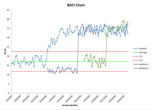
The BACI chart can be updated with new data. Select the “Update Charts” on the “Updating/Options” panel on the SPC for Excel Ribbon. Select the chart you want to update. All charts in the workbook are listed. You have select multiple charts at the same time to update.