Plot Multiple Y Variables Against One X Variable Help
Home » SPC for Excel Help » Statistical Tools » Correlation Help » Plot Multiple Y Variables Against One X Variable Help
The program will plot multiple Y variables against one X variable. The data for this chart must be in columns with the X variable in the first column. The Y variables must be in adjacent columns. An example of how to create this chart is given below for plotting two Y variables against the X variable.

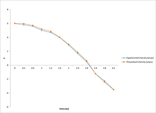
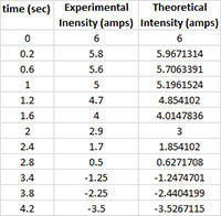
An experiment has been to do to measure the amps from a process over time. The experimenter wants to compare the measured amps to the theoretical amp.
- 1. Enter the data into a worksheet as shown below. The data can be downloaded at this link.
- 2. Select the data and the column headings.
- 3. Select “Correlation” from the “Statistical Tools” panel on the SPC for Excel ribbon.
- 4. Select the “Plot Multiple Y Variables Against One X Variable” option and then OK.
- 5. The following input box is used to enter the range containing the data and the headings. The default is the range selected on the worksheet.
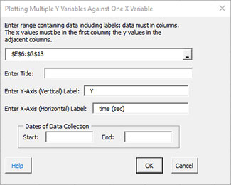
- Enter range: enter the worksheet range containing the data and the headings; the data must be in columns with the x values in the first column followed by the y values in adjacent columns; the default is the range selected on the worksheet.
- Enter Title and Labels: enter the title, y-axis label, and x-axis label; there is no default title, but the default for the y-axis is “Y” while the default for the x-axis is the first cell in the column containing the x values.
- Dates of Data Collection: enter the dates of data collection; optional, if printed will appear in the lower left-hand corner of the chart.
- Select OK to generate the results.
- Select Cancel to end the program.
The chart generated by the above data are shown below.