Scatter Plot Matrix Help
Home » SPC for Excel Help » Statistical Tools » Correlation Help » Scatter Plot Matrix Help
A scatter plot matrix is a two-dimensional array of scatter diagrams between every possible pair of variables in the data. This allows you to quickly scan for relationships between the variables. An example of how to create a scatter plot matrix is given below.

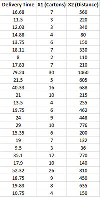
A soft drink bottler is trying to predict delivery times for a driver. He has collected data on the delivery time, the number of cartons delivered and the distance the driver walked. He wants to see the relationship between these three variables. We will use the scatter plot matrix to do this.
- 1. Enter the data into a worksheet as shown below. The data can be downloaded at this link.
- 2. Select the data and the column headings.
- 3. Select “Correlation” from the “Statistical Tools” panel on the SPC for Excel ribbon.
- 4. Select the “Scatter Plot Matrix” option and then OK. The input form below is displayed.
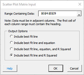
- Range containing data: default is the range selected on the worksheet; include the headings as well as the data.
- Output Options: this option controls the best fit line on each scatter plot.
- Include best fit line.
- Include best fit line and equation.
- Include best fit line, equation and R Squared.
- Include best fit line and R Squared.
- Select OK to generate the results.
- Select Cancel to end the program.
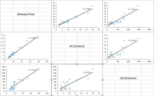
A new worksheet is added and the scatter plot matrix created as shown below. Note that the diagonals contain the names of the variables. This is the y axis variable for that row of charts. For example, on the first row of charts above, the delivery time is the y axis. The first chart has X1 as the x axis and the last chart in the row has X2 as the x axis.