Waterfall Charts Help
Home » SPC for Excel Help » Statistical Tools » Correlation Help » Waterfall Charts Help
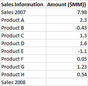
A waterfall chart shows how the initial value of a variable increases or decreases to a final value based on a series of intermediate values that impact that variable. For example, the table below shows that the sales for a company at the end of 2007 was 7.98 million dollars. During 2008, Products A – H either increased in sales (positive number) or decreased in sales (negative number). These increases and decreases lead to the final sales in 2008. A waterfall chart is a picture of this. The example is based on the sales situation described above.

- 1. Enter the data into a worksheet as shown below. The data must be in two adjacent columns. The first column contains the category labels; the second column the numerical data corresponding to those labels. The first cell in each range must be the heading.The data can be downloaded at this link.
- 2. Select the data and the column headings.
- 3. Select “Correlation” from the “Statistical Tools” panel on the SPC for Excel ribbon.
- 4. Select the “Waterfall Chart” option and then OK. The input form below is displayed.
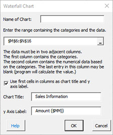
- Name of Chart: This name is the name that will be displayed on the worksheet tab. It must be unique and meet the requirements for naming worksheets tab in Excel.
- Enter the range containing the categories and the data: the default value is the range selected on the worksheet; you may select the range here if the default range is not correct.
- Use first cells in columns as chart title and y axis label: if this selected, the first cell in the first column will be the chart title and the first cell in the second column will be the y axis label.
- Chart Title: Enter the chart title. The default text is the contents of the first cell in the first column range of selected data.
- y Axis Label: Enter the y axis label. The default text is the contents of the first cell in the second column range of selected data.
- Select OK to generate the results.
- Select Cancel to end the program.
Waterfall Chart Output
The output for the data in this example is shown below.
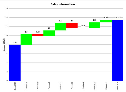
The starting and ending points are in blue. The positive increases to sales are in green. The negative increases are in red. The actual numerical value is included above the data point.
The waterfall chart can be updated with new data. Select the “Update Charts” on the “Updating/Options” panel on the SPC for Excel Ribbon. Select the chart you want to update. All charts in the workbook are listed. You have select multiple charts at the same time to update.