Pareto Diagrams
Home » SPC for Excel Software » Pareto Diagrams
Our SPC software, SPC for Excel, easily creates Pareto diagrams – a great visual way to separate the vital few from the trivial many. There are four Pareto options:
- Frequency - totals the frequency of occurrence by category (e.g., number of returns by product)
- Defect - totals reasons for defects (e.g., reasons for customer returns)
- Variables - totals frequency for categories for different levels of a variable (e.g, defects by shift)
- Two-Level - creates a two-level Pareto diagram (variable -defect)
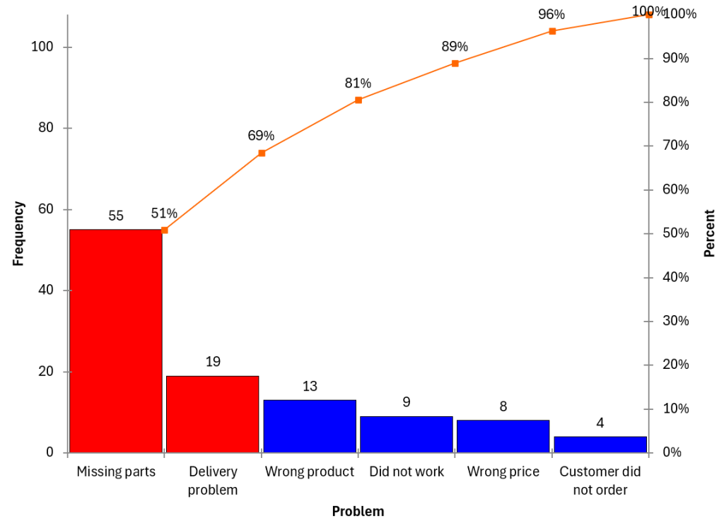
Watch a Video Highlighting How to Make a Frequency Pareto Diagram
Pareto Diagram Features
- New data easily added
- Data can be in rows or columns
- Turn cumulative line on or off
- Add dates of data collection
- Option to create other category for frequencies below a certain value
- Format changes maintained when Pareto diagram is updated
- Option to color the vital few
- Option to set the gap between the bars