SPC for Excel Software
Home » SPC for Excel Software
Create, analyze, and maintain SPC studies directly in Excel
SPC for Excel is built for quality professionals who rely on Excel but need dependable, repeatable SPC without fragile templates or separate SPC applications.
The software runs directly inside Microsoft Excel, allowing you to perform SPC and statistical analysis using the spreadsheets you already trust.
What you can do with SPC for Excel?
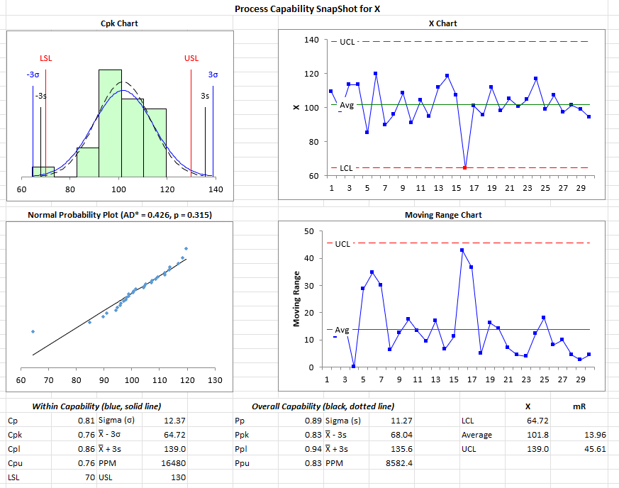
- Process Capability Analysis – to meet your customer needs
- Control Charts and Histogram – to manager your processes
- Gage R&R Study – to validate your measurement system
- Problem Solving Tools (Pareto, histogram, scatter and more) – to help your team solve problems
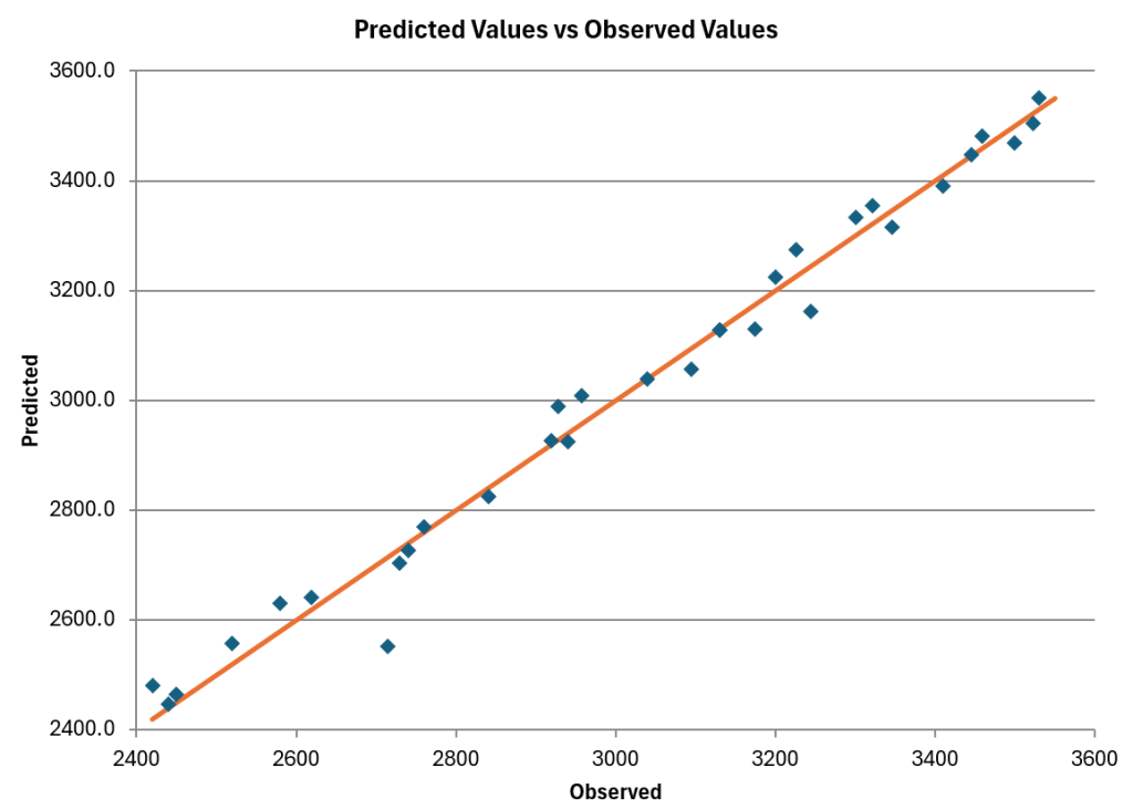
- Advanced Data Analysis Tools (DOE, ANOVA, distribution fitting, regression, hypotheses testing and more) – to meet your advanced needs
Why doing SPC manually or with a template breaks down
Manual SPC relies on custom formulas, copied templates, and individual discipline. Over time, this leads to errors, inconsistency, and unnecessary spreadsheet maintenance.
Common problems include:
-
Formulas copied or overwritten incorrectly
-
Multiple versions of “the same” template
-
Results that vary by user or spreadsheet
-
Rigid templates limit flexibility of analysis
SPC for Excel eliminates these risks by providing:
-
Standardized SPC methods across users
-
Easily update as data changes
-
Consistent, repeatable results
-
Outputs suitable for audits and regulated environments
Teams spend less time fixing spreadsheets and more time improving processes.
A practical, lower cost alternative to standalone SPC and statistical tools
Standalone SPC tools (such as Minitab) often require separate licenses, training, and workflows outside Excel. For Excel-based teams, this increases both cost and complexity.
SPC for Excel provides full SPC capability inside Excel, reducing total cost of ownership.
Compared to standalone SPC software, SPC for Excel offers:
-
Lower overall software cost
-
No separate SPC application to manage
-
Faster adoption by Excel users
-
Perpetual licenses
-
No annual or maintenance fees
Instead of replacing Excel, SPC for Excel strengthens it.
Designed to work the way you already work
SPC for Excel installs directly into Microsoft Excel and becomes part of your normal workflow.
-
Works with Excel 365 / 2021 / 2019 back to 2013
-
Installs locally
-
Easy to uninstall
-
No data export or duplicate files
This makes deployment straightforward for both users and IT teams.
The software includes a getting started guide, on-line videos, built-in online help and example Excel workbooks to help you get started quickly
Used by teams worldwide
With over 100,000 users in 80 countries, SPC for Excel is used in real production SPC environments worldwide.
SPC for Excel is used by:
-
Quality engineers and quality managers
-
Manufacturing and operations teams
-
Healthcare and regulated environments
-
Continuous improvement professionals
- Anyone interested in process improvement
“I like the integration into Excel, possibility to export the graphs seamlessly to Word, the good amount of possible analysis that can be done for measurement processes (especially that I can do traditional GR&R and EMP studies and compare), and that I can calculate sample sizes and do equivalence studies.”
Malte H.
Get started with SPC for Excel
The best way to see if SPC for Excel fits your needs is to try it with your own data.