September 2008
In This Issue
- Introduction
- Understanding X-s Control Charts
- When to Use
- Steps in Construction
- Control Chart Constants
This month’s publication is the first part of a two part series on X-s charts. The X-s chart is often overlooked in favor of the X-R chart. But, the X-s chart might actually be the better chart to use. This month we will introduce X-s charts and describe how they are constructed. Next month we will look at a detailed example of an X-s chart.
Introduction to X-s Control Charts
The most common control chart for years has been the X-R chart. This control chart uses the range to measure the variation within a subgroup. For the measurements within a subgroup, the range is the maximum – minimum value. The range is an easy concept to understand – and to calculate. This was important when the control chart calculations had to be done by hand or with a calculator. But with computer software, this is no longer an issue. One problem with the X-R chart is that the range becomes a poorer and poorer measure of within-subgroup variation as the subgroup size increases. A different method is needed for the larger subgroup sizes. This is where the X-s chart provides the solution. This month’s newsletter introduces the X-s chart.
This type of control chart is used with variables data – data that is taken along a continuum. Time, density, weight, and length are examples of variables data. Like most other variables control charts, it is actually two charts. One chart is for the subgroup averages ( X). The other chart is for the subgroup standard deviations (s).
Understanding the X-s Control Chart
In the past, there has been reluctance to use the X-s chart in place of the X-R chart. The standard deviation is just not as easy to understand as the range. Plus, there was the calculation issue.
Yet, the X-s chart is very similar to the X-R chart. The major difference is that the subgroup standard deviation is plotted when using the X-s chart, while the subgroup range is plotted when using the X-R chart. One advantage of using the standard deviation instead of the range is that the standard deviation takes into account all the data, not just the maximum and the minimum. The constants used to calculate the control limits and to estimate the process standard deviation are different for the X-s chart than for the X-R chart. As for the X-R chart, frequent data and a method of rationally subgrouping the data are required to use the Xbar-s chart.
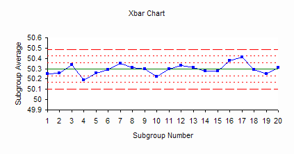
The figures below are an example of an X-s chart. A company is tracking performance of a bagging machine. Each bag should contain a minimum of 50 pounds (lbs) of sand. Ten bags are weighed at the start of each hour. This provides frequent data as well as a method of rationally subgrouping the data. The ten bags are used to form a subgroup, so the subgroup size (n) is 10. The average weight of the ten bags is calculated. This is the subgroup average ( X). The standard deviation of the ten bags is calculated. This is the subgroup standard deviation (s).
The figure below is the X chart. The X values are plotted on this chart. Three lines are plotted on the chart. The middle line is the overall process average; the upper line is the upper control limit; and the lower line is the lower control limit.
The figure below is the s chart. The subgroup standard deviations are plotted on this chart. Three lines are plotted on this chart as well. The middle line is the average standard deviation ( s). The other two lines are the upper and lower control limits for the subgroup standard deviations.
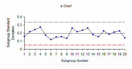
The bagging process represented by control charts above is in statistical control. Since the s chart is in statistical control, this means that the variation between the individual bag weights (the within-hour variation) is consistent over time. We don’t know what the next s value will be, but we do know that it will be between 0.06 and 0.34 with a long term average of 0.2. Since the X chart is in statistical control, the variation in subgroup averages (the hour-to-hour variation) is consistent over time. The next result will be between 50.1 and 50.49 with a long term average of 50.3. The process is consistent and predictable in the near future.
When to Use X-s Control Charts
X-s charts are used to analyze a process operating over time. Like all control charts, they will send a signal when a special cause of variation is present. You can use X-s charts for any subgroup size greater than 1. This means they can be used in place of X-R charts all the time. But, you definitely should use the X-s charts when the subgroup size is 10 or more. The standard deviation gives a better estimate of the variation in large subgroups than the range does.
Data has to be frequently available (multiple samples per hour, day, or week). The subgroups should be formed with rational subgrouping in mind. In the bag weight example above, the subgroups were formed so that the X chart examined the variation in the average bag weight for the subgroup from hour to hour while the s chart examined the variation within the subgroup from hour to hour. Selecting ten bags at the start of the hour helps minimize the variation in the s chart and causes the out of control situations to appear on the X chart.
In situations where either the X-s chart or the X-R chart can be used (small subgroups), the choice is one of convenience more than anything. The control charts will generally look very much alike and you will reach the same conclusions.
The Steps in Constructing an X-s Control Chart
The steps in constructing the X-s chart are given below. Most of the time you will use a software program to generate control charts. However, it is important to understand how the control charts are constructed and the steps in constructing them.
1. Gather the data.
Select the subgroup size (n). Typical subgroup sizes for an X-s chart are 10 or more. However, you can use the X-s chart with any size subgroup of two or more. The concept of rational subgroup should be considered. The objective is to minimize the amount of variation within a subgroup. This helps you “see” the variation in the averages chart easier.
Select the frequency with which the data will be collected. This will be part of the rational subgrouping. Time is always important in taking data and in interpreting the data. Data should be collected in the order in which they are generated (in most cases).
Select the number of subgroups (k) to be collected before control limits are calculated. You can start a control chart with only 5 subgroups. You will need to recalculate the averages and control limits for each new subgroup until you have at least twenty subgroups of data.
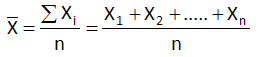
For each subgroup, record the individual sample results. For each subgroup, calculate the subgroup average ( X): where X1, X2, etc. are the individual sample results and n is the subgroup size:
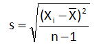
For each subgroup, calculate the subgroup standard deviation:
2. Plot the data.
Select the scales for the x and y axes for both the X and s charts
Plot the subgroup standard deviations (s) on the s chart and connect consecutive points with a straight line.
Plot the subgroup averages on the X chart and connect consecutive points with a straight line.
3. Calculate the overall process averages and control limits.
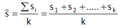
Calculate the average standard deviation (s), where s1, s2, etc. are the standard deviations for subgroups 1, 2, etc. and k is the number of subgroups:
Plot s on the s chart as a solid line and label.
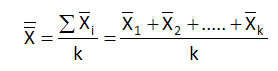
Calculate the overall process average, where X1, X2, etc. are the subgroup averages for subgroups 1, 2, etc:
Plot the overall process average on the X chart as a solid line and label.
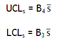
Calculate the control limits for the s chart. The upper control limit is given by UCLs. The lower control limit is given by LCLs. B4 and B3 are control chart constants that depend on the subgroup size.
Plot the control limits on the chart as dashed lines and label.
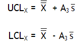
Calculate the control limits for the X chart. The upper control limit is given by UCLX. The lower control limit is given by LCLX. A3 is a control chart constant that depends on the subgroup size.
Plot the control limits on the X chart as dashed lines and label.
4. Interpret both charts for statistical control.
Always consider variation first. If the s chart is out of control, the control limits on the X chart are not valid since you do not have a good estimate of s. All tests for statistical control apply to the X chart. Points beyond the control limits, number of runs and length of runs apply to the s chart.
5. Calculate the process standard deviation, if appropriate.
If the s chart is in statistical control, the process standard deviation can be calculated as:
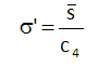
c4 is a control chart constant that depends on subgroup size.
If the control charts indicate that the process is in statistical control, extend the control limits into the future and monitor the process performance using these control limits. If the control charts indicated that there are special causes of variation, find the reason for the special cause of variation and remove it from the process. Once you have 20 points in a row in statistical control, recalculate the control limits based on that data, and use those limits in the future.
X-s Control Chart Constants
Below are the control charts constants for the X-s chart for subgroup sizes up to 25.
| n | A3 | B3 | B4 | c4 |
| 2 | 2.659 | 3.267 | 0.7979 | |
| 3 | 1.954 | 2.568 | 0.8862 | |
| 4 | 1.628 | 2.266 | 0.9213 | |
| 5 | 1.427 | 2.089 | 0.94 | |
| 6 | 1.287 | 0.03 | 1.97 | 0.9515 |
| 7 | 1.182 | 0.118 | 1.882 | 0.9594 |
| 8 | 1.099 | 0.185 | 1.815 | 0.965 |
| 9 | 1.032 | 0.239 | 1.761 | 0.9693 |
| 10 | 0.975 | 0.284 | 1.716 | 0.9727 |
| 11 | 0.927 | 0.321 | 1.679 | 0.9754 |
| 12 | 0.886 | 0.354 | 1.646 | 0.9776 |
| 13 | 0.85 | 0.382 | 1.618 | 0.9794 |
| 14 | 0.817 | 0.406 | 1.594 | 0.981 |
| 15 | 0.789 | 0.428 | 1.572 | 0.9823 |
| 16 | 0.763 | 0.448 | 1.552 | 0.9835 |
| 17 | 0.739 | 0.466 | 1.534 | 0.9845 |
| 18 | 0.718 | 0.482 | 1.518 | 0.9854 |
| 19 | 0.698 | 0.497 | 1.503 | 0.9862 |
| 20 | 0.68 | 0.51 | 1.49 | 0.9869 |
| 21 | 0.663 | 0.523 | 1.477 | 0.9876 |
| 22 | 0.647 | 0.534 | 1.466 | 0.9882 |
| 23 | 0.633 | 0.545 | 1.455 | 0.9887 |
| 24 | 0.619 | 0.555 | 1.445 | 0.9892 |
| 25 | 0.606 | 0.565 | 1.435 | 0.9896 |
Next month, we will continue our look at the X-s control chart.
Summary
This month’s publication has introduced the X-s control chart. Like most other variables control charts, it is actually two charts. One chart is for the subgroup averages ( X). The other chart is for the subgroup standard deviations (s). The X-s chart is very similar to the X-R chart. The major difference is that the subgroup standard deviation is plotted when using the X-s chart, while the subgroup range is plotted when using the X-R chart. One advantage of using the standard deviation instead of the range is that the standard deviation takes into account all the data, not just the maximum and the minimum. An example of an X-s chart was introduced. The steps in constructing the chart were covered and the constants used to calculate the control limits and to estimate the process standard deviation were given.