Moving Average Time Series Analysis Help
Home » SPC for Excel Help » Analysis Help » Time Series Analysis Help » Moving Average Time Series Analysis Help
The Moving Average time series analysis is used to analyze data that has a trend. The Moving Average model is found by calculating the moving average of a constant length. For example, suppose you have a data set that starts out as:
11, 16, 12, 15, 15, 12, 14
The moving average length you selected is 3. The first subgroup is then composed of the first three values: 11, 16, 12. To form the second subgroup, you delete the first entry and add the next entry to the data set. So, the second subgroup is 16, 12, 15; the third subgroup is 12, 15, 15 and so on.

This help page describes how to perform the Moving Average time series analysis using the SPC for Excel software using data that can be downloaded at this link. This page contains the following:
Data Entry
Enter your data in a spreadsheet as shown below. The data must be in a single column with or without a heading. The data can be anywhere in the spreadsheet. There can be no empty cells or non-numeric entries in the data (except if there is a heading). It is important that the data represent evenly spaced data in time.
Running the Analysis
- 1. Select the data on the worksheet to be included in the analysis. You just have to put the cursor in the first row (the data or the heading as shown above). The software will select the data automatically then.
- 2. To start the analysis, select “Time Series” under the “Analysis” panel on the SPC for Excel ribbon. The form below is shown.
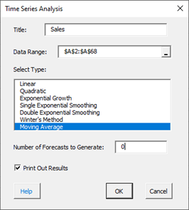
- Title: this is the data name; the default is the first cell in the data column if it is non-numeric; otherwise it is blank.
- Data Range: the range containing the data; if this range is not correct, it can be edited here.
- Select Type: select the time series method you wish to use; Moving Average in this example
- Number of Forecasts to Generate: enter the number of forecasts you want; the default is 0.
- Print out Results: this option prints out the results in a spreadsheet including the model, MAPE, MAD, MSD, the actual values, the fitted values, the residuals, and the forecasts if any; the default is to print out the results. This output is in addition to the chart that is created (see below).
- Select Cancel to stop the analysis.
- Select OK to create to show the next form.
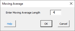
Smoothing Constant (Alpha) Options:
- Enter Moving Average Length: enter the subgroup size for the moving average
- Select Cancel to end.
- Select OK to create the output.
Output
The output from the Moving Average time series analysis consists of two parts: the chart and the printed results (if that option was selected).
The Moving Average chart is shown below. It includes the actual values, the fitted values, the forecasts and 95% confidence limits (if a number greater than 0 was entered; 6 was used in this example), the values of MAPE, MAD, and MSD.
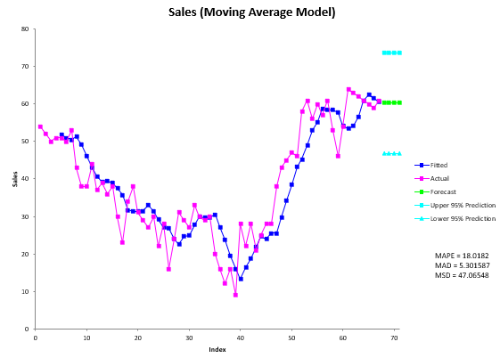
The printed results are shown below. It includes the same information as in the chart but in tabular format.
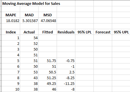
Interpretation of Output
The first thing to do is to examine the chart of the fitted values with the actual values. Decide if the fitted values fit the data. If so then it is probably a good fit. If you ran other models, you compare the three accuracy measures (MAPE, MAD, and MSD) described in the first time series help page. The smaller the values, the better the fit.
If there are forecasts values, you can check to see how good they might be. You want the fitted values to closely follow the actual results. If it begins to vary at the end of the actual data, something may be changing (like the trend).