Time Series Analysis Help
Home » SPC for Excel Help » Analysis Help » Time Series Analysis Help
A time series is a series of data points in time order, taken at successive equally spaced points in time, such as daily, yearly, etc. A time series is plotted over time as a run chart. One use of time series analysis is to forecast future values based on history. The objective is to find patterns in the data that can be used to extrapolate those patterns into the future.
The SPC for Excel software has seven time series methods:

This help page describes how to select a model and how to compare models. Information on each individual model is given in the links above. In this page:
- Mean Absolute Percentage Error (MAPE)
- Mean Absolute Deviation (MAD)
- Mean Squared Deviation (MSD)
Selecting a Model
Selecting a time series model to use depends in part on whether the data has a trend component and/or a seasonal component. The table below summarizes when to use the various time series models.
Time Series Models in SPC for Excel
| Trend but No Seasonal | No Trend and No Seasonal | No Trend but Seasonal | Trend and Seasonal | |
|---|---|---|---|---|
| Linear | X | |||
| Quadratic | X | |||
| Exponential Growth | X | |||
| Single Exponential Smoothing | X | |||
| Double Exponential Smoothing | X | |||
| Winter’s Method | X | X | ||
| Moving Average | X |
For example, if your data appears to have a trend (e.g., upward for sales), you can use the Linear, Quadratic , Exponential Growth or Double Exponential Smoothing models. Use the Quadratic or Exponential Growth model if there is curvature in your data. If your data does not appear to have a trend and does not have any seasonal aspects (e.g., swimming pool supplies), use the Moving Average or the Single Exponential Moving model. Winter’s method is used if you have seasonal data.
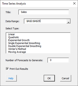
To access the Time Series Analysis, select “Time Series” under the “Analysis” panel on the SPC for Excel ribbon and the form below is shown. Select the time series method you want to use, the number of forecasts you want to use and OK.
Comparing Models
There are several ways to compare models. One is visual. The points should be randomly distributed around the fitted values. You can also compare models by comparing the three measures of accuracy:
- Mean Absolute Percentage Error (MAPE)
- Mean Absolute Deviation (MAD)
- Mean Squared Deviation (MSD)
These are used in all models and are described below. The smaller the values, the better the model fits the data. Often, a model with a better fit will have smaller values of all three measures. However, if this is not the case, MAPE is usually used to judge which model is best.
Mean Absolute Percentage Error (MAPE)
MAPE measures the accuracy of fitted time series values as a percentage of the error. It is given by:
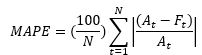
where:
- At = actual value at time t
- Ft= fitted value at time t
- N = number of data points (time intervals)
The value of MAPE tells you how far off the forecast is. For example, if MAPE = 9.13 (as is the case for the data used in the linear time series analysis help), it means that the forecast is off by an average of 9.13% for the data. If the value of MAPE is exceptionally large, it may be because there are values close to 0. This inflates the MAPE. The smaller the value of MAPE, the better the fit.
Mean Absolute Deviation (MAD)
Mean absolute deviation is another measure of the accuracy of the fitted time series values. It is given by:
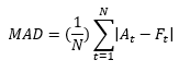
The smaller values of MAD represent a better fit for the model.
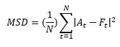
Mean Squared Deviation (MSD)
This is the third measure of accuracy of the fitted time series values. Again, the smaller the value, the better the fit.