Single Exponential Smoothing Help
Home » SPC for Excel Help » Analysis Help » Time Series Analysis Help » Single Exponential Smoothing Help
The Single Exponential Smoothing time series analysis is used to analyze data that has no trend and no seasonal component. The Single Exponential Smoothing model used for the fit is:
Ŷ1 = Y1
Ŷt+1 = αYt + (1 – α)Ŷt
where
- Yt = the value of the data at time t
- Ŷ = the fitted value at time t
- α = weighting constant

This help page describes how to perform the Single Exponential Smoothing time series analysis using the SPC for Excel software with the data that can be downloaded at this link. This page contains the following:
Data Entry
Enter your data in a spreadsheet as shown below. The data must be in a single column with or without a heading. The data can be anywhere in the spreadsheet. There can be no empty cells or non-numeric entries in the data (except if there is a heading). It is important that the data represent evenly spaced data in time.

Running the Analysis
Select the data on the worksheet to be included in the analysis. You just have to put the cursor in the first row (the data or the heading as shown above). The software will select the data automatically then.
To start the analysis, select “Time Series” under the “Analysis” panel on the SPC for Excel ribbon. The form below is shown.
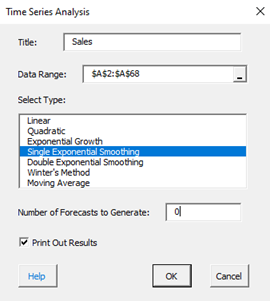
- Title: this is the data name; the default is the first cell in the data column if it is non-numeric; otherwise it is blank.
- Data Range: the range containing the data; if this range is not correct, it can be edited here.
- Select Type: select the time series method you wish to use; Single Exponential Smoothing in this example
- Number of Forecasts to Generate: enter the number of forecasts you want; the default is 0.
- Print out Results: this option prints out the results in a spreadsheet including the model, MAPE, MAD, MSD, the actual values, the fitted values, the residuals, and the forecasts if any; the default is to print out the results. This output is in addition to the chart that is created (see below).
- Select Cancel to stop the analysis.
- Select OK to create to show the next form below.
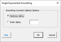
Smoothing Constant (Alpha) Options:
- Optimize Alpha: this option allows the software to find the value of alpha that minimizes the sum of the errors squared.
- Enter Alpha: this option allows you to enter the weighting constant to be used
- Select Cancel to end.
- Select OK to create the output.
Output
The output from the Single Exponential Smoothing time series analysis consists of two parts: the chart and the printed results (if that option was selected).
The Single Exponential Smoothing chart is shown below. It includes the actual values, the fitted values, the smoothing constant, and the values of MAPE, MAD, and MSD. The forecasts, if included, are also shown along with the upper and lower 95% prediction limits.
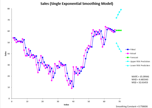
The forecast values are the fitted value at t+1, where t is the last actual time interval. The prediction limits are given by:1
Var(et(k))=[1 + (k – 1)α2]σe2
Upper Prediction Limit = Forecast + 1.96 × [Var(et(k))]1/2
Lower Prediction Limit = Forecast – 1.96 × [Var(et(k))]1/2
where k = number of steps ahead and σe2 = Var(et(l)) = the variance of the one step ahead forecast errors, which is estimated from the data used for fitting.
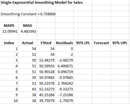
The printed results are shown below. It includes the same information as in the chart but in tabular format.
Interpretation of Output
The first thing to do is to examine the chart of the fitted values with the actual values. Do the fitted values follow the actual values? If the points do that, then it is probably a good fit. If you ran other models, you compare the three accuracy measures (MAPE, MAD, and MSD) described in the first time series help page. The smaller the values, the better the fit.
1Prediction Intervals fro the Holt-Winters Forecasting Procedure; Chatfield and Yar, International Journal of Forecasting 6 (1990)