In this issue:
This month’s publication introduces the c control chart. On occasion, there is a customer complaint. Sometimes someone gets injured on the job. Sometimes the warehouse does not have an item that is supposed to be in stock. These situations require examining counting type attributes data. Each count (customer complaint, injury, or stock out) is considered a defect. The c chart is one technique to use for examining variation in counting type attributes data over time.
c Control Charts
c charts are used to look at variation in counting type attributes data. They are used to determine the variation in the number of defects in a constant subgroup size. Subgroup size usually refers to the area being examined. For example, a c chart can be used to monitor the number of injuries in a plant. In this case, the plant is the subgroup. Since the plant doesn’t change size very often, it is a subgroup of constant size.
To use the c chart, the opportunities for defects to occur in the subgroup must be very large, but the number that actually occurs must be small. For example, the opportunity for injuries to occur in a plant is very large, but the number that actually occurs is small.
Operational definitions (March 2004publication available on website) must be used to determine what constitutes a defect. A subgroup can contain different types of defects. For example, a customer complaint can occur for a number of different reasons. If this is the case, operational definitions must exist for each defect.
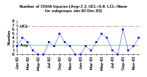
The figure above is an example of a c chart. In this example, the variation in the number of OSHA recordable injuries in a plant is being monitored. The subgroup size in this case is the plant. The operational definition for an injury is any injury that is OSHA recordable. The opportunity for defects to occur is very large since there are many opportunities for injuries to occur. However, the number of defects (injuries) that actually occur is small. A c chart is appropriate under these conditions. The time frame was selected as one month.
The number of injuries each month is plotted for a two-year period. For example, there were 2 injuries (c = 2) in January 2002 and 4 injuries (c =4) in February 2002. The overall average and control limits have also been calculated and plotted.
The figure is in statistical control. What does it mean when the c chart is in statistical control? It means that there are only common causes of variation present (see January 2004 publication on variation, available on the web-site). It also means that the number of injuries will remain consistent in the near future. The average number per month will be around 2. Some months it may be as high as 6, others as low as 0.
Since the process is in control, the system must be changed to decrease the number of injuries. This is management’s responsibility. However, the people closest to the job will usually have great ideas about what needs to be done to improve the process. They usually do not have the authority to make the required changes. Attempting to decrease the number of injuries by encouraging the workforce to be more careful will not work. The process must be changed. Examine the reasons why injuries occur. A Pareto diagram (June 2004publication available on the website) can be used for this. Look for ways to prevent injuries from occurring in the first place.
Steps in Constructing a c Control Chart
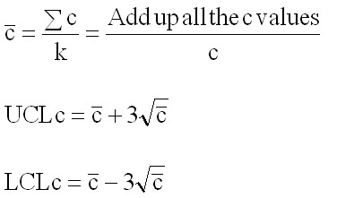 The steps in constructing a c chart are given below. The equations you need are shown to the right.
1. Gather the data
a. Select the subgroup size. The subgroup size is the area where defects have the opportunity to occur. It must be constant from subgroup to subgroup. The opportunity for defects to occur must be large. The number of defects that actually occur must be small.
b. Select the frequency with which the data will be collected. Data should be collected in the order in which they are generated.
c. Select the number of subgroups (k) to be collected before control limits will be calculated (at least twenty).
d. Count the number of defects (c) in each subgroup. Ensure that operational definitions of a defect are complete.
e. Record the data.
2. Plot the data.
a. Select the scales for the control chart.
b. Plot the values of c for each subgroup on the control chart. c. Connect consecutive points with straight lines.
3. Calculate the process average.
a. Calculate the process average number of defects ( c):
b. Draw the process average number of defects on the control chart as a solid line and label.
4. Calculate the control limits.
a. Calculate the control limits for the c chart. The upper control limit is given by UCLc. The lower control limit is given by LCLc.
b. Draw the control limits on the control chart as dashed lines and label.
5. Interpret the chart for statistical control.
a. The following tests for statistical control as a minimum should be used (see April 2004publication available on the website). If any of these conditions are present, the process is out of statistical control due to the presence of a special cause of variation.
· Points beyond the control limits
· Seven points in a row trending up or trending down
· Seven points in a row above or below the average
Summary
This month’s publication looked at how to use a c control chart. To use a c control chart, the opportunity for defects to occur must be large, but the actual number that occur must be small. The steps in how to construct a c control chart were covered.