In this issue:
Many customers today are examining quality from many different aspects. Not only do customers want a product that meets their expectations, but they also want quality in items associated with the product. These items include things such as accurate paperwork that might accompany a delivery, deliveries arriving on time, and having the phone answered when the customer calls. How can we monitor these types of situations over time? The p control chart, introduced this month, is useful for determining the variation in yes/no type data, e.g., the paperwork is right or it is not.
p Control Charts
A p control chart is used to look at variation in yes/no type attributes data. There are only two possible outcomes: either the item is defective or it is not defective. The p control chart is used to determine if the fraction of defective items in a group of items is consistent over time.
A product or service is defective if it fails to conform to specifications or a standard in some respect. For example, consider the case of a customer calling the company to place an order. The customer would probably not like to have the phone ring 10 to 15 times before it is answered. Suppose you have determined that the operational definition for answering the phone in a timely fashion is “to answer the phone on three or fewer rings.” Using this definition, you could monitor the fraction of phone calls answered or not answered in a timely fashion. If a phone call is answered on or before the third ring, the item (answering the phone call) is not defective. If the phone call is not answered on or before the third ring, the item is defective.
You use a p control chart when you have yes/no type data. This type of chart involves counts. You are counting items. To use a p control chart, the counts must also satisfy the following two conditions:
- You are counting n items. A count is the number of items in those n items that fail to conform to specification.
- Suppose p is the probability that an item will fail to conform to the specification. The value of p must be the same for each of the n items in a single sample.
If these two conditions are met, the binomial distribution can be used to estimate the distribution of the counts and the p control chart can be used. Be careful here because condition 2 does not always hold. For example, some people use the p control chart to monitor on-time delivery on a monthly basis. This is not valid unless the probability of each shipment during the month being on time is the same for all the shipments. Big customers often get priority on their orders, so the probability of their orders being on time is different than that of other customers and you can’t use the p control chart. The example below will take you through the steps to construct a p control chart.
Example
A team in an accounting group has been working on improving the processing of invoices. The team is trying to reduce the cost of processing invoices by decreasing the fraction of invoices with errors. The team developed the following operational definition for a defective invoice: an invoice is defective if it has incorrect price, incorrect quantity, incorrect coding, incorrect address, or incorrect name. The team decided to pull a random sample of 100 invoices per day. If the invoice had one or more errors it was defective. The data from the last 25 days are given in the table.
| Day Number | Invoices Inspected (n) | Number Defective (np) | Fraction Defective (p) |
|---|---|---|---|
| 1 | 100 | 22 | 0.22 |
| 2 | 100 | 33 | 0.33 |
| 3 | 100 | 24 | 0.24 |
| 4 | 100 | 20 | 0.20 |
| 5 | 100 | 18 | 0.18 |
| 6 | 100 | 24 | 0.24 |
| 7 | 100 | 24 | 0.24 |
| 8 | 100 | 29 | 0.29 |
| 9 | 100 | 18 | 0.18 |
| 10 | 100 | 27 | 0.27 |
| 11 | 100 | 31 | 0.31 |
| 12 | 100 | 26 | 0.26 |
| 13 | 100 | 31 | 0.31 |
| 14 | 100 | 24 | 0.24 |
| 15 | 100 | 22 | 0.22 |
| 16 | 100 | 22 | 0.22 |
| 17 | 100 | 29 | 0.29 |
| 18 | 100 | 31 | 0.31 |
| 19 | 100 | 21 | 0.21 |
| 20 | 100 | 26 | 0.26 |
| 21 | 100 | 24 | 0.24 |
| 22 | 100 | 32 | 0.32 |
| 23 | 100 | 17 | 0.17 |
| 24 | 100 | 25 | 0.25 |
| 25 | 100 | 21 | 0.21 |
These data will be used to construct a p control chart. The subgroup size is n = 100. The p values for each subgroup (day) have been calculated and are shown in the table. For example, for day 1, there were 22 defective items (np) found in the 100 invoices inspected. Thus, p = np/n = 22/100 = 0.22 or 22%. The p values for the other days are calculated similarly.
Averages and Control Limits
The next step is to calculate the average fraction defective. To determine the average, we add up all the np values and divide by the sum of all the n values. The sum of the np values is 621; the sum of the n values is 2500. The average is then calculated as shown below.
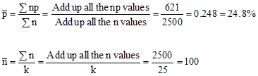
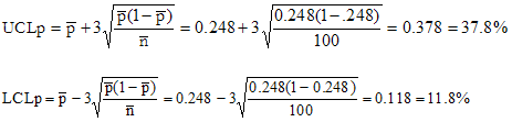
The next step is to determine the average subgroup size. Since the subgroup size is constant, the average subgroup size is 100. This average calculation is shown in the second equation where k is the number of subgroups. The next step is to calculate the control limits. The control limits calculations are shown below.
Making the Chart
The values of p, the average, and the control limits are plotted in the figure. See if you can answer the four questions below.
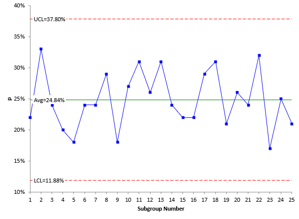
- What variation is the p control chart examining?
- Is the process in statistical control? What does this mean?
- What should be done next to work on improving this process?
- What other type of statistical tool could be used in conjunction with this p control chart and why?
ANSWERS: The variation being examined is the variation in the % of invoices with errors from day to day. The process is in statistical control (see our April 2004 e-zine on interpreting control charts on the website). This means that the process is consistent and predictable. On average, each day will have about 25% of the invoices with errors. Some days it may be as high as 37% or as low as 12%. Only common causes of variation are present (January 2004 e-zine). The process is in statistical control. Note that this does not mean that the process is acceptable. Having 25% of invoices with errors is not acceptable. The next step is to apply a problem-solving model (May 2004 e-zine) to reduce the number of errors. You should be using a Pareto diagram (June 2004) with this p control chart. The Pareto diagram is used to determine the reason for errors and the frequency with which they occur.
Varying Subgroup Size
In constructing a p control chart, the subgroup size should be constant if possible. If not, the values of n should not vary by more than ± 25%. The impact of the subgroup size can be seen by examining the equations for the control limits. The control limits have the average subgroup size in the denominator under the square root sign. If the subgroup size varies too much, the average subgroup size is not a good estimator of n. In these cases, the control limits have to be calculated for each varying subgroup size. In the control limit equations, nbar is replaced by n, the actual subgroup size.
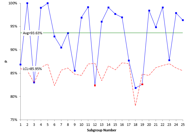
A company is monitoring the percentage of line items that are shipped correctly from a major supplier. They have collected data for the past 25 weeks. Each week the number of line items shipped from the supplier is determined as well as the number of line items shipped correctly. The data for the past 25 weeks are shown in the table.
| Week | Number Shipped (n) | Number Shipped Correctly (np) | % Correct (p) | pbar | LCLp | UCLp |
| 1 | 91 | 79 | 86.81% | 93.63% | 85.95% | 101.31% |
| 2 | 81 | 81 | 100.00% | 93.63% | 85.49% | 101.77% |
| 3 | 47 | 39 | 82.98% | 93.63% | 82.94% | 104.32% |
| 4 | 99 | 98 | 98.99% | 93.63% | 86.26% | 100.99% |
| 5 | 120 | 120 | 100.00% | 93.63% | 86.94% | 100.32% |
| 6 | 42 | 39 | 92.86% | 93.63% | 82.32% | 104.93% |
| 7 | 84 | 76 | 90.48% | 93.63% | 85.63% | 101.62% |
| 8 | 94 | 88 | 93.62% | 93.63% | 86.07% | 101.19% |
| 9 | 69 | 59 | 85.51% | 93.63% | 84.81% | 102.45% |
| 10 | 65 | 63 | 96.92% | 93.63% | 84.54% | 102.72% |
| 11 | 121 | 120 | 99.17% | 93.63% | 86.97% | 100.29% |
| 12 | 125 | 103 | 82.40% | 93.63% | 87.07% | 100.18% |
| 13 | 51 | 49 | 96.08% | 93.63% | 83.37% | 103.89% |
| 14 | 108 | 107 | 99.07% | 93.63% | 86.58% | 100.68% |
| 15 | 86 | 84 | 97.67% | 93.63% | 85.73% | 101.53% |
| 16 | 131 | 127 | 96.95% | 93.63% | 87.23% | 100.03% |
| 17 | 122 | 107 | 87.70% | 93.63% | 86.99% | 100.26% |
| 18 | 22 | 18 | 81.82% | 93.63% | 78.00% | 109.25% |
| 19 | 69 | 57 | 82.61% | 93.63% | 84.81% | 102.45% |
| 20 | 65 | 64 | 98.46% | 93.63% | 84.54% | 102.72% |
| 21 | 97 | 92 | 94.85% | 93.63% | 86.19% | 101.07% |
| 22 | 109 | 108 | 99.08% | 93.63% | 86.61% | 100.65% |
| 23 | 123 | 108 | 87.80% | 93.63% | 87.02% | 100.23% |
| 24 | 94 | 92 | 97.87% | 93.63% | 86.07% | 101.19% |
| 25 | 82 | 79 | 96.34% | 93.63% | 85.54% | 101.72% |
The subgroup size varies each week. In this case, we should recalculate the control limits each week. The control limits are shown. Note that the control limits change each time the subgroup size changes. The control chart is shown in the figure below. Notice how the control limits change as the subgroup size changes. Is this chart in statistical control? What does that mean?
Summary
This month’s publication looked at p control charts. p control charts are used to monitor the variation in the fraction of defective items in a group of items. The steps in how to construct a p control chart were introduced along with how to handle varying subgroup sizes.
nice example, but for the varying subgroup size the LCLp is not varying in table. The plot appears to have the correct values.
Thanks! 19 years it has been that way and you found it. I put the right data in the table, plus redid the control charts so they are larger.
Hi Looks like the table has not been updated. I thought i was going mad until I saw this comment. 🙂
I thought i had updated that table! It is updated now.