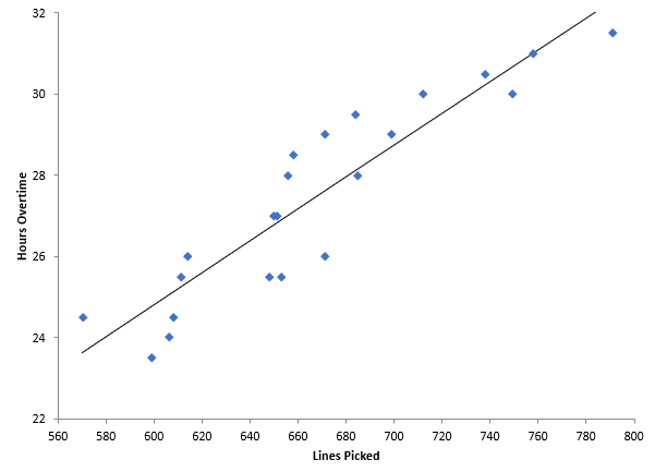
Our previous blog (What is a Scatter Diagram?) included an example of overtime in a warehouse. You are a warehouse manager, and your boss is concerned about overtime. You think that overtime is caused by the work level – the more lines picked in the warehouse, the more overtime. You constructed a scatter diagram to see if that is true. That scatter diagram is shown below.
How do you analyze this scatter diagram? There are several things you can do. First, you can simply look at the scatter diagram and see what it tells you. Is there a positive, negative or no correlation present? These were described in our previous blog. In this example, it appears that, as the number of lines picked increases, the overtime hours also increase. There appears to be a positive correlation between lines picked and overtime.
Another way to analyze a scatter diagram is to add a “best-fit” line and then see if it is statistically significant. The best-fit line is displayed in the scatter diagram above. The best-fit line is given by the equation below.
Overtime Hours = 0.0392(Lines Picked) + 1.298
The coefficient for lines picked is 0.0392. This tells you how much overtime increases for each line picked. It increases 0.0392 hours per line picked. But is it statistically significant? A best-fit line simply represents a regression analysis between the two variables. This type of analysis generates a p-value, which is a measure of how significant the results are. If the p-value is less than 0.05, there is a statistically significant correlation between the two variables. The p-value in this example is less than 0.01, so there is a statistically significant correlation between the two.
Just because something is statistically significant does not mean that it is of use to you. Large data sets can have statistically significant relationships but not be of value to you. You use the R2 value to help you determine this. R is the correlation coefficient. The R2 value is simply the square of R. R2 can vary from 0 to 1. R2 gives the amount of variation in y that is explained by the variation in x. R2 in this example is 0.845. This means that 84.5% of the variation in overtime is explained by the variation in lines picked. You usually want values of R2 to be 80% or larger – this means that there is a useful correlation between the two variables.
The chart above was generated by the SPC for Excel software. This software gives you the best-fit line as well as the p-value and R2 value.
