There are times we want to compare things, e.g., different machines, different raw materials or different shifts. There are several ways to do this statistically, but visual is always best. And the best visual technique for comparing things is the Analysis of Means (ANOM) method.
Suppose you have five different treatment methods you are considering for coating parts. For each treatment method, you coat four parts and measure the coating weight. For each treatment method, you calculate the average and the range.
Of course, the treatment averages are not usually the same. This is not unexpected. Normal process variation will cause the averages to be different. The question we want to answer is:
“Are there any significant differences in the treatment averages?”
And ANOM can be used to do that.
- The steps in the ANOM methodology are given below.
- Collect the data by running the experiments
- Calculate the subgroup (treatment) averages and ranges
- Calculate the overall average and the average range
- Plot the subgroup averages and overall average on the ANOM chart
- Calculate the detection limits:
- Detection Limits = Overall Average ± ANOMs(Average Range)
- Plot the detection limits on the ANOM chart
- Interpret the ANOM chart
ANOMs is called a scaling factor. It depends on the subgroup size, the number of subgroups and the overall alpha (s) level you select for the analysis. Typical values of alpha are 1%, 5%, and 10%. Alpha represents how sensitive the analysis is. The larger alpha is, the more sensitive the analysis is and the more likely it is to get a false signal. The smaller alpha is, the less sensitive the analysis is and the less likely it is to get a false signal.
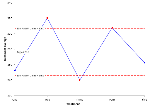
An example of an ANOM chart is shown below with 10% ANOM limits.
The ANOM chart shows three treatment averages beyond the detection limits: two, three and four. These three treatments have significantly different coating weight averages than the overall average.
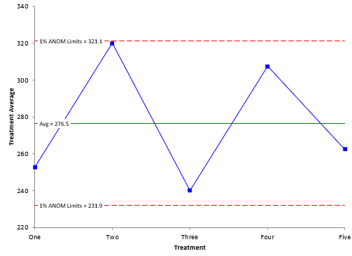
Suppose we used an alpha of 1%. This means the analysis would be less sensitive. The resulting ANOM chart is shown below.
The detection limits with the smaller alpha are wider. Note that with this less sensitive analysis, all the treatment averages are within the detection limits.
The ANOM looks very much like a control chart. The difference is that the ANOM chart has detection limits, based partially on the alpha level which you select. Control limits also have an alpha level set by the number of subgroups and subgroup size. You don’t have the option to change the alpha level with a control chart. You want alpha levels for control charts to be smaller to avoid the false signals.
For more information on ANOM, please see our SPC Knowledge Base article, The Analysis of Means and Ranges. Our SPC for Excel software contains the ANOM methodology.

