Our recent blog, entitled What Do These Histograms Tell You?, showed you five different histograms. The blog challenged you to figure out what the histograms were telling you about a supplier’s process. This is the background information we gave in our blog:
“A supplier sends in weekly shipments of one raw material to you. There is one raw material characteristic that is key to how it performs in your process. The supplier provides you with a Certificate of Analysis with each shipment that includes the measured value for this raw material characteristic. You have the last 50 Certificates of Analysis. You use those 50 measured values to construct a histogram with the specifications overlaid.
You believe that the data should be normally distributed. This means that the distribution should be bell-shaped with most of the data near the average. As you move away from the average, there is less and less data.”
We then gave the five histograms below that were created from the supplier’s data. And then we asked:
What does each histogram tell you about your supplier’s process and what impact does that probably have on your process?
Our answers are below.
Histogram 1
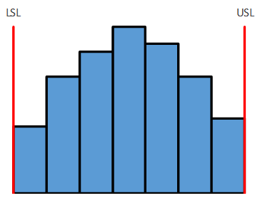
In Histogram 1, there are no tails on the histogram. The histogram ends right at the USL and LSL. With a normal distribution, you would expect to have some more data beyond the specification limits. It appears that the supplier is doing 100% inspection and sorting the raw material to ensure that only in-specification material is shipped to you. This increases the supplier’s cost and the price you pay for the raw material. It is clear that the supplier’s process is not capable of meeting your specifications.
Histogram 2
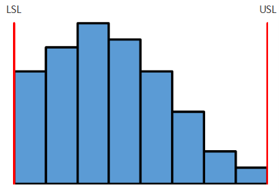
For Histogram 2, the process is not centered within the specifications. It is essentially the same process as in Figure 1, just no longer centered relative to the specifications. Again, the supplier must sort material to ensure that only in-specification material is being sent. This, again, increases the supplier’s cost and the price you pay. More product is out of specification in Histogram 2 than Histogram 1 simply because the process is not centered. The supplier’s process is not capable of meeting your specifications.
Histogram 3
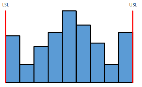
The supplier appears to be producing material that is out of spec in Histogram 3. There should be tails on both sides of the histogram. The supplier may be reworking this material to bring it back into specification increasing his cost and your price. Or, the supplier simply changes the test result to say material out of specifications is just within specifications. Either way, the supplier cannot meet your specifications. The supplier is having to test and sort – increasing the supplier’s cost and his price.
Histogram 4
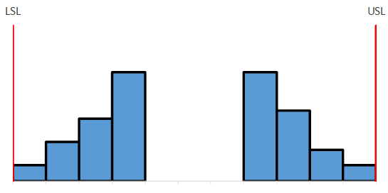
Histogram 4 is an interesting histogram. Who is getting the good material in the middle? Not you. The supplier is sorting the material and sending the center cut to another customer who probably has tighter specifications. This can very well cause you problems in your process as you use raw material from the top part sometimes and then from the bottom part sometimes.
Histogram 5
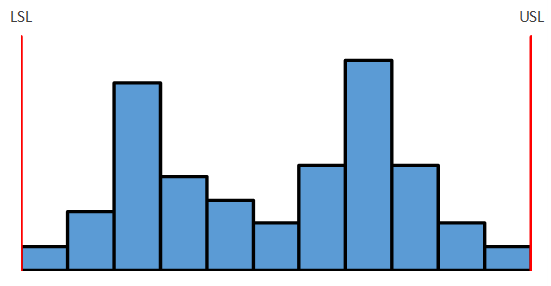
Histograms should only have one peak. Histogram 5 has two. This shows that there are two processes present in the supplier’s process. It could be two machines, two shifts, two raw material suppliers, etc. The two processes increase the amount of variation in the material you receive. If the supplier can move to one process, it will decrease the variation we see in the raw material – and most likely the variation in your process.
Histograms can detect problems. It is amazing what you can learn by simply plotting the data as a histogram!
