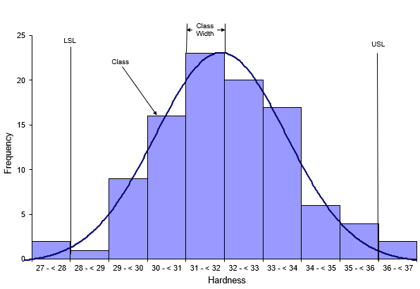
A histogram is a snapshot in time of your process. It tells you four things:
- Which result (or range of results) occurs most frequently
- How much variation there is
- What the shape of the variation looks like
- If any results are out of specifications
Remember, all processes have variation. Processes in statistical control tend to form a stable pattern, which is called a distribution. Distributions are characterized by three parameters: location, spread, and shape. These parameters can be estimated from a histogram. An example of a histogram is shown below.
A histogram is a bar chart. The horizontal axis is the measurement which, in this example, is the hardness of steel tubes. The measurement represents a value or a range of values. The vertical axis is how often the value occurred or how often it was in a range of values. Each bar on the histogram is called a class. The width of the bar (the range of values contained in the bar) is called the class width. Now you can use the histogram to tell you four things.
Which result (or range of results) occurs most frequently?
The range of 31 to < 32 is the highest bar on the histogram above, so this range occurs most frequently. This is called the mode of the histogram.
How much variation is there?
You can quickly estimate the range by looking at the largest and smallest value on the horizontal axis. In this example, those values are 37 and 27. So an estimate of the variation is 37 – 27 = 10. You can also estimate the variation from the midpoints of the first and last bar on the histogram.
What does the shape of the variation look like?
Histograms can take on many shapes. The histogram may be bell-shaped (like the normal distribution); it may be skewed to the left; or it may be skewed to the right. The histogram above appears to be bell-shaped and can probably be represented by a normal distribution.
Are any results out of spec?
You can add the specifications to the histogram to see if any results are out of spec. The hardness specification for this example is 28 to 36. It is easy to see from the histogram that the process does make some product that is out of spec. There are two samples with hardness results below 28. There are also two samples with hardness results above 36.
In conclusion, a histogram is a bar chart that tells you four important things about your process as shown above. The histogram above was made using the SPC for Excel software, a powerful but easy method of handling your data analysis needs.
