A Pareto chart helps you answer questions. What is the reason for the most rework or scrap in your organization? Which customers complain the most? What keeps us from getting the books closed after the end of the month. These questions are common in organizations, but we don’t always agree on the answer. This is where the Pareto chart comes in. A Pareto chart is a data-based approach to determining what “vital few” issues you should be working on.
The Pareto chart is named after Vilfredo Pareto, an Italian economist, who discovered that 80% of Italy’s wealth was held by 20% of the people. This has become known as the Pareto principle or the 80/20 rule. For example, 80% of customer complaints come from 20% of the customers. The Pareto chart helps you separate that 20% – the vital few – from the 80%- the trivial many so you can focus your time where you will get the most return.
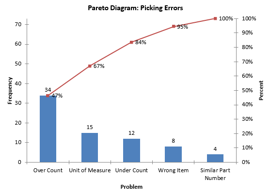
A Pareto chart is a special type of bar chart. An example is shown below dealing with picking errors in a warehouse. The reasons for picking errors are placed on the horizontal (x) axis. How often each reason occurs (the frequency) during the data collection period is shown on the vertical (y) axis. The reasons are placed on the x axis based on how often they occurred, starting with the reason that occurred most frequently. This makes it easy to see what reason occurred most frequently – and to get agreement. In this example, “over count” occurs most. This means, if you want to reduce picking errors, you should probably focus on “over count” to start with.
There is often a “cumulative percentage” line added to the Pareto chart. This line gives you the cumulative percent for the reasons starting with the first reason and going through all the reasons. For example, over count was responsible for 47% of the total picking errors. Over count and unit of measure, the next most frequent reason, accounted for 67% of the picking errors.
The vertical axis metric is usually frequency – how often a reason occurs. But it does not have to be. If you are monitoring injuries in a plant, it might be that injuries to arms or hands are most frequent. But this may just be scratches where as injuries to eyes or head are much more serious. You might want to use something different than frequency, like lost time or medical costs. The point is that you do not have to use “frequency” all the time as the vertical axis metric. There are times where it is appropriate to use other metrics, such as cost. Management often likes to see data in terms of cost.
So, a Pareto diagram is a bar chart that uses data to separate the “vital few” from the “trivial many” so your efforts are spent where you can get the most return.
