A scatter diagram shows the relationship between two variables. For example, you might want to compare the speed you drive with the time it takes you to get to work, or to compare the heights and weights of children, or to compare the steam usage in a plant to the outside temperature. This is what scatter diagrams do.
Suppose you are a warehouse manager. Overtime is a concern to you since it is something your boss watches closely. There is overtime every day. You have a theory that the overtime is simply caused by the work level – the number of lines that are picked each day in the warehouse. How do you prove your theory? One way is to construct a scatter diagram.
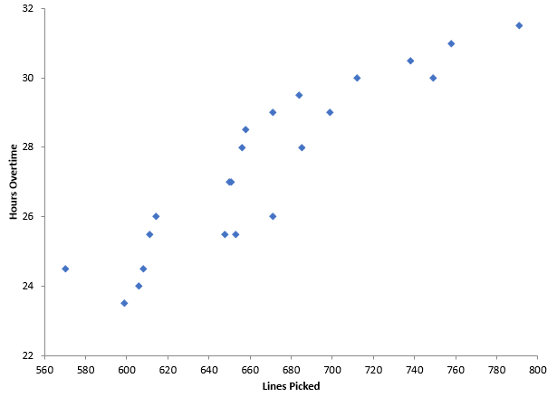
You need paired data sets to construct a scatter diagram. So, each day you collect data on the number of lines picked and the overtime. Once you have enough paired data points, you plot the data. The lines picked per day are plotted on the x-axis. The overtime hours – which you think depends on the lines picked – is plotted on the y-axis. An example of a scatter diagram for this situation is given below.
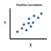
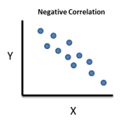
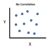
What relationship do you see? It appears, that in general, as the lines picked increases, the overtime hours increase as well. This is a positive correlation – one variable tends to increase when the other variable increases. There are three basic correlations that a scatter diagram can identify: positive, negative or no correlation
Positive Correlation: as X increases, Y increases. For example, if you are paid by the hour, the more hours you work the more pay you receive.
Negative Correlation: as X increases, Y decreases. For example, your heating bill increases as the temperature outside decreases.
No Correlation: a change in X does not impact the value of Y. For example, the hours I spend reading have no impact on your heating bill.
You can “visually” see these correlations between two variables by constructing a scatter diagram. The relationship may be linear – or it may not be. Of course, there are some statistics you can calculate to determine if the relationship is statistically significant. Our next blog will give a brief overview of those statistics for linear relationships.
The scatter diagram above was made using the SPC for Excel software, a simple but powerful package for statistical analysis within the Excel environment


