February 2011
This month’s newsletter examines the “g” control chart. The g control chart is used to analyze rare events. For example, health care facilities often are interested in tracking events that don’t occur very often such as a certain type of infection. If the events are very rare, the traditional attribute control charts (p, np, c or u) may not be very useful. An earlier newsletter examined how the individuals control chart (X-mR) could be used to monitor these types of rare events (click here for more information). This newsletter introduces the g control chart as another way these rare events can be tracked. This control chart has been added to the SPC for Excel software as a result of a customer requesting it.
In this issue:
- Introduction: Infections after Surgery
- Use a c Control Chart?
- The g Control Chart
- Interpreting the g Control Chart
- Summary
- Quick Links
There are a number of options with the g control chart. One option is to track the time (number of days) between rare events. There is a point plotted on the chart for each event. You would like the chart to indicate that the number of days between events is increasing. Another option is to track the number of units between events. For example, you might want to track the number of hospital admissions before an event occurs. Or you might want to track the number of units produced in a plant before a rare breakdown. This month’s newsletter examines how to construct and interpret a g control chart.
Introduction: Infections after Surgery
A surgical facility is tracking the number of times a certain infection occurs after surgery each month. These do not happen very often so they are considered “rare” events. The facility’s quality assurance group has data for the last two years. The monthly data is shown in the table below.
| Month | No. of Infections | Month | No. of Infections | |
|---|---|---|---|---|
| Jan-09 | 0 | Jan-10 | 2 | |
| Feb-09 | 1 | Feb-10 | 0 | |
| Mar-09 | 0 | Mar-10 | 0 | |
| Apr-09 | 2 | Apr-10 | 1 | |
| May-09 | 1 | May-10 | 0 | |
| Jun-09 | 0 | Jun-10 | 2 | |
| Jul-09 | 0 | Jul-10 | 1 | |
| Aug-09 | 0 | Aug-10 | 1 | |
| Sep-09 | 2 | Sep-10 | 0 | |
| Oct-09 | 1 | Oct-10 | 1 | |
| Nov-09 | 1 | Nov-10 | 0 | |
| Dec-09 | 1 | Dec-10 | 1 |
The first step the group must do is to decide how to track the data.
Use a c Control Chart?
The four basic attribute control charts are the p, np, c and u control charts. Of these four, the c control chart seems to the most likely candidate. You use the c control chart when there is a large opportunity for defects (infections in this example) to occur, but the actual number that do occur is small compared to this opportunity. You can get a summary of these four attribute control charts in our April 2009 newsletter.
The QA group developed a c control chart based on the data in the table. The resulting chart is shown below.
Figure 1: c Chart for Number of Infections per Month

The average number of infections per month is 0.75; the upper control limit is 3.35. Take a hard look at this chart. Is it very useful? If you make a change to the process that you hope will reduce the number of infections, how will you know from the chart that an improvement has occurred? You would need to wait for the control chart to signal an improvement has been made. You would need a run below the average – seven months in a row with no infections. Not a really useful chart when you think about it.
The control limits shown in the above chart were calculated using the c control limit equations:
where c is the average infections per month. These are not really the appropriate control limits in this case. This is actually the small sample case for the c control chart. If you use the approach outlined in our March 2008 newsletter, the upper control limit is equal to 5. Either way, this c control chart is not that useful.
The g Control Chart
A different approach is need. We can use the g control chart to examine the days between infections. The monthly data is not useful. Instead, we need the dates the infections occur. These dates are shown in the table below. The table also includes the days between infections.
| Date | Days Between Infections |
|---|---|
| 2/5/2009 | |
| 4/3/2009 | 57 |
| 4/25/2009 | 22 |
| 5/6/2009 | 11 |
| 9/15/2009 | 132 |
| 9/21/2009 | 6 |
| 10/7/2009 | 16 |
| 11/22/2009 | 46 |
| 12/1/2009 | 9 |
| 1/5/2010 | 35 |
| 1/30/2010 | 25 |
| 4/7/2010 | 67 |
| 6/4/2010 | 58 |
| 6/24/2010 | 20 |
| 7/5/2010 | 11 |
| 8/23/2010 | 49 |
| 10/8/2010 | 46 |
| 12/4/2010 | 57 |
The first infection occurred on 2/5/2009. The next infection occurred on 4/3/2009. There are 57 days between 2/5/2009 and 4/3/2009. The next infection occurred on 4/25/2009. There are 22 days between 4/3/2009 and 4/25/2009. The days between infections are the values of g, and these are plotted on the g control chart.
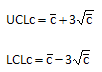
There are different methods of calculating the centerline and the control limits. One common method, based on a geometric distribution, is to use the following equations:

where g is the average days between infections and k is the number of values you have for days between infections. If you are not going to use any of the out of control tests involving the centerline, you could simply use the average as the centerline. But since this is assumed to be a geometric distribution, the centerline is usually taken to be 0.693 times the average. The calculations are shown below.

If the LCLg is below zero, the lower control limit can be set to 0 or to “None.” The g control chart with these calculations is shown in Figure 2.
Figure 2: g Chart Based on Geometric Distribution

This chart is in statistical control. There are no points beyond the UCL and no patterns.
Another method for the g control chart calculations is to use a probability approach. In this approach, you start by calculating the value of p, which is an event probability.

This value is used to calculate the centerline and the control limits. The probability-based equations are:

The value of aUCL depends on the number of sigma limits for the control limits. For the usual 3 sigma limits, the value of aUCL is 0.00135. Using this value, the calculations become:

The g control chart with based on the probability control limits is shown in Figure 3. Note there is a considerable difference in the upper control limit on the two charts based on the method used to calculate the control limits.
Figure 3: g Chart with Probability Control Limits

All the points on this chart are within the control limits and there are no patterns. The “process” is in statistical control.
Interpreting the g Control Chart
You can see that the g control chart gives you a much better picture of what is happening in the infection process than the c control chart. You obviously want a point to be above the upper control limit. So, if you can go 158 (by the first g chart) days or more, you have significantly reduced the frequency of infections. A run of 7 or more in a row trending up is also an indication that the process is improving, as is 8 points in a row above the centerline.
Summary
This newsletter has introduced a g control chart as another method of looking at rare events. It assumes that the data follows a geometric-type distribution. This newsletter showed an example of a g control chart in health care and tracked the number of days between infections. You can also use the g control chart to the number “produced” between events. For example, we could have track the number of admissions between infections or the number of surgeries.