November 2025
 Most of us are familiar with regression. In regression, we try to model a process by predicting a numerical response based on one or more predictor variables. The response is the process output, and the predictor variables are the process inputs.
We usually run into linear regression. In linear regression, the output response is continuous. Examples of continuous output responses include time, height, and purity.
But what happens if the response is not continuous, but counts, like 0, 1, 2, 3? In this case, you usually don’t use linear regression. You use Poisson regression. This publication introduces Poisson regression.
In this issue:
- Introduction
- When to Use Poisson Regression
- Poisson Model
- Example
- Poisson Regression Output
- Summary
- Quick Links
Please feel free to leave a comment at the end of the publication. You can download a pdf copy of this publication at this link.
Introduction
Suppose you are producing plastic film. Every now and then, there is a blemish on the plastic film – a defect. You monitor the process by taking a given area of plastic film and counting the number of blemishes. It doesn’t necessarily mean the plastic film is defective; just that it has defects.
There are many processes that produce data as counts. Other examples include the defects per shift, the number of customer service calls not answered the first time, the number of first aid cases in a plant, and the number of accidents on a highway.
Poisson regression is used to model this type of counting data. Counting data are integers 0 and above: 0, 1, 2, 3 etc. The outcomes are the number of times something occurs in a fix interval of time, population, or space.
When to Use Poisson Regression
There are certain conditions that must be met to use Poisson regression. These are given below.
- The response (Y) must be non-zero, non-negative integers, like 0, 1, 2, 3.
- The responses must cover a given time, scale or population, e.g., defects per hour, customer complaints per week, or first aid cases per month in a plant.
- You want to determine if one or more predictor variables have a statistically significant effect on Y.
- Y is not normally distributed.
If these conditions are met, you can use Poisson regression.
Poisson Model
The basic Poisson regression model uses a logarithmic link and is given by:
![]()
where is the expected number of visits and the are the coefficients. You can take the exponential of both sides to get:
![]()
To understand how this works, consider the case where you have single predictor. Then:
![]()
Taking the exponential of each side gives:
![]()
Suppose the model shows that B1 = .5. Then eB1 = e0.05 = 1.65. This means that an increase of 1 in X generates a 65% increase in m, the expected number of visits. More details on this below.
Example
A statistician is trying to predict how many emergency room (ER) visits there are per day. She is examining the impact of four predictor variables. These are:
- Temperature: the daily average temperature (°C)
- Flu Index: flu activity index (0–10)
- Air Quality: AQI (higher = worse)
- Staffing: Number of people working in the ER (8 to 20)
She has data for 116 days. The data for the first 10 days are shown below. You can download the entire data set at this link. The data was generated using ChatGPT.
Table 1: Partial Data for Emergency Room Visits
|
Day |
Temperature |
Flu Index |
Air Quality |
Staffing Level |
Visits |
|
1 |
28.8 |
1.0 |
82.5 |
14 |
3 |
|
2 |
22.0 |
9.2 |
106.9 |
11 |
27 |
|
3 |
24.9 |
7.1 |
65.1 |
20 |
19 |
|
4 |
31.2 |
10.0 |
98.9 |
18 |
20 |
|
5 |
29.3 |
1.5 |
138.2 |
15 |
4 |
|
6 |
15.1 |
8.7 |
130.1 |
20 |
23 |
|
7 |
24.8 |
1.6 |
87.1 |
12 |
13 |
|
8 |
19.2 |
6.2 |
136.9 |
14 |
11 |
|
9 |
19.5 |
1.2 |
78.5 |
17 |
7 |
|
10 |
15.0 |
9.7 |
114.8 |
10 |
32 |
The data for the 116 days was analyzed using Poisson regression in the SPC for Excel software. The output is given below, and the results are explained.
Poisson Regression Output
Deviance Table
The output from the Poisson Regression is given below. We will start with the deviance table. The deviance table for the 116 points is shown in Table 2.
Table 2: Deviance Table
|
Source |
DF |
Deviance |
Mean |
Chi-Square |
p value |
|
Regression |
4 |
153.2 |
38.29 |
153.2 |
0.000 |
|
Temperature |
1 |
5.869 |
5.869 |
5.869 |
0.015 |
|
Flu_Index |
1 |
80.58 |
80.58 |
80.58 |
0.000 |
|
Air_Quality |
1 |
0.0571 |
0.0571 |
0.0571 |
0.811 |
|
Staffing_Level |
1 |
0.243 |
0.243 |
0.243 |
0.622 |
|
Error |
111 |
44.67 |
0.402 |
||
|
Total |
115 |
197.8 |
The deviance table tells you how well the model fits the data and whether adding the predictors helps improve the model. Deviance measures how far the model predictions are from what is observed. Small deviances are good; large deviances are not good.
The “Deviance” column contains the deviances. The “Total” deviance is the deviance of a model containing no predictors – just models to the average value. This data gives a total deviance of 197.8. This is also called the null deviance.
The “Regression” deviance is the improvement from adding all the predictors to the model. Its value is 153.2 in our example. This means that a deviance of 153.2 can be removed from the total deviance of 197.8 by adding all the predictors to the model.
The “Error” deviance gives the deviance unexplained by the model. It is the “Total” deviance – the “Regression” deviance = 197.8 – 153.2 = 44.67. This is sometimes called the residuals deviance.
The columns in the deviance table are:
- DF: Degrees of freedom for that predictor.
- Deviance: How much variation that predictor explains.
- Mean: Deviance divided by DF.
- Chi-Square: Test statistic comparing models with and without that predictor.
- p-value: whether the predictor has a significant effect (usually < 0.05) or not (usually >0.05).
Look at the p-value column in Table 2. You can see the p-value is less than 0.05 for “Regression”. This means that the predictors added to the model had a statistically significant impact on the response variable (visits).
In addition, two of the predictors (temperature and flu index) have p values less than 0.05. This means that adding those two predictors to the model had a statistically significant impact on the number of visits.
What does the deviance table tell us? It tells us the regression model is statistically significant. In addition, it tells us that two of the predictors (temperature and flu index) have a significant impact on the number of visits, while two do not (Air quality and staffing).
Predictor’s Table
The next part of the output is the Predictor’s table. This is shown in Figure 3.
Figure 3: Predictor’s Table
|
Coeff. |
Standard Error |
t Stat |
p Value |
95% Lower |
95% Upper |
VIF |
|
|
Intercept |
2.253 |
0.266 |
8.481 |
0.0000 |
1.726 |
2.779 |
|
|
Temperature |
-0.0191 |
0.00798 |
-2.396 |
0.0182 |
-0.0349 |
-0.00331 |
1.446 |
|
Flu_Index |
0.124 |
0.0137 |
9.018 |
0.0000 |
0.0964 |
0.151 |
1.443 |
|
Air_Quality |
0.000296 |
0.00124 |
0.239 |
0.8115 |
-0.00216 |
0.00275 |
1.008 |
|
Staffing_Level |
-0.00338 |
0.00686 |
-0.493 |
0.6228 |
-0.0170 |
0.0102 |
1.004 |
The columns in this table are described below.
- Coeff:
- The coefficient is the effect of the predictor on the log of the response variable. If positive, the predictor increases the number of responses. If negative, the predictor decreases the number of responses.
- You can predict the impact as shown previously. For example, both temperature and flu index have a statistically significant effect on the number of visits. The exponential of the coefficient gives you the impact:
- Flu Index: one unit increase in flu index increases the number of visits by e124 = 1.13, or a 13% increase.
- Temperature: one unit decrease in temperature decreases the number of visits by e-0.0191 = 0.981 or about a 2% decrease in visits.
- Standard Error: gives the variability in the estimate of the coefficient. The smaller the standard error, the more precise the estimate of the coefficient.
- t Stat: coefficient divided by the standard error. A larger value implies the predictor has a significant impact on the outcome.
- p Value: whether the predictor has a significant effect (usually < 0.05) or not (usually >0.05).
- 95% Lower / Upper: This is the 95% confidence interval for the coefficient. If it contains 0, then the predictor is not significant. If the interval does not contain 0, the predictor is significant.
- VIF: measures if the predictors are highly correlated with each other. High values of VIF mean that the two predictors at least are highly correlated. You don’t know which one has the impact. It also leads to other issues. So you want VIF to be around 1.
- No collinearity if VIF = 1
- Moderate collinearity if VIF > 5
- High collinearity if VF > 10
So, what does the predictor’s table tell us? It tells us that the regression is significant and two of the predictors (temperature and flu index) have a statistically significant impact on the number of visits. This agrees with the results from the deviance table. Also, there is no collinearity in the predictors.
Regression Model
Based on the results in the predictor’s table, the regression model is given by:
Visits = Exp(Y)
Y = 2.253 – 0.019(Temperature) + 0.124(Flu_Index) + 0.000296(Air_Quality) – 0.003(Staffing_Level)
Note that the model does include all the predictors. If you wish, you can rerun the analysis using only the significant predictors. We will not do that here.
Model Stats
The model statistics are shown in Table 4:
Table 4: Model Stats
|
Deviance R Squared |
77.42% |
|
Deviance Adjusted R Squared |
76.61% |
|
AIC |
563.3 |
|
AICc |
553.9 |
|
BIC |
577.1 |
These statistics are measures of how well the model fits the data (the R squared values) and allow you to compare the model to other models (AIC, AICc and BIC). The R squared values are similar to the R squared values in linear regression.
The rows in the model stats are explained below.
- Deviance R Squared: this answers the question about how much of the variation in the response variable is explained by the model. In this example about 77% of the variation is explained. This is a good percentage.
- Deviance Adjusted R Squared: this examines if you have too many predictors. The value is about 76%. Since it is close to the deviance R squared, the model does not have too many predictors.
- AIC, AICs, BIC: these are used to compare models with lower values being better. We will not delve into this since we are only considering one model.
Goodness of Fit
The Goodness of Fit table tells us whether the model fits the data well. It is a check for under dispersion and overdispersion. Overdispersion is a common problem in Poisson regression. It occurs when the variance is much larger than the average. The Goodness of Fit table is shown below.
Table 5: Goodness of Fit
|
Statistic |
DF |
Value |
Mean |
Chi-Square |
p value |
|
Deviance |
111 |
44.67 |
0.402 |
44.67 |
1.0000 |
|
Pearson Chi-Squared |
111 |
45.69 |
0.412 |
45.69 |
1.0000 |
The table shows two statistics that are used to test the goodness of fit: deviance and the Pearson Chi-square statistics.
The deviance is the error deviance from Table 2. The Person Chi-Squared statistic compares the observed results with the predicted results.
The p-value for both can be calculated using the Excel function CHISQ.DIST.RT. In both instances, the p-value is 1.
You are making sure that there is no overdispersion present. If there is overdispersion present, then the following is true:
- Deviance >> DF
- Pearson χ² >> DF
- p-value < 0.05
That is not the case here, and it appears that the model fits the data very well.
Other Output
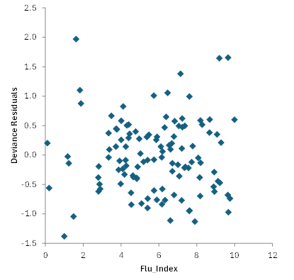
There is often more output associated with the Poisson regression. Residuals analysis is one example. We will not cover that in detail here, but residual analysis helps you identify outliers in the data. You can plot residuals against various factors. For example, Figure 1 is a plot of Deviance residuals vs Flu_Index. Absolute deviance residuals greater than 3 are considered outliers.
Figure 1: Deviance Residuals vs Flu_Index
There are also other charts that can be produced including a normal probability plot and a plot of predicted versus actual values. This plot is shown in Figure 2 .
Figure 2: Predicted vs Observed Values
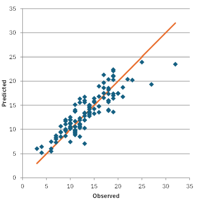
This chart shows the results fall along a straight line confirming that the model is a good fit to the data.
You can download a workbook containing the data and the output for Poisson regression from the SPC for Excel software at this link.
Summary
This publication has introduced Poisson regression. Poisson regression is used when the response variable (Y) is counts, like 0, 1, 2, 3. The output for Poisson regression from the SPC software was explained. This included the deviance table, the predictor’s table, the regression model, the model statistics, and the goodness of fit table. Several charts were introduced including residual charts.