September 2022
(Note: all the previous SPC Knowledge Base in the root cause category are listed on the right-hand side. Select this link for information on the SPC for Excel software.)

Multiple linear regression is used to build a model where one or more predictor variables (the X’s) can be used to predict the response variable (Y). The model is an equation that describes the response variable in terms of the statistically significant predictor variables.
Software packages have the capability to generate a lot of other regression statistics beyond the model – all designed to help decide how “good” the model is. This publication focuses on residuals that are often included in the multiple linear regression analysis.
In this publication:
- Example Data and the Model
- Predicted versus Observed Values
- Residuals
- Residuals and Normality
- Residuals and Observation Number
- Residuals and Predicted Values
- Scaled Residuals
- Summary
- Quick Links
Part 1 can be accessed at this link. Please feel free to leave a comment at the end of this publication. You may download a pdf copy of this publication at this link.
Example Data and the Model
We will use the same data that was presented in Part 1, which is from the book “Introduction to Linear Regression Analysis” by Douglas Montgomery, Elizabeth Peck, and Geoffrey Vining. A soft drink distributor wants to predict the amount of time (y) a delivery driver will take to service vending machines. There are two predictor variables that he is interested in exploring: the number of cases of product stocked (x1) and the distance walked in feet by the delivery driver (x2).
The data are given in Table 1. There are a total of 25 observations (delivery trips). For each trip, the number of cases stocked, the distance walked in feet, and the time taken in minutes were recorded.
Table 1: Delivery Time Data
| Obs. Number | Number of Cases | Distance | Delivery Time | Obs. Number | Number of Cases | Distance | Delivery Time | |
|---|---|---|---|---|---|---|---|---|
| 1 | 7 | 560 | 16.68 | 14 | 6 | 462 | 19.75 | |
| 2 | 3 | 220 | 11.50 | 15 | 9 | 448 | 24.00 | |
| 3 | 3 | 340 | 12.03 | 16 | 10 | 776 | 29.00 | |
| 4 | 4 | 80 | 14.88 | 17 | 6 | 200 | 15.35 | |
| 5 | 6 | 150 | 13.75 | 18 | 7 | 132 | 19.00 | |
| 6 | 7 | 330 | 18.11 | 19 | 3 | 36 | 9.50 | |
| 7 | 2 | 110 | 8.00 | 20 | 17 | 770 | 35.10 | |
| 8 | 7 | 210 | 17.83 | 21 | 10 | 140 | 17.90 | |
| 9 | 30 | 1460 | 79.24 | 22 | 26 | 810 | 52.32 | |
| 10 | 5 | 605 | 21.50 | 23 | 9 | 450 | 18.75 | |
| 11 | 16 | 688 | 40.33 | 24 | 8 | 635 | 19.83 | |
| 12 | 10 | 215 | 21.00 | 25 | 4 | 150 | 10.75 | |
| 13 | 4 | 255 | 13.50 |
A multiple linear regression was performed using these data and the SPC for Excel software. The purpose of regression analysis, of course, is to generate a model that predicts the response variable (delivery time) from the values of the predictor variables (number of cases and the distance walked). The form of the model is:
y = b0 + b1x1 + b2x2
where y is the response variable (delivery time), b0 is the intercept, b1 is the coefficient for x1 (number of cases) and b2 is the coefficient for x2 (distance). The model from the SPC for Excel analysis is given below.
Delivery Time = 2.341231 + 1.615907(Number of Cases) +0.014385(Distance)
This model can now be used to predict the delivery time based on the number of cases and distance walked.
Predicted versus Observed Values
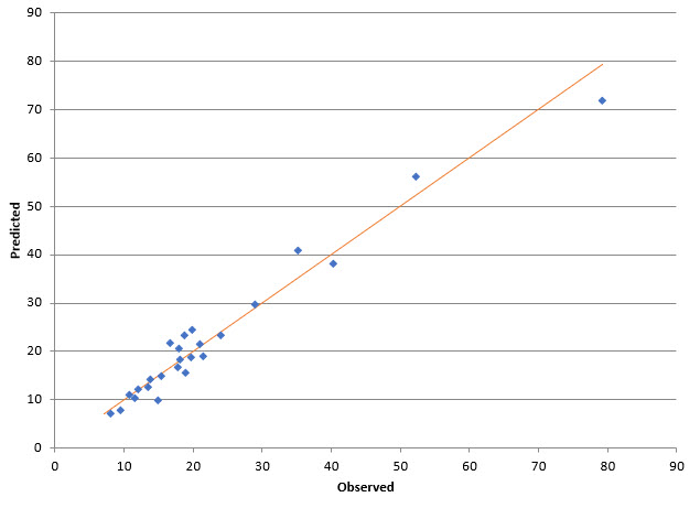
One method of determining how good the model predicts the observations is to plot the predicted values versus the observed values. If the model is good, you would expect the points to lie close to a straight line. This is done in Figure 1.
Figure 1: Predicted versus Observed Values for the Delivery Data
The SPC for Excel software was used to make the charts for the delivery analysis in this publication. The closer the points are to the line, the better the fit. This looks like a pretty good fit based on Figure 1.
Residuals
The difference between the predicted value and the observed value is called the residual. It is “how far” the point is off the line in Figure 1. A residual is defined as:
ei = yi – ŷi
where ei is the ith residual, yi is the ith observed value and ŷi is the ith predicted value. Table 2 shows the residuals for the data.
Table 2: Residuals
| Obs. Number | Observed Value | Predicted Value | Residuals | Obs. Number | Observed Value | Predicted Value | Residuals | |
|---|---|---|---|---|---|---|---|---|
| 1 | 16.68 | 21.708 | -5.028 | 14 | 19.75 | 18.682 | 1.068 | |
| 2 | 11.5 | 10.354 | 1.146 | 15 | 24 | 23.329 | 0.671 | |
| 3 | 12.03 | 12.08 | -0.05 | 16 | 29 | 29.663 | -0.663 | |
| 4 | 14.88 | 9.956 | 4.924 | 17 | 15.35 | 14.914 | 0.436 | |
| 5 | 13.75 | 14.194 | -0.444 | 18 | 19 | 15.551 | 3.449 | |
| 6 | 18.11 | 18.4 | -0.29 | 19 | 9.5 | 7.707 | 1.793 | |
| 7 | 8 | 7.155 | 0.845 | 20 | 35.1 | 40.888 | -5.788 | |
| 8 | 17.83 | 16.673 | 1.157 | 21 | 17.9 | 20.514 | -2.614 | |
| 9 | 79.24 | 71.82 | 7.42 | 22 | 52.32 | 56.007 | -3.687 | |
| 10 | 21.5 | 19.124 | 2.376 | 23 | 18.75 | 23.358 | -4.608 | |
| 11 | 40.33 | 38.093 | 2.237 | 24 | 19.83 | 24.403 | -4.573 | |
| 12 | 21 | 21.593 | -0.593 | 25 | 10.75 | 10.963 | -0.213 | |
| 13 | 13.5 | 12.473 | 1.027 |
The first observation was with 7 cases walking 560 feet. The predicted value is then:
Delivery Time = 2.341231 + 1.615907(Number of Cases) +0.014385(Distance)
Delivery Time = 2.341231 + 1.615907(7) + 0.014385(560)
Delivery Time = 21.70818
The observed value for observation 1 is 16.68, so the residuals for observation 1 is:
ei= yi– ŷi= 16.68 – 21.70818 = -5.028
The rest of the residuals are calculated the same way.
Note that observation 9 has the highest residual. This observation also had the largest number of cases and distance walked.
Now we have the residuals. What do we do with them? One use of them is to check some of the assumptions used in multiple linear regression. Another is to give insights in the how good the model is.
Residuals and Normality
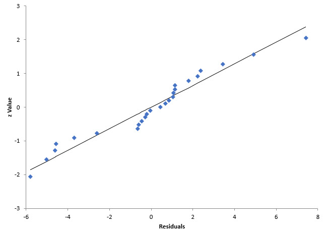
One assumption is that the residuals are normally distributed. This should be checked. If they are not normally distributed, you may have to look at a different type of regression analysis. One way to check if the residuals are normally distributed is to create a normal probability plot as shown in Figure 2.
Figure 2: Residuals Normal Probability Plot for the Delivery Data
If the residuals are normally distributed, the points should fall along a straight line. Do the points lie along a straight line? Maybe, but maybe not. The p value for this plot is 0.11. Since it is greater than 0.05, you assume the residuals are normally distributed. But with a p value of 0.11, it is probably a borderline conclusion. There might be one or more outliers influencing the results, such as observation 9.
If the points are significantly off the line or the p value is less than 0.05, other regression methods beside linear should be considered.
Residuals and Observation Number
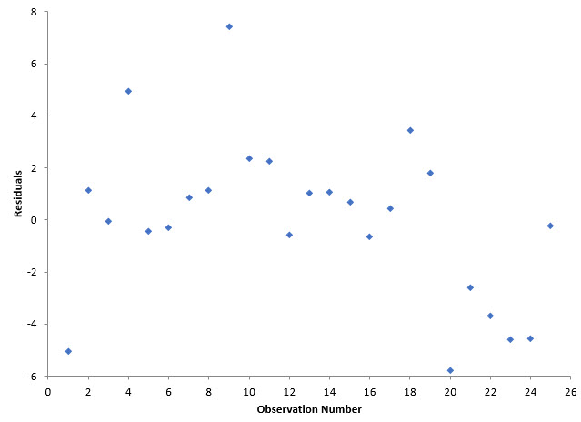
Another assumption is that the residuals are not correlated. One method of determining if the residuals are correlated is to plot the residuals over time (versus observation number assuming the observation numbers are in time-order). The residuals should bounce randomly around 0. Figure 3 is a plot of the residuals versus observation number.
Figure 3: Residuals versus Observation Number for the Delivery Data
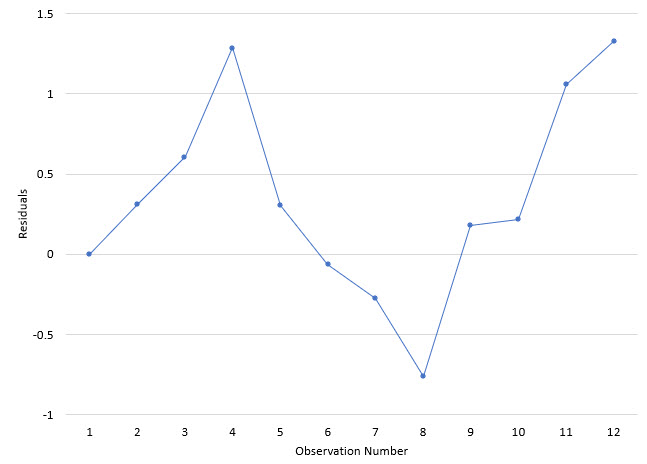
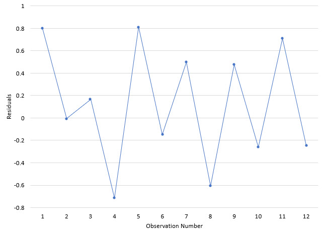
The points appear to fluctuate randomly around 0, implying that the residuals are not correlated. If a positive correlation exists between the residuals, you get a chart like Figure 4.
Figure 4: Residuals with a Positive Correlation Example
In this example, a large residual tends to be followed by another large residual, while a small residual tends to be followed by another small residual.
If a negative correlation exists, then there is more of a sawtooth pattern as shown in Figure 5.
Figure 5: Residuals with a Negative Correlation Example
With a negative correlation, a “up” value is usually followed by a “down” value and vice versa.
Residuals and Predicted Values
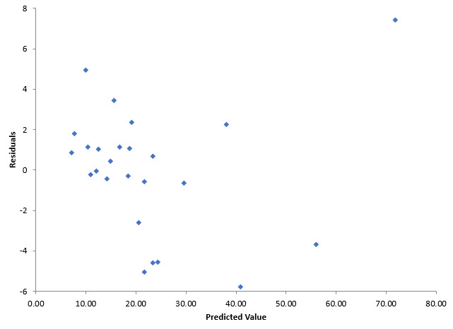
Another assumption is the variance of the residuals is consistent. One method of checking this is to plot the residuals versus the predicted values for delivery time. The pattern on the chart will give you insights into the variance. Figure 6 shows the plot of the residuals versus the fitted values.
Figure 6: Delivery Time Residuals vs Fitted Values for the Delivery Data
If the residuals can be contained within a band, then there is no issue with the variance of the residuals. You can see from Figure 6 that most of the results are within the band from -6 to 6. The numerical values of the band are not important; it is the pattern on the chart. There is one point outside that band (observation 9), which may be an outlier as pointed out earlier. Overall, it appears that there is no issue with the variance changing.
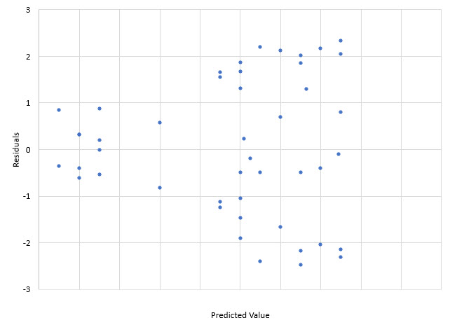
A somewhat common occurrence is for the variation in the residuals to increase as the observed values get larger. If this occurs, the points on the chart will form a cone – increasing in width as the values increase. An example of this is shown in Figure 7.
Figure 7: Residuals with Increasing Variance
The variance of the residuals was determined in Part 1 in the ANOVA table. The variance is given by the mean square of the residuals (MSRes), which is the sum of squares due to the residuals divided by n – p, where n is the number of observations and p is the number of parameters in the model. See Part 1 for more information.
Scaled Residuals
Scaled residuals are very helpful in finding outliers. You can plot the scaled residuals to see if any are beyond certain limits. We begin with the standardized residuals.
Standardized Residuals
The standardized residuals are calculated by dividing the residuals by the square root of MSRes.
MSRes is 10.62 from Part 1 of this series. The first residual from Table 2 is -5.028, so the first standardized residual is given by:
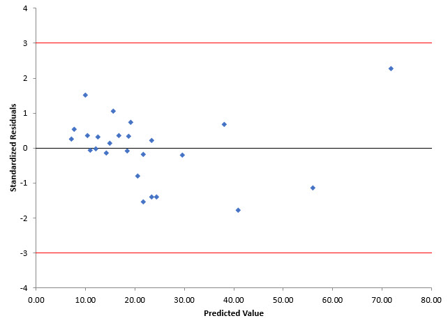
The mean of the standardized residuals is 0 and the standard deviation is 1. You can use this then to define that an outlier occurs if any standardized residuals is greater than 3 or less than -3. Figure 8 shows this.
Figure 8: Standardized Residuals versus Predicted Values for Delivery Data
You can see point 9 is within the +/- 3 limits for the standardized residuals implying it is not an outlier.
Internally Studentized Residuals
The internally studentized residuals improves on the standardized residuals. It takes into account the inequality of variances across the factors. It makes use of the H matrix (see Part 1). The internally studentized residuals are given by:
where hii is the ith diagonal element in the H matrix. The H matrix was shown in the Excel workbook that you can download from Part 1.
For the first observation, h11 is 0.1018. So, the internally studentized residual for the first observation is:
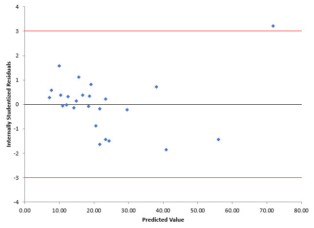
Internally studentized residuals greater than 3 or less than -3 are considered outliers. It should be noted some resources us 2 and – 2 as the limits for outliers. Figure 9 shows the internally studentized residuals versus the predicted value.
Figure 9: Internally Studentized Residuals versus Predicted Values for Delivery Data
Note that point 9 is now an outlier.
Externally Studentized Residuals
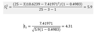
The externally studentized residuals are similar to the internally studentized residuals but use a different estimate of the variance. The estimate of the variance is based on a dataset with the ith observation removed. It is given by Si2.
where n= number of observations and p = number of parameters (including the constant is present). This variance is used to determine the externally studentized residuals:
For the first observation:
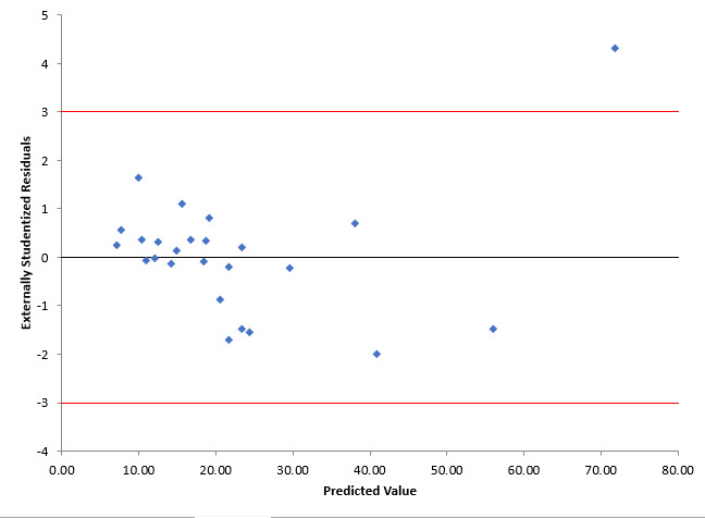
Figure 10 shows the externally studentized residuals versus the predicted value.
Figure 10: Externally Studentized Residuals versus Predicted Values for Delivery Data
Comparing Figures 9 and 10 show that observation 9 is even further out when looking at the externally studentized residual. There are indications that observation 9 may be an outlier. You could rerun the regression leaving out observation 9 to see what impact it has on the results.
Summary
This publication has examined the residuals that are often calculated as part of multiple linear regression. These residuals give you insights to how adequate the model is. Plotting residuals is a very effective way of visually seeing how adequate the model and your assumptions are. Scaled residuals give you additional insights.
