May 2022
(Note: all the previous SPC Knowledge Base in the root cause category are listed on the right-hand side. Select this link for information on the SPC for Excel software.)

Just like most techniques, it takes some thought to determine how to design the experiment and how to interpret the results. There are different types of ANOVA designs: crossed, nested and mixed. Designs can have different types of factors – fixed or random – or a mixture of the two. The analysis method changes depending on the type of design and factors that you have. Misclassify and you may draw the wrong conclusions.
ANOVA will tell you which factors have a significant effect on a response variable. But it doesn’t tell you what the factors should be set at to optimize the response variable. A variability chart can be used to help do this.
In this issue:
- ANOVA Definition
- Hypothesis Testing in ANOVA
- The Experimental Design
- Crossed and Nested Designs
- Fixed and Random Factors
- The ANOVA Table
- Variability Chart
- Summary
- Quick Links
The SPC for Excel software was used to analyze the results in this publication. This software includes ANOVA for up to 5 factors as well as the variability chart.
Please feel free to leave a comment at the end of this publication. You can also download a pdf copy of this publication at this link.
ANOVA Definition
ANOVA is a statistical technique that determines if the means of two or more treatment combinations are the same. It is basically used to analyze the results of a properly planned experiment to find out if certain factors impact a response variable.
Hypothesis Testing in ANOVA
The null hypothesis in an ANOVA is that all treatment means are the same. If µi is the mean for one treatment combination out of k treatment combinations, then:
H0: µ1 = µ2 = µ3 = µ4 = …. = µk
H1: µi ≠ µj
where H0 is the null hypothesis and H1 is the alternate hypothesis. The alternate hypothesis is simply that not all the means are equal.
The Experimental Design
One of the simplest types of ANOVA involves only two factors. This is the example that we will use in this publication. It is from Design and Analysis of Experiments, 6th Edition by Douglas Montgomery.
In this example an engineer is designing a battery that will be subjected to some large variations in temperature. The engineer wants to test three different materials to be used for the plate. He has no control over the temperature in the field but can control them in the laboratory. He selected three temperatures that represent the range of temperatures that the battery will see in the field (15, 70 and 125 °F). So, the engineer has selected the factors to include in the design (two factors: temperature and material) and the levels for each factor (material: 1, 2 and 3; temperature: 17, 70, 125). The factors are the independent variables in this experiment. The response variable is battery life – the dependent variable in this experiment.
In generic terms, the factors are often represented by capital letters, e.g., A and B in this case. The levels of each factor are represented by small letters with subscript numbers, e.g., a1, a2, etc., represent the levels of factor A; b1, b2, etc. represent the levels of factor B. A treatment combination represents the levels of each factor where an experimental run is done, e.g., a1b1 is the experimental run when factor A is at its level a1 and Factor B is at is level b1.
It sounds like this experiment is going to determine what impact temperature and material have on battery life, if any. This is true, but there is more. There is something referred to as interaction effects. Interaction effects represent the combined effects of factors on the response variable. If there are only two variables, like temperature and type of material, you are investigating not only the effect of temperature and material but also the interaction effect of temperature and material. This effect is denoted by temperature*material or AB. If there is an interaction effect present, the impact of material on the battery life depends on the level of temperature.
There can be interaction effects for any number of factors. For example, if you have three factors, you will have the main effects of each factor by itself (A, B and C) as well as the two-factor interactions (AB, AC, BC) and the three-factor interaction (ABC).
The next thing the engineer must decide is how many times he wants to replicate each treatment combination. The replications are used to determine the “normal” variation in the process. This “normal” variation is used to determine if any of the treatment means are significantly different, as you will see below. The engineer decides to replicate each treatment combination 4 times. The experimental runs are conducted in a random order.
The results from the experiment are shown in Table 1.
Table 1: Battery Life (Hours) Results
| Temperature | ||||||
|---|---|---|---|---|---|---|
| Material | 15 | 70 | 125 | |||
| 1 | 130 | 155 | 34 | 40 | 20 | 70 |
| 74 | 180 | 80 | 75 | 82 | 58 | |
| 2 | 150 | 188 | 136 | 122 | 25 | 70 |
| 159 | 126 | 106 | 115 | 58 | 45 | |
| 3 | 138 | 110 | 174 | 120 | 96 | 104 |
| 168 | 160 | 150 | 139 | 82 | 60 | |
Crossed Designs and Nested Designs
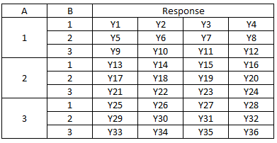
A design is crossed when every level of a factor occurs in a treatment combination with every level of the other factors. In our example, every level of material occurs with every level of temperature. This design is crossed. The layout for the design in Table 1 is shown in Table 2 below.
Table 2: Crossed Design with Four Replications
The first treatment is for A = 1 and B = 1. The four replications are given as Y1, Y2, Y3 and Y4. It is easy to see that every level of A is associated with each level of B during the experiment.
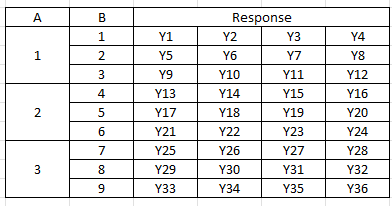
It is not always possible though to have each level of a factor occur with every level of the other factors. In this case, you will use a nested design. This occurs when fewer of all levels of at least one factor occur with each level of the other factors. Table 3 is an example of a two-factor nested design with four replications.
Table 3: Nested Design with Four Replications
The only difference between Tables 2 and 3 are the levels of B. In the crossed design, the three levels of B are repeated for level of A. In the nested design, this is not possible and each level of A is combined with different levels of B. If Factor B is nested within Factor A (as in Table 3), then a level of Factor B can only occur within one level of Factor A.
Here is an example of a nested design. You have three suppliers for a raw material you use in your process. You want to see if there is a difference in purity of the raw material they send you. The suppliers are Factor A in this case. For each supplier, you select 3 batches. This is Factor B. You select four samples from each batch. This is the design shown in Table 3.
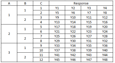
Just to complicate things a little bit, you can have a mixed design where you have both fixed and nested combined. An example is shown in Table 4 for Factor A with three levels, Factor B with two levels, and Factor C with 12 levels.
Table 4: Mixed Design with Four Replications
In this design, Factors A and B are crossed – each level of B occurs in each level of A. This is not true for Factor C. It is nested under Factors A and B.
Fixed and Random Factors
Factors in ANOVA are either fixed or random. And it does make a big difference because the analysis is will change depending on the type of factors. A fixed factor is controlled. In our example, there are three temperature levels. These are controlled. You only care about the results from these temperatures. You are not trying to say anything about all the other temperatures.
A random factor has many possible levels, and you are interested in exploring all the levels. You can’t include all the levels in the design, so you randomly select levels to use in the design.
Fixed factors and random factors require a different type of analysis. If you misclassify a factor, you can generate incorrect results.
The ANOVA Table
The results are presented in an ANOVA table. It is a method of summarizing data from an experimental design. It divides the sources of variation into two major categories: within treatment combinations and between treatment combinations. The objective is to determine if there are any differences between treatments. This is done by comparing the variance between treatments with the variance within treatments. If the variance between treatments can be explained by the within variance, we will conclude that there are no differences between the treatments. If the variance between treatments cannot be explained by the within variance, we will conclude that there are differences between the treatments.
The ANOVA table for battery life is shown below in Table 5. This is a crossed design with fixed factors.
Table 5: ANOVA Table for Battery Life (Crossed Design)
| Source | Sum of Squares | Degrees of Freedom | Mean Square | F | p Value |
|---|---|---|---|---|---|
| Temperature | 39119 | 2 | 19559 | 28.968 | 0.0000 |
| Material | 10684 | 2 | 5341.9 | 7.911 | 0.0020 |
| Temperature*Material | 9613.8 | 4 | 2403.4 | 3.560 | 0.0186 |
| Within | 18231 | 27 | 675.2 | ||
| Total | 77647 | 35 |
The first column is the source of variation. The ANOVA table separates the between treatment variation (temperature, material, and temperature*material in the table) from the within treatment variation (within in the table).
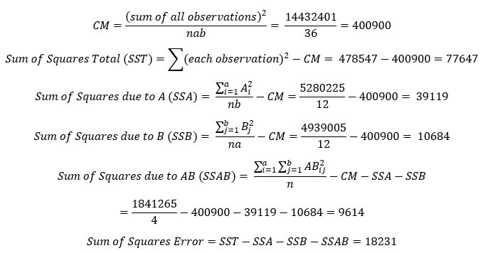
The second column is the Sum of Squares (SS). The SS is a measure of the variation that is attributed to each source of variation. The calculations for this example are shown below. These calculations assume that this is a crossed design with fixed factors, where a = number of levels of factor A, b = number of levels for factor B and n = the number of replications. Also, the value of Ai is the sum of the results when A is at level i. Bj and ABij are found similarly. The “Within” source is often called “Error.”
The third column contains the degrees of freedom (df). It is a measure of how much independent information you have. For a main factor, like A, it is given by the number of levels for factor A minus 1. For interaction factors, like AB, the degrees of freedom are the degrees of freedom for Factor A times the degrees of freedom for Factor B. So, with the total number of samples = 36, the degrees of freedom are given by:
df A = a – 1 = 2
df B = b – 1 = 2
df AB = (a – 1)(b – 1) = 4
df Error = (N – 1) – (df A + df B + df AB) = 27
df Total = N – 1
The fourth column contains the mean square values for the various sources of variation. These are obtained by dividing the sum of squares for each source by the degrees of freedom for each source. The treatment mean squares (e.g., A, B and AB) represent the variation between sample means. The mean square error (MSE) is obtained by dividing the “within” sum of squares by the “within” degrees of freedom. The MSE represents the variation within the samples.
The mean squares are used to determine if a source is statistically significant. This is done by calculating the F value for each source. For the crossed design with fixed factors, this is done by dividing each mean square for a source by MSE, the mean square error. For example, the F value for factor A is:
F for Factor A = Mean Square for Factor A/MSE = 19559/675.2 = 28.968
The F values are shown in the fifth column.
The sixth column is key to determining which factors or interactions have a statistically significant impact on the response variable. This column contains the p value for the F value. This represents how likely it is that you could get the calculated F value if the null hypothesis of no difference in means was true. The smaller the value, the more likely it is that the null hypothesis is not true. Quite often, the p value is compared to alpha = 0.05. If the p value is less than alpha, then the null hypothesis is rejected.
In this example, the p value for temperature, material and the interaction of temperature*material is less than 0.05. All are statistically significant and impact battery life.
If you would like to see the calculations for one factor ANOVA, please see our SPC Knowledge Base article One Factor ANOVA.
The Variability Chart
The ANOVA table tells you which factors and interactions significantly impact the response variable. But it doesn’t tell you what levels are best. It is helpful to construct a chart that plots the results. The variability chart does this. The variability chart plots the following:
- Individual sample results
- Treatment averages
- Subgroup averages
- Overall mean
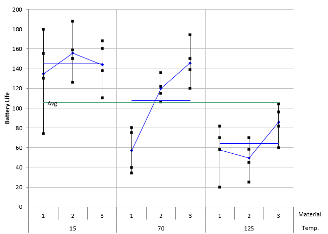
The variability chart for the battery life experiment is shown in Figure 1.
Figure 1: Variability Chart for Battery Life
This variability chart groups the results by temperature and shows the results for each level of material. The individual black squares are the sample results (4 replications per treatment condition). The blue diamonds are the average of each treatment condition (the average of the 4 replicates). The blue line is the average of the results for each temperature in this case. The green line is the overall average.
The variability chart shows that the lower temperature (15) gives longer battery life. It averages around 140+ hours while the temperature of 70 averages around 105 and the temperature of 125 averages around 60+ for the three materials. You can see the interaction between temperature and material in this figure as well. As you move up each temperature level through the three materials, you see different responses. For 15 degrees, there is little difference in the average battery life regardless of material type. For 70 degrees, the average battery life increases as you move from material 1 to material 3. For 70 degrees, the battery life is highest for material 3. If there is no interaction, you would expect the change in response to be the same, not different as shown in the figure.
It appears that a temperature of 15 and material type 3 (across all temperatures) gives the best result for battery life.
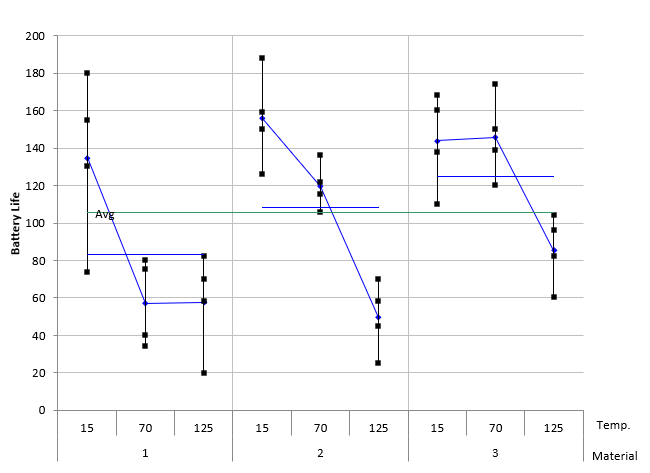
You can switch the factors on the x-axis to make it easier to see different factors. Figure 2 shows the variability chart with the results grouped by material.
Figure 2: Variability Chart with the Results Grouped by Material
The conclusions are still the same, it is just sometimes easier to see the results by looking at the different views the variability chart gives you.
Summary
This publication examined the Analysis of Variance (ANOVA) to determine what factors and/or interactions significantly impact a response variable. The variability chart was used to determine what the factor levels should be to give the optimized response variable. An example using a crossed design and fixed factors was used to demonstrate this. Designs can be crossed, nested or a mix of the two. Factors used in a design can be fixed, random or a combination of the two.
Do you have a download version available?
Yes, you can download a demo of the software at this link: SPC for Excel Demo |
Thank you