Our last blog – What is the Analysis of Means(ANOM)? – explained how ANOM is used to determine if there are differences in treatment means from an experiment. ANOM answers the question:
“Are there any significant differences in the treatment averages?”
The Analysis of Ranges (ANOR) is very similar to ANOM, but ANOR focuses on the within treatment variations. ANOR answers this question:
“Are there any significant differences in the within treatment variations?”
The example and the methodology for both ANOM and ANOR are taken from the book “Analyzing Experimental Data” by Dr. Donald Wheeler.
Here is the experiment. You have five different treatment methods you are considering for coating parts. For each treatment method, you coat four parts and measure the coating weight. You want to know if there are any differences in the treatment averages (ANOM) or the within treatment variation (ANOR) for the experiment you ran.
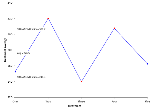
For each treatment method, you calculate the average and the range. The overall average and average range are also calculated. The last blog showed how to construct the ANOM chart. The ANOM chart from the last blog is shown below. There were three averages beyond the detection limits. This means that those three treatment averages are significantly different than the overall average.
The ANOM detection limits depend on the average range. This is a measure of the variation within a treatment. How can you be sure the average range is valid, i.e., the within treatment variation is the same for each of the five treatments? ANOR does this.
To start, the ranges for each treatment and the average range are plotted on the ANOR chart. There is only an upper detection limit for the range chart. It is given by:
Upper Detection Limit = ANORs(Average Range)
where ANORs is a scaling factor based on the number of subgroups, the subgroup size and the alpha level. The last blog explained the alpha level. Dr. Wheeler suggests using a smaller alpha for the range analysis than for the average analysis. The purpose of the two charts are different. The alpha level for the ANOM chart above was 10%.
With ANOM, you are looking for a signal from the experiment you ran. That is not the case for the ANOR chart. You don’t want a signal. If you get a signal on the ANOR chart, it means that a special cause was present in that subgroup – something happened that does not normally happen. If this occurs, then the estimate of the average range is probably inflated – which leads to larger detection limits on the ANOM chart and potentially missed signals.
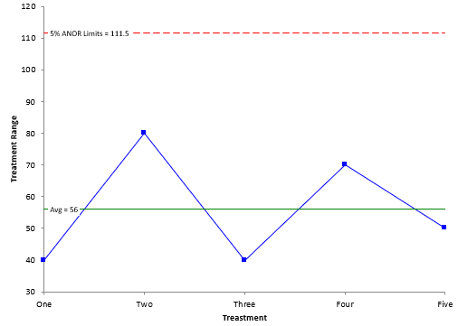
The ANOR chart is shown below with alpha = 5%.
There no treatment ranges beyond the upper detection limit. This means that there are no differences in the within treatment variations – each one is the same. It also means that you can “trust” the results in the ANOM – that there are three treatment averages that are different from the overall average.
For more information on ANOR, please see our SPC Knowledge Base article, The Analysis of Means and Ranges. Our SPC for Excel software contains the ANON and ANORmethodology.

