Control Charts Help
Home » SPC for Excel Help » Control Charts Help
A control chart is a method for looking at process variation over time. The control chart will tell you if your process is in statistical control (only common causes of variation present – and therefore consistent and predictable) or if there are special causes of variation. For much more information on control charts, please see our SPC Knowledge Base on our website.
A overview of how SPC for Excel creates control charts is given below. SPC for Excel has over 25 different charts you can create. The “Control Charts” panel on the SPC for Excel ribbon contains three parts:

Select any of the links for more information on that topic. An overview of how control charts are created in general is given below.
Overview
The procedure for creating a control chart using the SPC for Excel software is simple and straightforward. Plus, the procedure is essentially the same for all control charts.
- Enter the subgroup/sample identifiers (e.g., numbers (1, 2, 3), dates (2/1/14, 2/2/14, 2/3/14), batch number (33501, 33502, 33503), etc.) into an Excel spreadsheet
- Enter the data (the metric you want to monitor) into the Excel spreadsheet
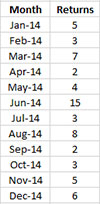
For example, suppose you are monitoring the number of returned goods to your factory each month. You have data for the past 12 months and enter it into an Excel spreadsheet as shown below.
Once you have the data in the worksheet, you select the data on the worksheet and the type of control chart you want to use from the “Control Charts” panel on the SPC for Excel ribbon. The data above can be analyzed using a c control chart under Attributes. Selecting “Attributes” from the “Control Chart” panel and then “c Chart” displays the input form below.
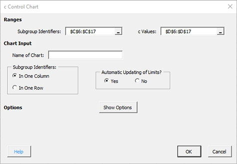
Enter the chart name, select OK and you have your control chart! Fast and simple.
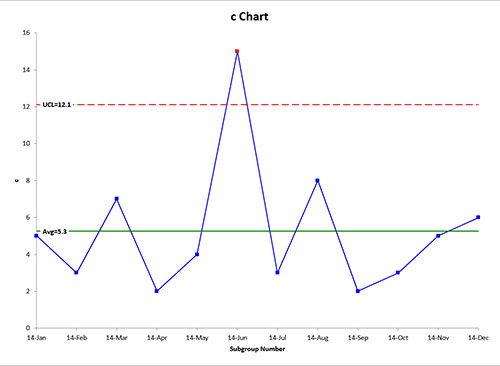
Note that the out of control points are in red. This is just one of the many features contained in the software. You can add new data easily to the chart, remove points from the calculations, split control limits, and add comments to name a few. Format the chart anyway you want and it will be maintained when the chart is updated.