October 2021
(Note: all the previous SPC Knowledge Base in the attribute control charts category are listed on the right-hand side. Select this link for information on the SPC for Excel software.)

But what about when you don’t have much data at all? Maybe something only happens rarely. For example, a certain type of infection or an adverse reaction to a drug may happen very seldom in a hospital. There are control charts, like the g control chart, which are designed especially for these “rare events”. This is one method of handling rare events. But what about the individuals control chart? Can it handle rare events as well?
This publication compares the g control chart and the individuals control chart in handling of rare events using the days between infections in a hospital as an example. The two charts are used to analyze a set of data containing rare events. The results are then compared. Is one better than the other?
In this publication:
- Example Data
- g Control Chart
- Individuals Control Chart
- Rates on the Individuals Control Chart
- Summary
- Quick Links
Please feel free to leave a comment at the end of this newsletter. You may also download a pdf copy of this newsletter at this link.
Example Data
A hospital is working to reduce a certain type of infection in ICU. Data have been collected when the infection occurs. The data for the last 15 dates of infections are shown below in Table 1. The days between infections have been calculated and added to Table 1. This is the baseline data that will be used for the control charts.
Table 1: Baseline Data for Days Between Infections
| Date | Days Between Infections |
|---|---|
| 2/1/2019 | |
| 2/23/2019 | 22 |
| 3/8/2019 | 13 |
| 4/2/2019 | 25 |
| 4/23/2019 | 21 |
| 4/28/2019 | 5 |
| 5/10/2019 | 12 |
| 6/2/2019 | 23 |
| 6/9/2019 | 7 |
| 6/27/2019 | 18 |
| 7/17/2019 | 20 |
| 7/24/2019 | 7 |
| 8/2/2019 | 9 |
| 8/7/2019 | 5 |
| 8/15/2019 | 8 |
The first date in the data where an infection occurred was 2/1/2019. The next date the infection occurred was 2/23/2019. There are 22 days between those two dates. The other days between infections in Table 1 are found similarly.
The hospital has implemented new procedures that hopefully will reduce the frequency of infections. Those new procedures were implemented after 8/15/2019. The data collected after that time is shown in Table 2.
Table 2: Data on Infections After New Procedure Implemented
| Date | Days Between Infections |
|---|---|
| 10/3/2019 | 49 |
| 11/16/2019 | 44 |
| 12/27/2019 | 41 |
| 3/14/2020 | 78 |
| 5/19/2020 | 66 |
| 7/26/2020 | 68 |
| 10/21/2020 | 87 |
| 12/27/2020 | 67 |
| 3/1/2021 | 64 |
| 5/15/2021 | 75 |
| 7/12/2021 | 58 |
You can see from Table 2 that the days between infections are higher than in Table 1 implying that the new procedures have indeed worked. Let’s see what the control charts tell us, starting with the g control chart.
g Control Chart
The g control chart is based on the geometric distribution and is designed specifically for monitoring rare events in a process. Most of the time, the g control chart tracks the number of days between rare events, like in our example. The g control chart can also be used with the number of opportunities between rare events, for example, the number of doses dispensed between an adverse drug reaction.
In our example, g is the number of days between infections. These are the values that are plotted on the g control chart. The centerline and control limits must be added to the chart. The average value of g is given by:
g=(Σgi)/k
where k is the number of data values. Note that examining the days between rare events, there is one less data point than there are dates.
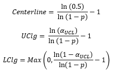
The event probability and alpha (based for example, on three sigma limits) are used to determine the control limits for the g control chart. Most control charts use the average as the centerline. Not so with the g control chart.
In this approach, you start by calculating the value of p, which is the event probability.
This value is used to calculate the centerline and the control limits. The probability-based equations are:
where UCLg is the upper control limit, LCLg is the lower control limit and the value of sUCL depends on the number of sigma limits for the control limits. For the usual 3 sigma limits, the value of sUCL is 0.00135. Note that you want a point above the UCL because this indicates a significant increase in the days between infections.
For more information on the g control chart and the control limit calculations, please see our SPC Knowledge Base Article: g Control Charts.
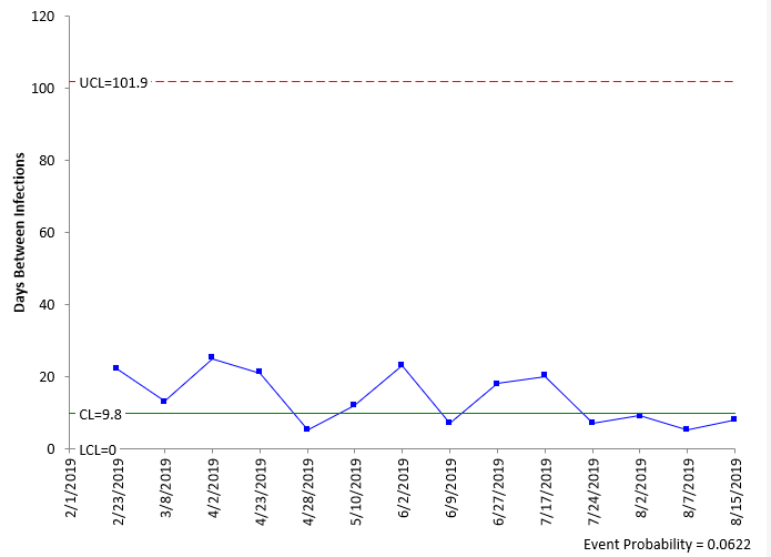
These equations were used to generate the centerline and control limits on the g control chart shown in Figure 1 for the baseline data.
Figure 1: g Control Chart for Baseline Data
The g control chart for the baseline data is in statistical control. There are no points beyond the control limits or any patterns (like 8 in a row above the centerline). This control chart does look different than most of the ones we see. The centerline is towards the bottom of the chart; the limits are not equidistance from the centerline. This is because it is based on a geometric distribution. There is another difference: the centerline is not the average. The average of the days in Figure 1 is 13.9, not 9.8.
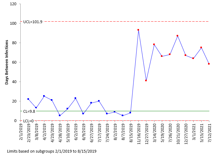
Now, let’s add the data to the g control chart after the procedural changes were made. This is shown in Figure 2. Remember that the centerline and control limits are based on the baseline data.
Figure 2: g Control Chart with Data After Procedural Changes Added
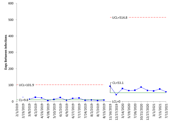
The g control chart shows the increase in days between infections clearly. The process has been improved with the new procedures. You can split the control limits to quantify the improvement and use the new control limits into the future. This is shown in Figure 3.
Figure 3: g Control Chart with Split Limits
This charts shows that the centerline has moved from 9.8 to 53.1. Remember, this is not the average for the two time periods but the centerlines. There is a run of 8 above the centerline on the second part of the chart.
The g control chart can be used to monitor rare events. It will tell you if the process is in statical control or there is a special cause of variation present. It can also show improvements. But it does look different from most other control charts. The large difference between the centerline and the UCL happens quite often with g control charts. What if we just use our old friend, the individuals control chart.
Individuals Control Charts
Let’s see how the data looks on an individuals control chart. Right off, there is one major difference – the individuals control chart is two charts – one for the individual X values and one for moving ranges. For example, the first three dates from Table 1 are given below.
| Date | Days Between Infections |
| 2/1/2019 | |
| 2/23/2019 | 22 |
| 3/8/2019 | 13 |
The days between infections are the X values. These are plotted on the X chart. The moving range is the range between consecutive X values, so the first moving range is |22 – 13| = 9.
The X and moving range values are plotted on their respective charts over time. The averages and control limits are then determined and added to the charts.
The overall average (X) and the average moving range (R) are then calculated using the following formulas:
X=ΣX/k
R=ΣR/(k-1)
where k = number of samples. Now you can calculate the upper control limit (UCLx) and lower control limit (LCLx) for the X chart as follows:
UCLx =X+ 2.66R
LCLx =X – 2.66R
The upper control limit (UCLr) for the moving range chart can then be calculated.
UCLr = 3.268R
The 2.66 and 3.268 are constants based on using a moving range of 2 in the analysis.
Let’s compare the X chart to the g control chart. The moving range chart is not included in this analysis. Figure 4 is the X chart for the baseline data.
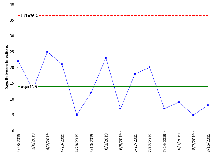
Figure 4: X Chart for Baseline Data
There is a LCL on the X chart, but it is negative. Since you can’t have negative days between infections, the LCL is left off the chart. Compare this chart to Figure 1, the g control chart based on the baseline data. What differences do you see? The X chart has the average days between infections (13.9) while the g control chart does not (has the centerline). Plus, the upper control limit is much smaller on the X chart. This makes it easier to see the variation between the plotted points. Now, let’s add the data from
Table 2 to the chart in Figure 4. Remember, the average and control limits are based on the data in Figure 4 and Table 1.
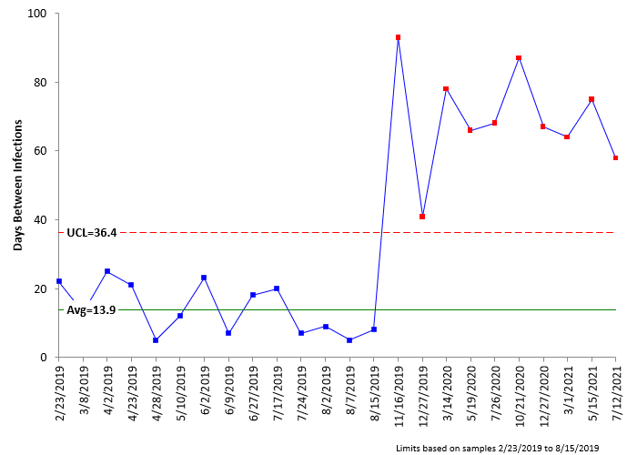
Figure 5: X Chart with Data After Procedural Changes Added
It is easy to see that the new procedures work on the X chart. There is a run outside the control limits. Now compare the X chart in Figure 5 to the g control chart in Figure 2. Note that the points on the g control chart are not beyond the UCL, but there is a run above the centerline. So, both charts picked up the change and have similar patterns. Figure 6 is the X chart with the control limits split.
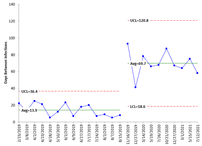
Figure 6: X Control Chart with Split Limits
Compare Figure 6 for the X chart with split limits to Figure 3 for the g control chart with split limits. Again, the upper control limit on the g control chart is large, which causes the days between infections to look compressed. Again, the centerline on the g control chart is not the average, as it is on the X chart. The points are distributed around the average on the X chart.
Comparing the X chart and the g control chart, it appears that the X chart is just as good, if not better, in analyzing the rare event data.
There is another way the individuals control chart can be used to analyze rare events.
Rates on Individuals Control Chart
Another method of using the individuals control chart with rare events is to calculate the rate of occurrence.
For example, the first data point is 22 days between infections. The yearly rate can be calculated as:
(1 infection/22 days)*(365 days/year) = 16.59 infections per year
The rates are shown in Table 3.
Table 3: Data as Rates
| Date | Days Between Infections | Rate | Date | Days Between Infections | Rate | |
|---|---|---|---|---|---|---|
| 2/1/2019 | 8/7/2019 | 5 | 73.00 | |||
| 2/23/2019 | 22 | 16.59 | 8/15/2019 | 8 | 45.63 | |
| 3/8/2019 | 13 | 28.08 | 10/3/2019 | 49 | 7.45 | |
| 4/2/2019 | 25 | 14.60 | 11/16/2019 | 44 | 8.30 | |
| 4/23/2019 | 21 | 17.38 | 12/27/2019 | 41 | 8.90 | |
| 4/28/2019 | 5 | 73.00 | 3/14/2020 | 78 | 4.68 | |
| 5/10/2019 | 12 | 30.42 | 5/19/2020 | 66 | 5.53 | |
| 6/2/2019 | 23 | 15.87 | 7/26/2020 | 68 | 5.37 | |
| 6/9/2019 | 7 | 52.14 | 10/21/2020 | 87 | 4.20 | |
| 6/27/2019 | 18 | 20.28 | 12/27/2020 | 67 | 5.45 | |
| 7/17/2019 | 20 | 18.25 | 3/1/2021 | 64 | 5.70 | |
| 7/24/2019 | 7 | 52.14 | 5/15/2021 | 75 | 4.87 | |
| 8/2/2019 | 9 | 40.56 | 7/12/2021 | 58 | 6.29 |
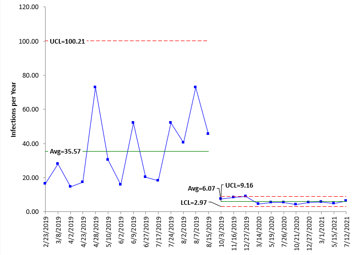
Now you can plot the rates using the individuals control chart. This is shown in Figure 7.
Figure 7: X Chart for Infection Yearly Rates
Note that improvement for this control chart is decreasing the yearly infection rate – so “down” is good, whereas “up” is good for the number of days between infection on the previous X and g control charts. This chart clearly shows the improvement as well, although it is hard to see the variation after the improvement but might be better if the chart is started new at the split point.
For more information on rates with the individuals control chart, please see our SPC Knowledge Base article: Rare Events and X-mR Charts.
Summary
This publication examined some alternatives for tracking “rare events” using control charts. All three charts examined were capable of seeing process changes in days between infections or the yearly rate. The g control chart had several issues – namely that the centerline is not the average and that the large upper control limit made it difficult to see the variation near the centerline. The individuals control chart did not have these issues. While both will work, it seems, at least with this dataset, that the individuals control chart is the best option. And the simplest.

