May 2019
(Note: all the previous SPC Knowledge Base in the attribute control charts category are listed on the right-hand side. Select this link for information on the SPC for Excel software)
Ever had a p control chart where the control limits were so tight that almost every point was beyond the control limits? If you use control charts a lot, you may have well run into this problem before. I have. And the way I typically “solved” it was to use an individuals control chart instead of the p control chart. But there is another option to use in these situations. It is called the Laney p’ chart. This month’s publication introduces the Laney p’ chart.
In this issue:
- Background Information
- The Data
- Using the p Control Chart
- Using the Individuals Control Chart
- Using the Laney p’ Control Chart
- Summary
- SPC for Excel Version 6 is Now Available!
- Quick Links
Please feel free to leave a comment at the end of this publication. You can download a pdf copy at this link.
Background Information
Attributes charts are often used to monitor data that are counts. This includes yes/no type data – such as the product is within spec or not. It also includes counting-type data – such as the number of customer returns. These attribute charts are based on certain assumptions, which have been covered in a previous publication: Attribute Control Charts Review. These assumptions include assumptions about the underlying distribution (binomial and Poisson) and the average of the distribution is the same over time.
Unfortunately, these assumptions are often not true, particularly with large sample sizes. In the past, the easiest solution was simply to use an individuals control chart instead of the attribute control chart. Our past publication, Comparing Individuals Charts to Attribute Charts, compared the individuals control chart to the attribute control charts.
In 2002, David B. Laney published an article in Quality Engineering that described a new approach to handle the situations when the assumptions are not true, particularly when the sample size is very large.
The Data
We will use data from the book The Health Care Data Guide by Lloyd P. Provost and Sandra K. Murray. These data are from a call center of a health care organization. The data tracks the number of members who communicate with the health care center by phone each month. The data are shown in Table 1. The table gives the number of members each month, the number that communicated by phone, and the percentage of members who communicated by phone.
Table 1: Health Care Organization Data
| Month | Members | Manage by Phone | % |
|---|---|---|---|
| Jan-07 | 8755 | 3852 | 44.00% |
| Feb-07 | 9800 | 4100 | 41.84% |
| Mar-07 | 17000 | 7083 | 41.66% |
| Apr-07 | 16400 | 7339 | 44.75% |
| May-07 | 19500 | 9406 | 48.24% |
| Jun-07 | 19800 | 9310 | 47.02% |
| Jul-07 | 21200 | 7250 | 34.20% |
| Aug-07 | 22300 | 10400 | 46.64% |
| Sep-07 | 21600 | 9250 | 42.82% |
| Oct-07 | 20500 | 9950 | 48.54% |
| Nov-07 | 18700 | 9846 | 52.65% |
| Dec-07 | 18900 | 9854 | 52.14% |
| Jan-08 | 14300 | 8034 | 56.18% |
| Feb-08 | 14800 | 8162 | 55.15% |
| Mar-08 | 14500 | 8122 | 56.01% |
| Apr-08 | 14600 | 8200 | 56.16% |
Using the p Control Chart
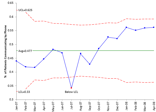
The classical approach to monitoring these types of data over time is with a p control chart. This type of chart monitors yes/no data – either the member called or did not. Each month, you count the number of members (n) and the number who called in (np). You then calculate the % who called in for the month as number who called in/total number of members. This is the p value. It is plotted each month. After enough months, the average and control limits are calculated and added to the chart. Figure 1 shows the p control chart based on the data in Table 1.
Figure 1: p Control Chart for % of Patients Communicating by Phone
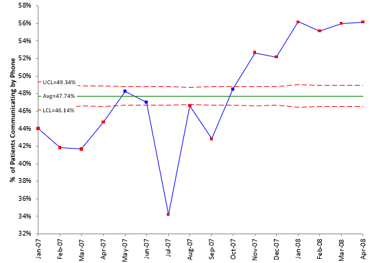
As you can see from the chart, most points are out of control. A control chart is really comparing the within subgroup variation with the between subgroup variation. In this example, the p control chart is comparing the within month variation to the between month variation. The control chart is showing that the within month variation is much less than the between month variation – and this leads to the control chart that looks like the one above.
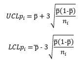
One reason this occurs is the large subgroup size. The control limits, based on this assumption of a binomial distribution, are given by:
where UCLpi and LCLpi are the upper and lower control limits for point i and p is given by:
p=Σnp/Σn
Note the ni value in the denominator of the control limits. The control limits vary as ni, the subgroup size, varies. Also, the control limits become very tight as n gets larger – the LCLpi and the UCLpi get closer together. This is why so many points are beyond the control limits. So maybe the individuals chart will help us.
Using the Individuals Control Chart
When faced with this issue in the past, the easiest thing has been to treat the data as individuals values and use an individuals chart to analyze the data. The individuals control chart for the data is shown in Figure 2 (the X chart only, not the moving range chart).
Figure 2: X Chart for % of Patients Communicating by Phone
More information on individual control charts, including the control limit equations, can be found in our publication, Individuals Control Charts.
This control chart looks a lot better than the p control chart. The control limits make a lot more sense. Not everything is out of control. There is nothing really wrong with this approach – using the individuals control chart. There is only one criticism about the individuals control chart in this situation – it does not account for varying subgroup sizes. Often that will not be an issue, but there are times when it can be. The Laney p’ chart takes care of this potential problem.
Using the Laney p’ Chart
The Laney p’ chart is produced by combining z values with the individuals control chart. It begins with calculating a z value for each point. A z value tells you the number of sample standard deviations between the point and the average. The z value for point i is given by:
p is the average shown in the p control chart (0.4774). The denominator is the standard deviation for point i. Note that denominator under the square root size has the sample size for point i. For the first point, calculations are:
The next step is to calculate the moving range of z between consecutive points.
Ri = |zi – zi-1|
The results of the calculations are given in the table below (small differences due to rounding).
Table 2: Laney p’ Chart Calculations
| Month | % | z | mR | UCL | LCL |
|---|---|---|---|---|---|
| Jan-07 | 44.00% | -7.005 | 62.52% | 32.96% | |
| Feb-07 | 41.84% | -11.694 | 4.689 | 61.71% | 33.77% |
| Mar-07 | 41.66% | -15.851 | 4.157 | 58.34% | 37.13% |
| Apr-07 | 44.75% | -7.659 | 8.193 | 58.54% | 36.94% |
| May-07 | 48.24% | 1.394 | 9.053 | 57.64% | 37.83% |
| Jun-07 | 47.02% | -2.020 | 3.414 | 57.57% | 37.91% |
| Jul-07 | 34.20% | -39.467 | 37.447 | 57.24% | 38.24% |
| Aug-07 | 46.64% | -3.290 | 36.177 | 57.00% | 38.48% |
| Sep-07 | 42.82% | -14.457 | 11.166 | 57.15% | 38.33% |
| Oct-07 | 48.54% | 2.291 | 16.748 | 57.40% | 38.08% |
| Nov-07 | 52.65% | 13.457 | 11.165 | 57.85% | 37.62% |
| Dec-07 | 52.14% | 12.111 | 1.345 | 57.80% | 37.68% |
| Jan-08 | 56.18% | 20.217 | 8.106 | 59.30% | 36.17% |
| Feb-08 | 55.15% | 18.051 | 2.166 | 59.11% | 36.37% |
| Mar-08 | 56.01% | 19.953 | 1.902 | 59.22% | 36.25% |
| Apr-08 | 56.16% | 20.386 | 0.433 | 59.18% | 36.29% |
The next step is to calculate the average range. The average of the moving range values in the table is 10.4108. The standard deviation of the z values is given by the following:
where 1.128 is a constant that depends on the moving range size (2 in this case). The last step is to determine the control limits. The control limits are given by:
For example, the UCLp’ for the first point is given by:
The control limits calculations for all the points are shown in Table 2.
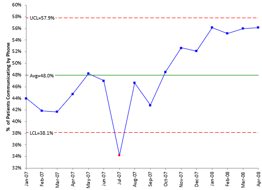
The Laney p’ chart can now be constructed. The plotted points are the percentages shown in Table 2. The average isp. The Laney p’ chart is shown below.
Figure 3 Laney p’ Chart for % of Patients Communicating by Phone
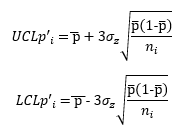
Compare the control limit equations for the p control chart and the Laney p’ control chart. What is the difference between them? The only difference is the appearance of the σz term in the Laney p’ control chart. What is this term really? Laney described it as the following:
“It is the relative amount of process variation not explained by the binomial assumption alone. As n increases, the variation due to sampling diminishes, thus making the batch-to-batch component relatively larger. That is why applications with large subgroups reveal this situation very often.”
This Laney p’ control chart looks very similar to the X control chart, except for the varying control limits. The X chart does not have the ability to address situations where the subgroup size varies – and loses the information contained in the variation. The Laney p’ chart is simply an extension of the X chart that allows it to handle the varying subgroup sizes as well as large subgroups sizes. This can also be extended to the u control chart.
Summary
This publication introduced the Laney p’ control chart. This control chart is very useful in handling large subgroup sizes that lead to very narrow limits on the traditional p control chart. It does this by combining the calculation of z values with the X control chart as shown above. The Laney p’ control chart can be used whenever you have large subgroup sizes when using attribute data.
SPC for Excel Version 6 is Now Available
SPC for Excel Version 6 has now been released. Version contains many new techniques, in particular relating to Measurement Systems Analysis (MSA). This version focuses on Dr. Don Wheeler’s Evaluating the Measurement Process. Included are three major EMP techniques:
- EMP Consistency Study
- EMP Short Study
- EMP Basic Study
The last is a better method of analyzing your basic Gage R&R study where multiple operators test multiple parts multiple times. Version 6 produces detailed reports or overview reports. You can download an example of the detailed EMP Basic Study report at this link.
New items in Version 6 include:
- Type 1 Gage Analysis
- Laney p’ Control Chart
- Laney u’ Control Chart
- Individuals chart using median X and/or median moving range
- Option to label out of control point with the reason
- ANOM (analysis of means) now includes ANOR (analysis of ranges)
- ANOX (analysis of individual values)
- Random number generator
Plus, you get the new builds for version 6 at no cost. These new builds continually improve the software with new and enhanced techniques. Find out more information on version 6 at this link.



As Dr Wheeler points out, unless you have a PhD in statistics, use an XmR chart. Don't torture the data.