In this issue:
- Attributes Data and Control Charts
- np Control Charts
- np Control Chart Example: Red Beads
- Steps in Constructing an np Control Chart
- Small Sample Case
- Combining np Charts with Pareto Diagrams
Last month’s publication introduced the red bead experiment as a method of teaching variation. This newsletter, like all past newsletters, is available on our website. We included a red-bead simulation program that you could download for free. That simulation included a control chart that would automatically plot the results from the red bead experiment. That control chart is an example of an np control chart. We introduce the np control chart in this publication.
Attributes Data and Control Charts
Customers today not only expect a quality product, but they also expect quality in items associated with the product. This includes answering the phone when a customer calls, resolving a customer issue on the first phone call, correct invoicing and on-time shipments, just to name a few. These types of “attributes” are not easily measured in most cases. How can we monitor these types of situations over time? Attributes control charts can be used with this type of data.
These types of data, which are based on counts, are often called attributes data. There are two types of attributes data: yes/no and counting type data. With yes/no type data, you are examining distinct items (such as invoices, deliveries, or phone calls). With counting type data, you are usually examining an area where a defect has an opportunity to occur. Both types of data are explained below.
Yes/No Data: For each item, there are only two possible outcomes: either it passes or it fails some preset specification. Each item inspected is either defective (i.e., it does not meet the specifications) or is not defective (i.e., it meets specifications). Examples of the yes/no data are phone answered/not answered, product in spec/not in spec, shipment on time/not on time and invoice correct/incorrect.
If you have yes/no data, you will use either a p or np control chart to examine the variation in the fraction of items not meeting a preset specification in a group of items. You would use a p control chart if the subgroup size (the number of items examined in a given time period) changes over time. You would use the np control chart if the subgroup size stays the same
Counting Data: With counting data, you count the number of defects. A defect occurs when something does not meet a preset specification. It does not mean that the item itself is defective. For example, a television set can have a scratched cabinet (a defect) but still work properly. When looking at counting data, you end up with whole numbers such as 0, 1, 2, 3; you can’t have half of a count.
If you have counting data, you would use a c chart or a u chart. The c chart would be used if the area stayed constant from sample to sample; the u chart would be used if the area did not stay constant.
If you don’t have data based on counts, you have variables data. Variables data are taken from a continuum and are often referred to as continuous. Variables data can, theoretically, be measured to any precision you like. Examples of variables data include time, length, width, density, dollars, and height.
For more information on types of data, you can download a free PowerPoint training module (click here) from our website or see our September 2004 newsletter on data collection (click here). You may also be interested in our newsletter on how to select the right kind of control chart (click here).
So, there are four different attributes control controls. With this newsletter, we will now have covered all four types. The links are given below.
Yes/No Type Data:
- p Control Charts (July 2005)
- np Control Chart (this newsletter)
Counting Data:
np Control Charts
An np control chart is used to look at variation in yes/no type attributes data. There are only two possible outcomes: either the item is defective or it is not defective. The np control chart is used to determine if the number of defective items in a group of items is consistent over time. The subgroup size (the number of item in the group) must be the same for each sample.
A product or service is defective if it fails, in some respect, to conform to specifications or a standard. For example, customers like invoices to be correct. If you charge them too much, you will definitely hear about it and it will take longer to get paid. If you charge them too little, you may never hear about it. As an organization, it is important that your invoices be correct. Suppose you have decided that an invoice is defective if it has the wrong item or wrong price on it. You could then take a random sample of invoices (e.g., 100 per week) and check each invoice to see if it is defective. You could then use an np control chart to monitor the process.
You use an np control chart when you have yes/no type data. This type of chart involves counts. You are counting items. To use an np control chart, the counts must also satisfy the following two conditions:
- You are counting n items. A count is the number of items in those n items that fail to conform to specification.
- Suppose p is the probability that an item will fail to conform to the specification. The value of p must be the same for each of the n items in a single sample.
If these two conditions are met, the binomial distribution can be used to estimate the distribution of the counts and the np control chart can be used. The control limits equations for the np control chart are based on the assumption that you have a binomial distribution. Be careful here because condition 2 does not always hold. For example, some people use the p control chart to monitor on-time delivery on a monthly basis. A p control chart is the same as the np control chart, but the subgroup size does not have to be constant. You can’t use the p control chart unless the probability of each shipment during the month being on time is the same for all the shipments. Big customers often get priority on their orders, so the probability of their orders being on time is different from that of other customers and you can’t use the p control chart. If the conditions are not met, consider using an individuals control chart.
np Control Chart Example: Red Beads
The red bead experiment described in last month’s newsletter is an example of yes/no data that can be tracked using an np control chart. In this experiment, each worker is given a sampling device that can sample 50 beads from a bowl containing white and red beads. The objective is to get all white beads. In this case, a bead is “in-spec” if it is white. It is “out of spec” if it is red. So, we have yes/no data – only two possible outcomes. In addition, the subgroup size is the same each time, so we can use an np control chart.
Data from one red bead experiment are shown below. The numbers represent the number of red beads each person received in each sample of 50 beads.
| Worker | Day 1 | Day 2 | Day 3 | Day 4 |
|---|---|---|---|---|
| Tom | 12 | 8 | 6 | 9 |
| David | 5 | 8 | 6 | 13 |
| Paul | 12 | 9 | 8 | 9 |
| Sally | 9 | 12 | 10 | 6 |
| Fred | 10 | 10 | 11 | 10 |
| Sue | 10 | 16 | 9 | 11 |
The np control chart from this data is shown below.
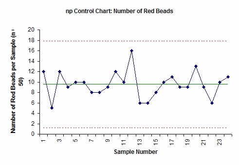
The np control chart plots the number of defects (red beads) in each subgroup (sample number) of 50. The center line is the average. The upper dotted line is the upper control. The lower dotted line is the lower control limit. As long as all the points are inside the control limits and there are no patterns to the points, the process is in statistical control. We know what it will produce in the future. While we don’t know the exact number of red beads a person will draw the next time, we know it will be between about 2 and 17 (the control limits) and average about 10.
Steps in Constructing an np Control Chart
The steps in constructing the np chart are given below. The data from above is used to demonstrate the calculations.
1. Gather the data.
a. Select the subgroup size (n). Attributes data often require large subgroup sizes (50 – 200). The subgroup size should be large enough to have several defective items. The subgroup size must be constant.
In the red bead example, the subgroup size is 50.
b. Select the frequency with which the data will be collected. Data should be collected in the order in which it is generated.
c. Select the number of subgroups (k) to be collected before control limits are calculated. You can start a control chart with as few as five to six points but you should recalculate the average and control limits until you have about 20 subgroups.
d. Inspect each item in the subgroup and record the item as either defective or non-defective. If an item has several defects, it is still counted as one defective item.
e. Determine np for each subgroup.
np = number of defective items found
f. Record the data.
2. Plot the data
a. Select the scales for the control chart.
b. Plot the values of np for each subgroup on the control chart.
c. Connect consecutive points with straight lines.
3. Calculate the process average and control limits.
a. Calculate the process average number defective:
![]()
where np1, np2, etc. are the number of defective items in subgroups 1, 2, etc. and k is the number of subgroups.
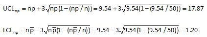
In the red bead example, each of the six workers had 4 samples. So, k = 24. The total number of red beads (summing all the data in the table above) is 229. Thus, the average number of defective items (red beads) in each sample is 9.54.
b. Draw the process average number defective on the control chart as a solid line and label.
c. Calculate the control limits for the np chart. The upper control limit is given by UCLnp. The lower control limit is given by LCLnp.
The control limits for the red bead data are calculated by substituting the value of 9.54 for the average number defective and the value of 50 for the subgroup size in the equations above. This gives an upper control limit of 17.87 and a lower control limit of 1.20.
d. Draw the control limits on the control chart as dashed lines and label.
4. Interpret the chart for statistical control.
a. The following tests for statistical control are valid.
- Points beyond the control limits
- Length of runs test
- Number of runs test
The red bead control chart (shown above) is in statistical control. All the points are between the control limits and there are no patterns. Remember that the upper control limit represents the largest number we would expect if only common cause of variation is present. The lower control limit represents the smallest number we would expect. As long as the process stays the same, we can predict what will happen in the future. Each person will have between 2 and 17 red beads in the sample. This won’t change until we fundamentally change the process.
Small Sample Case for np Control Charts
The control limits above are valid only if the average number defective (npbar) is sufficiently large. If the average becomes too small, the distribution is no longer symmetrical and the control limit equations are not valid. If npbar < 5, the average is no longer “large” enough and you have the small sample case for the np chart. In this case, you must use the actual binomial distribution to find the control limits. Please see our February 2008 newsletter (click here) for more details.
Combining np Control Charts with Pareto Diagrams
Suppose you are tracking the number of invoices with errors on a weekly basis. You have developed an operational definition of what constitutes an error on the invoice. You have decided there are five possible reasons: wrong item, wrong price, wrong person, wrong address, or wrong payment terms. You collect data for 20 weeks. The control chart for the twenty weeks is shown below.
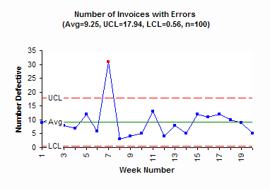
This chart has one out-of-control point. In week 7, there was an unusually high number of invoices with errors. The special cause should be found and eliminated. Then efforts at reducing the common causes of variation can begin. But to improve you must know what errors occur most frequently. This is where you can construct a Pareto diagram on the reasons for invoice errors. The Pareto diagram for this example is shown below.
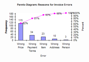
It is easy to see from this Pareto diagram that the number one reason for invoice errors is the wrong price. Working on reducing pricing errors will significantly improve the process. For more information on Pareto diagrams, click here.
When using an np control chart (or any attributes control chart), always track the reasons defects occur or an item is defective. This allows you to construct a Pareto diagram on reasons and bring focus to your process improvement efforts.
Summary
This month’s publication looked at np control charts. The red beads experiment is an example of where the np control chart can be used. The steps in constructing the np control chart were introduced. Combining np control charts with Pareto diagrams in an important step in process improvement.