June 2004 (Updated June 2018)
(Note: all the previous SPC Knowledge Base in the “Bar Charts” category are listed on the right-hand side. Select this link for information on the SPC for Excel software. This publication was originally published in June 2004. It was updated in June 2018 with more information and graphics.)

A Pareto chart is a data-based approach to determine what the major problem or cause is. All companies have lots and lots of problems on which to work. There is not enough time in our day to work on everything. The Pareto chart gives us a way to determine which problem to work on first – where we will get the most return for our investment. And the Pareto chart is also a great communication technique as we shall see.
In this issue:
- The 80/20 Rule
- Overview of the Pareto Chart
- Constructing a Pareto Chart
- Pareto Chart Example: Billing Errors
- Tunneling Down in the Pareto Chart
- The “Other” Category
- Operational Definitions
- Summary
- Quick Links
You may download a pdf version of this publication at this link. Please feel free to leave a comment at the end of the publication.
The 80/20 Rule
Vilfredo Pareto, an Italian economist, developed the Pareto chart in the late 1800s. He discovered that 80% of Italy’s wealth was held by 20% of the people. This has become known as the 80/20 rule or the Pareto principle. It is at the heart of the Pareto chart. The 80/20 rule applies in many places – 20% of our customers are responsible for 80% of the customer complaints; 20% of the workforce account for 80% of employee issues. The Pareto chart is one method of separating that 20% – the vital few – from the 80% – the trivial many. This allows us to focus our time, energy, and resources where we will get the most return for our investment.
Overview of the Pareto Chart
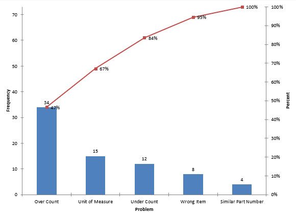
A Pareto chart is a special type of bar chart. It can be used in many situations. For example, it can be used to determine which causes of a problem occur most frequently. Figure 1 below is an example of a Pareto chart on reasons for picking errors by pickers in a warehouse. The reasons for picking errors are placed on the x (horizontal) axis. These reasons include over count (picked more items than on the order), under count (picked fewer items than on the order), unit of measure problem, similar part number, and wrong item.
Figure 1: Picking Errors
The frequency is plotted on the y (vertical) axis. This frequency is how often each reason for a picking error occurred. The reasons on the x-axis are listed from the one that occurred most frequently (over count) to the one that occurred least frequently (similar part number)
It is easy to see from the Pareto chart which reason occurs most frequently – it is over count. It is difficult for anyone to disagree with this since the Pareto chart uses data. The Pareto chart helps get consensus on the major issue.
The line on the Pareto chart is called the cumulative percentage line. It gives the cumulative percent for the reasons starting with the first reason and going through all the reasons. For example, over count was responsible for 47% of the total picking errors. Over count and unit of measure, the next most frequent reason, accounted for 67% of the picking errors. Of course, the last entry on the cumulative percentage line is 100%. The cumulative line gives you an idea of how much improvement there could be if a reason was eliminated, e.g., 47% of the picking errors could be eliminated if we could figure out how to eliminate over counts.
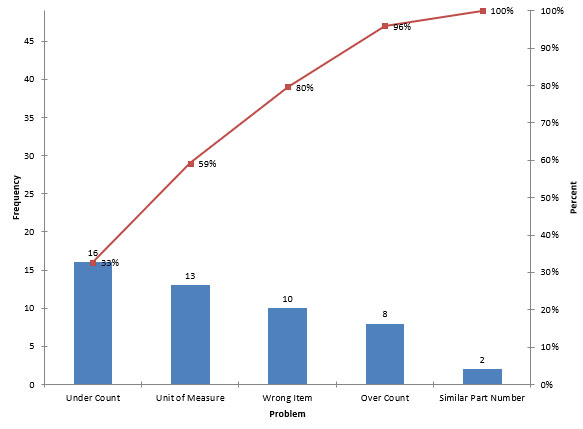
Pareto charts can also be used to show improvements. If we worked on reducing picking errors due to over counts, what would happen to the over count “bar” on the Pareto chart in Figure 1? It should be lower and move to the right. Figure 2 shows the Pareto chart after working on reducing picking errors due to over counts. You can see that the over count “bar” has moved to the right. It is the second smallest bar instead of the largest. So, a Pareto chart can be used to show the gains made through process improvements.
Figure 2: Pareto Chart after Reducing Over Counts
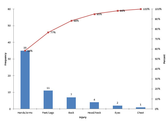
The vertical axis metric is usually frequency – how often a reason occurs. But it does not have to be. There are other options to consider and sometimes it depends on what the Pareto chart is being used for. For example, consider Figure 3 below. This is a Pareto chart on injuries in a manufacturing plant. The vertical axis is frequency – how often an injury occurred to a part of the body. Are there other ways to look at these data? The greatest frequency occurred with injuries to the hands and arms. This is not surprising in a manufacturing plant – cuts or bruises to the arms and hands are not that uncommon – particularly in the maintenance department.
But they are not too serious most of the time. On the other hand, injuries to the head, eyes or chest can be very serious. You may want to examine the data in terms of seriousness of injury – working on injuries to arms and hands may not be as important as injuries to the head, eyes or chest even those occur less frequently. You may consider examining the data in terms of lost time or medical costs. The point is that you do not have to use “frequency” all the time as the vertical axis metric. There are times when it is appropriate to use other metrics, such as cost. Management often likes to see data in terms of cost.
Pareto charts can be used in many situations. They can be used to determine the major causes of why marriages fail or survive, what kind of gardening techniques are most successful, or why people are watching less commercial television than they used to. At work, Pareto charts can be used in all areas including production, maintenance, shipping, accounting, and safety. They can be used to determine the major reasons for problems in any of these areas. These problems may deal with waivers, injuries, delayed shipments, invoice errors, etc.
Figure 3: Pareto Chart on Types of Injuries
Constructing a Pareto Chart
The manual steps in constructing a Pareto chart are listed below. Of course, software packages do these steps for you!
- Determine the problems or causes to be used on the chart.
- Select the time-period to be covered on the chart.
- Total the frequency of occurrence (or cost) for each problem during the time period.
- Draw the x and y axes putting the proper units on the y-axis.
- Under the x-axis, write in the most important problem (largest frequency) first, then the next most important, etc.
- Draw in the bars. The height of the bar will correspond to the frequency of occurrence for each problem on the x-axis.
- Calculate the cumulative percentages.
- Plot the cumulative percent line.
- Title the graph and include any other important information.
Pareto Chart Example: Billing Errors
A team is working on reducing the time it takes to complete a billing process. Errors cause delays in billing. The team decided to collect data for one month on reasons why a bill did not go through the first time.
1. Determine the problems or causes to be used on the chart. The team brainstormed the list of reasons why the billing process would fail.
- Wrong PO #
- Addition
- Freight
- Cost
- Not on File
- Wrong Quantity
2. Select the time period to be covered on the chart. The team decides to collect data for a period of one month.
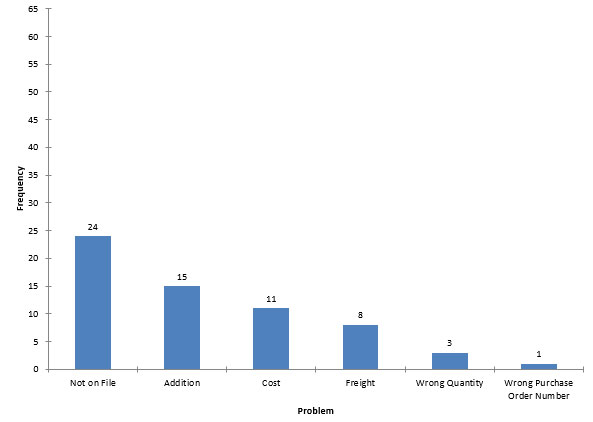
3.Total the frequency of occurrence (or cost) for each problem during the time period. After one month of data collection, the team had the following results:
- Wrong PO #: 1
- Addition: 15
- Freight: 8
- Cost: 11
- Not on File: 24
- Wrong Quantity: 3
4. Draw the x and y axes putting the proper units on the y-axis. Since the Pareto chart will include the cumulative line, the maximum value on the y-axis should be at least equal to the total number of problems (reasons). The total number is 62. There are 6 different reasons. The x-axis is divided into 6 equal segments.
5. Under the x-axis, write in the most important problem (largest frequency) first, then the next most important, etc. As can be seen in the table above, Not on File is the largest reason. This reason is listed first. The next most frequent reason is Addition. This is written in next. The other reasons are then written in based on decreasing frequency.
6. Draw in the bars. The height of the bar will correspond to the frequency of occurrence for each problem on the x-axis. If possible, it is a good idea to write in the actual frequency on the top of each bar.
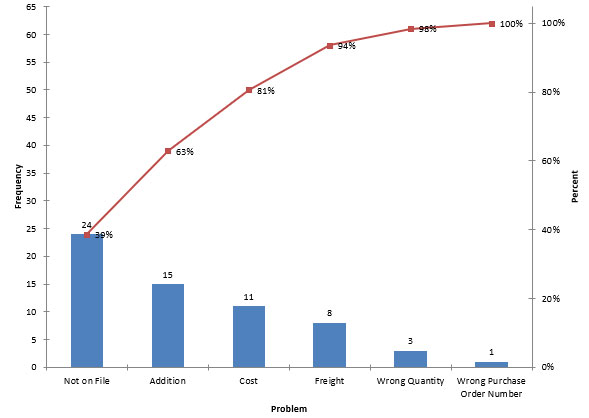
7. Calculate the cumulative percentage. The cumulative percentage is calculated as shown Below. the data are given in descending order based on frequency of occurrence.
- Not on File (24): 24/62 = 39%
- Addition (15): (24+15)/62 = 63%
- Cost (11): (24+15+11)/62 =81%
- Freight (8): (24+15+11+8)/62 =94%
- Wrong Quantity (3): (24+15+11+8+3)/62 = 98%
- Wrong Purchase Order Number (1): (24+15+11+8+3+1)/62 = 100%
8. Plot the cumulative percentage. The 100% mark on the cumulative percent axis corresponds to the total number of occurrences on the frequency axis.
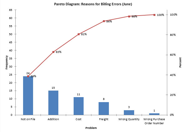
9.Title the graph and include any other important information. You should always include the dates the data were collected.
Tunneling Down in the Pareto Chart
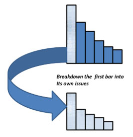
You can use the Pareto chart to “tunnel down” further into an issue. This simply involves taking the highest bar on a Pareto chart and expanding just that bar to get deeper into the problem. This is shown in the figure below.
Figure 4: Tunneling Down with the Pareto Chart
The “Other” Category
Quite often Pareto charts contain an “other” category. This category is used when a problem/cause does not fit into one of the defined categories.
If you make a Pareto chart and the “other” category is very large – approaching the “vital few”, then you know that you need to take a closer look at the “other” category. When collecting data, be sure that the data collectors record the reason for the “other” – not just put down “other.” This will allow you to determine if there are additional reasons that should be included.
Operational Definitions
Operational definitions are very important with Pareto charts. Since Pareto charts are based on data, you must collect data. And quite often you are collecting qualitative data – reasons for picking errors, shipping errors, etc.
Maybe you are collecting data on supplier on-time performance to rate suppliers. What is on-time? On-time has many different definitions. Maybe it is the date we asked for. If the supplier ships it early, is it on-time? If we agree to a change in the promised date, is it still on-time? On-time lacks a clear, operational definition.
What happens to our Pareto chart if you are collecting data with one interpretation of on-time and others are using a different definition? The data that are collected will be suspect and not much use to anyone. So, it is critical that you have good operational definitions so that everyone agrees when something, like on-time, occurs.
Last month’s publication discussed operational definitions in some detail. Please refer to that publication for more information on operational definitions.
Summary
The Pareto chart is a data-based method of determining which problem to work on first or what the major cause of a problem is. It helps a team reach consensus on where valuable time and resources should be spent. It is also a very effective communication tool. A Pareto chart makes it easy to see the magnitude of various problems. Pareto charts can also be compared to show improvements from one time period to another. Basically, the Pareto chart separates the vital few from the trivial many – the Pareto principle or the 80/20 rule.
The e-reader version of this newsletter is not exporting correctly as a PDF. I've tried accessing it with the latest versions of Internet Explorer, Mozilla Firefox, and Google Chrome with the same results. I conclude the problem is not due to the browser I'm using. I want to export all pages as a single PDF. I click the corresponding radio button and change the "1,2" string to "1-10". I've also tried changing the string to "1,2,3,4,5,6,7,8,9,10". It seems that regardless of what I do, the output is a cropped portion of Page 1 only. Note, my recollection is that with previous newsletters, the initial string has been "1-K" where K is the number of pages, and I've never before had problems generating a PDF of all pages that way.
Hi Sue,
Yes it appears we have a problem that we are working on solving. Please email me at bill@www.spcforexcel.com and I will send you the pdf version. Not sure when we will have it fixed on the web. Thanks for letting us know.
The issue has been fixed. You can download the pdf file now.
Thanks for the article