In this issue:
- Histogram Review
- Histograms Can Reveal Problems!
- More Examples
- The Steps in Constructing a Histogram
- Answers
This starts the third year for our SPC newsletter. Thanks to all of you for subscribing to this newsletter and for providing valuable feedback for improvement. This month we return to histograms. What result occurs most frequently from a process? How much variation is there about this most frequently occurring result? Is the variation symmetrical? Is the process producing any results that are out of specifications? These types of questions are common when beginning to look at how a process is operating. Last month’s e-zine introduced the histogram that can help you answer these types of questions. This month we will look at how to construct a histogram and how histograms can be used to detect process problems.
Histogram Review

Below is a brief review of the material covered in last month’s e-zine.
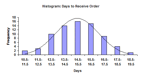
The figure above shows a completed histogram. This histogram displays the number of days it takes for a supplier to deliver an order. The histogram includes data collected over a one-month period (the time frame or “history”). The number of days required for an order to arrive is given on the x (horizontal) axis. The number of times this value occurred (number or frequency of occurrences) during the month is given on the y (vertical) axis. For example, orders took 13 days to arrive 10 times during the month. They took 15 days to arrive 16 times during the month. The histogram can be viewed as a summary of information over a certain time frame; in this example, the time frame is one month.
We can easily determine the value that occurred most frequently during the time frame. This value is the highest point on the histogram and is called the “mode.” For this example, the mode is 15 days. The histogram also gives an indication of how much variation is present. An indirect measure of this variation is found by comparing the smallest value and the largest value on the histogram. For this example, it takes from 11 (smallest value) to 19 (largest value) days for the supplier to deliver our orders during the month. This is called the overall range and is given by:
Overall Range = Maximum Value – Minimum Value
The histogram also provides an estimate of the shape of the distribution. For example, does the histogram represent a normal distribution (a bell-shaped curve)? The figure above shows a bell-shaped curve superimposed on the histogram. This histogram appears to fit this distribution. Many histograms will have this type of shape. Most values will occur around the highest bar (mode). As you move away from the mode, the values occur less frequently. Normally there will be a gradual decrease as you move away from the mode.
A histogram also permits us to compare the results with specifications. For example, suppose our specifications for delivery is 15 days ± 3 days. This means we require the orders to arrive between 12 and 18 days from the time the order is placed. These specifications can be added to the histogram. It is easily seen that some of the deliveries are outside the specifications of 12 to 18 days.
A histogram tells us four things:
- What the most common value (the mode) is
- The amount of variation present
- The shape of the distribution
- The relationship of the data to the specifications
Histograms Can Reveal Problems!

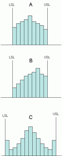
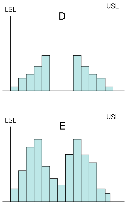
Suppose you are interested in determining how well a supplier of a major raw material is doing versus specifications. As an initial look, you decide to take data from Certificates of Analysis received from the supplier and construct histograms. For each histogram in the figure, what conclusions would you draw about the material you are being supplied? The answers are given below.
Assume you are dealing with a normal distribution where the high point on the histogram represents the mode (most frequently occurring value) and the frequencies become less and less as you move away from the mode.
More Examples
The Steps in Constructing a Histogram
1. Select the time frame (history) you are interested in and gather the data. The time frame must be sufficiently long so that there are at least 50 data points. It is better to have 75 to 100 points.
In the example, the time frame was one month. A total of 74 data points were collected. The data are shown below.
16 15 13 17 17 11 13 14 13 14 13 18 12 17 14 11 15 15 17 14 17 16 17 16 15 15 13 15 14 13 16 15 15 17 15 18 16 14 16 15 14 15 13 15 14 15 17 18 14 16 14 17 16 13 13 16 15 14 12 16 19 16 16 15 16 12 14 18 14 14
2. Select the number of classes (K) to be used on the histogram using the following guidelines:
Number of points: 50 – 100; use 5 – 15 classes
Number of points: 101 – 250; use 16 – 20 classes
Over 250 points: use 21 – 25 classes
Since there are 74 data points, the number of classes can be from 5 to 15. Suppose we set K = 10 classes.
3. Calculate the overall range (R), where R equals the maximum value minus the minimum value.
The maximum value is 19 days; the minimum value is 11 days. Thus, the range is R = 19 – 11 = 8 days.
4. Calculate the class width (width of bar on the histogram). The class width, h, is determined by h = R/K.
The class width is given by h = R/K = 8/10 = 0.8.
5. Round h to the nearest convenient number.
Round 0.8 to 1.0.
6. Select the class boundaries so that data points do not fall on the boundary between two classes. In other words, select the boundaries so the data must fall into one class only. Making the boundary value on one half the unit of measurement will accomplish this.
In the days to deliver an order from a supplier example, the results were measured in whole days (for example, 14 days, 15 days, etc.). The measurement unit in this case is one day. One half of this measurement unit is 1/2 x 1 = 1/2 or 0.5 days.
To determine the boundaries, find the minimum value. In the example, the minimum time was 11 days. Subtract one half the measurement unit from this minimum value: 11 – 0.5 = 10.5
10.5 is the initial starting point for the boundaries.
Starting with this initial point, make the first class by adding h to the initial point: 10.5 + 1 = 11.5. So the first class is given by:
10.5 to 11.5
The value of 11.5 is used as the starting point for the next class. Add h to this value to obtain the range for the second class: 11.5 + 1 = 12.5. So the second class is given by:
11.5 to 12.5
Continue this process until the maximum value (in this case 19) is reached. Thus, the classes are given by:
10.5 to 11.5
11.5 to 12.5
12.5 to 13.5
13.5 to 14.5
14.5 to 15.5
15.5 to 16.5
16.5 to 17.5
17.5 to 18.5
18.5 to 19.5
7. Record the number of data points in each class.
10.5 to 11.5 //
11.5 to 12.5 ///
12.5 to 13.5 //////////
13.5 to 14.5 //////////////
14.5 to 15.5 ////////////////
15.5 to 16.5 ///////////////
16.5 to 17.5 /////////
17.5 to 18.5 ////
18.5 to 19.5 /
8. Plot the histogram.
a. The x-axis represents the classes.
b. The y-axis represents the frequency of occurrence.
c. The height of the bar represents how often each class occurred.
9. Label the histogram and include any other important information such as the time period covered.
Answers
The histograms labeled A to E above show how histograms can point out problems. Below are the answers to what the histogram is telling you about the material you are receiving from a supplier.
A. This histogram is missing its tails. One would expect the histogram to have several more small bars on both sides. It appears that the supplier’s process is centered. But, since the tails are missing, this means that the supplier is sorting material to send to you. This costs the supplier money and, without a doubt, increases the price he charges you for the material. The supplier’s process is not capable of meeting your specifications.
B. This histogram is very similar to the one in A. In this case, the process is not centered relative to the specifications. The supplier is still sorting material and driving up your costs. There is more out-of-specification material with this process than with the one in A.
C. This process is very strange indeed. One would expect the tails to be get smaller. This one has two “tall” tails on each side. This could well be an indication of rework by the supplier. Material that is out of spec on the high or low side is reworked to bring it back in to spec. It could also be an indication that the supplier is classifying any out-of-spec material as being just within spec. In any case, there is extra cost that is being passed on to you.
D. In this process, the supplier is taking the heart out of the process and giving it to someone else. This again means that the supplier is sorting material and increasing costs. In addition, this type of histogram may well produce much more variation in your process.
E. A histogram should only have one mode (peak). There are two peaks in this process. This means that there are least two processes at the suppliers (e.g., two machines, two shifts, etc.). This increases the variation in the material you are receiving. If the supplier could make his processes one, it would reduce the amount of variation you see.
Summary
This month’s publication continued our look at histograms. Histograms can reveal problems as shown in the example above. In addition, the steps in constructing a histogram where covered.
