June 2005
This month is the fourth in a multi-part publication on X-R charts. This one is on rational subgrouping. There is perhaps no more important topic in deciding how to construct an X-R chart. You want to subgroup the data to explore the variation in which you are interested.
In the first part we introduced the X-R chart and provided the steps in constructing an X-R chart. In the second part, we looked at a detailed example of an X-R chart. Last month we looked at rational subgrouping and how it applies to X-R charts. An example was given for you to select which subgrouping plan was the best. Data were given and available for download from the website. Many of you downloaded these data. This e-zine provides the answer to the question of which subgrouping plan is best.
Rational Subgrouping Problem
In this issue:
- Rational Subgrouping Problem
- Plan A Results
- Plan B Results
- Plan C Results
- The Best Plan
- Quick Links
 As stated in last month’s overview to rational subgrouping, the basic idea is to let the X chart do the work. This will occur as long as the subgroups are chosen in such a way that there is minimum chance for change to occur within a subgroup and maximum chance for a change to occur between subgroups. All sources of variation contributing to the range chart should also be sources of variation in the X chart. This will be true as long as production run order is maintained.
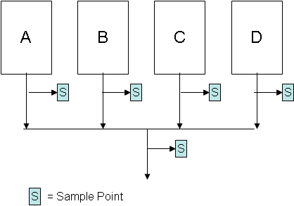
The problem is as follows. There are four machines that make the same product. A certain quality characteristic, X, is of interest to a customer. There are several potential methods of subgrouping the data to be used in control charts. The possible sampling points are given in the figure above. Three different subgrouping plans are presented below. Which one do you think is best?
Plan A
Select the first subgroup to consist of four samples from machine A, the second subgroup to consist of four samples from machine B, the third subgroup to consist of four samples from machine C and the fourth subgroup to consist of four samples from machine D. Repeat this sequence over time.
Plan B
Select one sample from each machine to form the subgroup of four each time.
Plan C
Select each subgroup to consist of four samples from the blended stream.
Which subgrouping plan is best? The data and questions to answer are given in last month’s e-zine. The charts and answers to the questions are given below.
Plan A Results
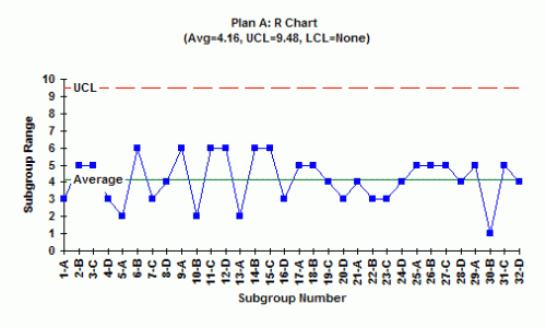
1. Is the range chart in statistical control? What does this mean?
The above range chart is in statistical control (for more on interpreting control charts, see our e-zine on Interpreting Control Charts, April 2004, as well as the March 2005 and April 2005 e-zines on X-R charts). What variation is the range chart examining? In this plan, each subgroup is composed of four samples from the same machine. So, the range chart is examining the within-machine (within subgroup) variation. And it is answering the question, is there any difference between the within-machine variation for the four machines? That is, is the variation in machine A larger or smaller than that in the other three machines, etc.?
When a range chart is in control, it means that the within subgroup variation is consistent over time. Since this range chart is in control, it means that there is no difference in the variation of individual parts made in machine A, machine B, machine C, and machine D. The standard deviation of each machine is essentially the same.
2. If the range chart is in statistical control, what is the estimate of the standard deviation? What is the standard deviation measuring?
Since the range chart is in control, the standard deviation of the data can be estimated. The standard deviation is given by:
s = R/d2
where d2 is a constant that depends on subgroup size. Since we are using a subgroup size of 4, the value of d2 is 2.059. The average range from the chart is 4.16. So, the standard deviation is 4.16/2.059 = 2.02. This is a measure of the variation in the individual values for each machine.
3. Is the X chart in statistical control? What does this mean?
The X chart is not in control. There are points beyond the control limits and really no points near the average. The X chart is comparing the subgroup averages between the machines – it is looking at the variation in subgroup averages over time and answering the question: are there any differences in the subgroup averages over time? Since the chart is not in control, the machine averages are not the same.
4. What explanations do you have for the way the X chart looks?
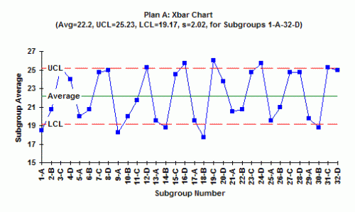
The explanation for the way the chart looks can be seen by examining the way the data is subgrouped. The first subgroup is from machine A, the second from machine B, the third from machine C, and the fourth from machine D. Look at the chart. What do you see? It appears that machines A and B have subgroup averages near the LCL, while machines C and D have subgroup averages near the UCL. It appears that you have at least two different processes: machines A and B are operating at one average with machines C and D operating at a different average. Finding out why and eliminating the reasons for the differences will greatly reduce the variation in the process.
Plan B Results
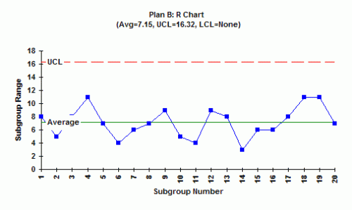
1. Is the range chart in statistical control? What does this mean?
The range chart for this subgrouping plan is in control. A subgroup for this plan was formed by taking one sample from each machine. Since the range chart is in control, it means that the within-subgroup variation is the same from subgroup to subgroup. This is not surprising since we saw that the range chart was in control for Plan A.
2. If the range chart is in statistical control, what is the estimate of the standard deviation? What is the standard deviation measuring?
Since the range chart is in control, the standard deviation can be estimated as shown above. R in this plan is 7.15, so the standard deviation = 7.15/2.059 = 3.47. This is measuring the variation in the individual results within a subgroup.
3. Is the X chart in statistical control? What does this mean?
At first glance, the X chart looks as if it is in statistical control. But looking more closely, you see that the points are hugging the average. This is an out-of-control situation caused by systematically sampling two different processes. The rule for this test is 15 points in a row in zone C on either side of the average. This shows that there is a special cause present.
4. What explanations do you have for the way the X chart looks?
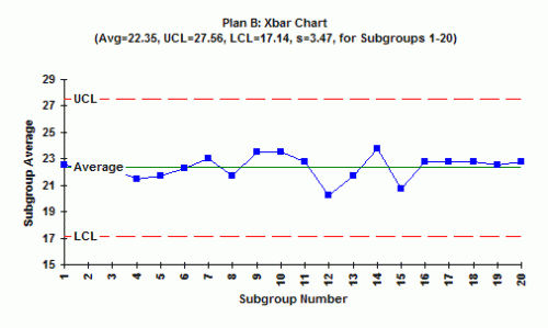
Remember what we learned in examining Plan A. Machines A and B operate at one level, while machines C and D operate at a different level. When you take sample from machines A and B, you get a low result; when you sample from Machines C and D you get a high result. Averaging these four results gives an average near the center line all the time.
5. How can you explain the difference in R for subgrouping Plan A and subgrouping Plan B?
The explanation above shows why R for Plan A is smaller than for Plan B.
Plan C Results
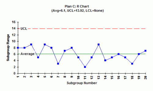
1. Is the range chart in statistical control? What does this mean?
The range chart is in statistical control. In this case, the subgroup is composed of four random samples from the combined stream. All you can say it that the within-subgroup variation is the same over time.
2. If the range chart is in statistical control, what is the estimate of the standard deviation? What is the standard deviation measuring? The standard deviation is 6.1/2.059 = 2.96. This is a measure of the variation in the individual results in the combined stream.
3. Is the X chart in statistical control? What does this mean? The X chart is in control. This means that the subgroup averages formed by randomly selecting four samples from the combined stream is in statistical control. You know what the combined stream will produce in the future.
4. What explanations do you have for the way the X chart looks?
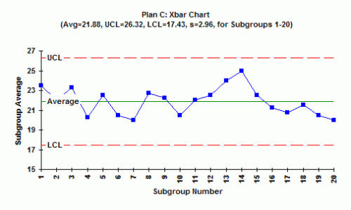
The X chart is in control because you are taking samples from a combined stream. Quite often, this will be the case when you combine streams and then take measurements.
The Best Plan
What happens if you select Plan C? You never know what is happening upstream in the process. You do not find out that the four machines operate at different averages. So, Plan C is not a very good one. Plan B gives you more information. The X chart is out of control so it means that there are differences between the machines – but you don’t know which ones are different. Plan A is the best. It tells you all you need to know (almost). It tells you that the variation within a machine is the same for all machines (from the range chart) and that the machine averages are different with machines A and B being the same and machines C and D being the same. Plan A is the best! It does not tell you how to make the machines have the same average. You must do problem-solving to accomplish this.